Introduction
Humans are among the most creative species on this planet. From time immemorial, art has taken various forms, from paleolithic cave paintings to modern art. For instance, the cave paintings of Bhimbetka gave a lot of information about the life of the people back then. The genesis of visual art dates back to the stone age.
Now, as part of the fourth generation of the revolution, who has witnessed art and creativity in various fields and forms, here come various tools and programming languages to our rescue to solve complex business problems using the art of visualization.
Today's businesses use various visualization techniques to understand and gain insights from data to make data-driven business decisions.. Today there are many visualization tools available such as Tableau, Power BI, Looker, Qlik sense and many more. On this issue, we will cover various types of graphics using Python.
The need for data visualization
Data makes more sense and is easy to understand when presented in a simple, visualized format, as it is difficult for the human eye to decipher the pattern, trend and seasonality from raw data. Therefore, data is visualized to understand how different parameters behave.
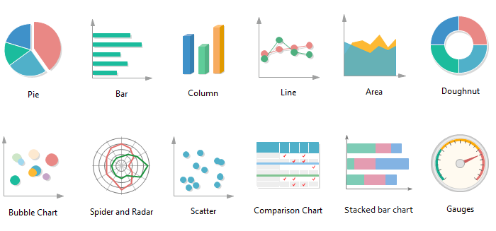
Various types of charts and their uses.
1. Bar and column charts
It is one of the simplest charts to understand how our quantitative field is performing in various categories. Is used for comparison.
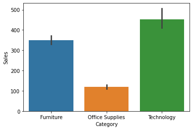
In the column chart above, we can see that technology sales are highest and office supplies are the lowest.
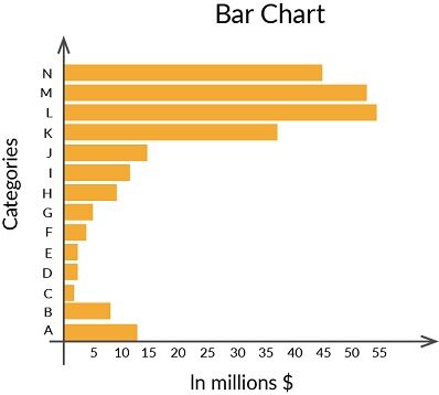
The graph shown above is a bar graph showing which L categories perform best.
2. Scatter chart and bubble chart
Scatter and bubble diagrams help us understand how to spread in all the considered range. Can be used to identify patterns, the presence of outliers and the relationship between the two variables.
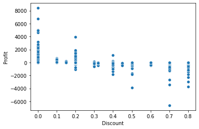
We can see that with the increase in discounts the profits are decreasing.
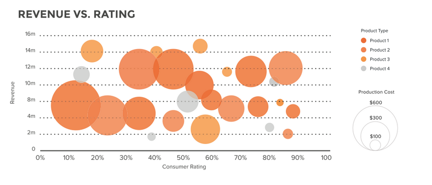
The graph shown above is a bubble graph.
3. Line graph
Preferred when time-dependent data must be presented. It is more suitable for analyzing the trend.
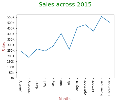
In the graph above, we can see that sales are increasing throughout the months, but there is a sudden drop in the month of July and the sales are highest in November.
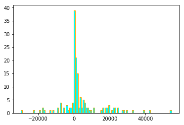
4. Histogram
A histogram is a frequency graph that records the number of occurrences of an entry in a data set. It is useful when you want to understand the distribution of a series.
5. Box plot
Box plots are effective for summarizing spread big data. They use percentile to divide the data range. This helps us understand the data point that is below or above a chosen data point. It helps us to identify outliers in the data.
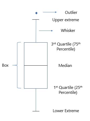
The box plot divides the complete data into three categories
* Median value: divide the data into two equal halves
* IQR: ranges between the percentile values 25 Y 75.
* Atypical values: these data differ significantly and lie outside the whiskers.
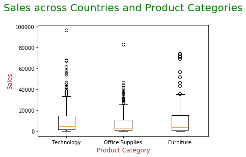
The circles in the graph above show the presence of outliers.
6. Subparcelas
Sometimes it is better to trace different plots on the same grid to understand and compare the data better.
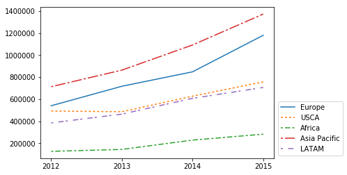
Here you can see that in the single chart we were able to understand the sales over a period of time in different regions.
7. Donut, pie charts and stacked column charts
When we want to find the composition of the data graphs mentioned above is the best.
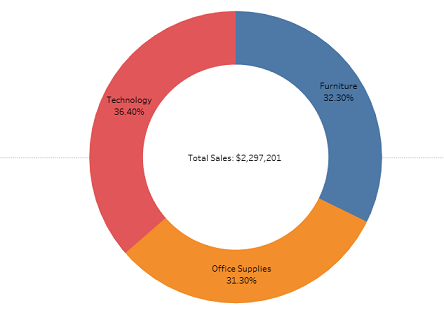
The donut chart above shows the sales composition of different product categories.
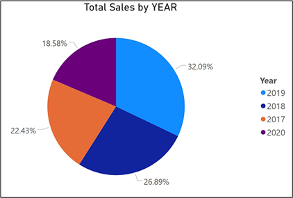
The pie chart above shows the percentage of sales in different years.
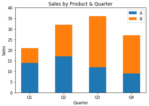
The column chart above shows the sale of two products in different quarters..
8. Heat maps
It is the most preferred graphic when we want to check if there are any. correlation between variables.
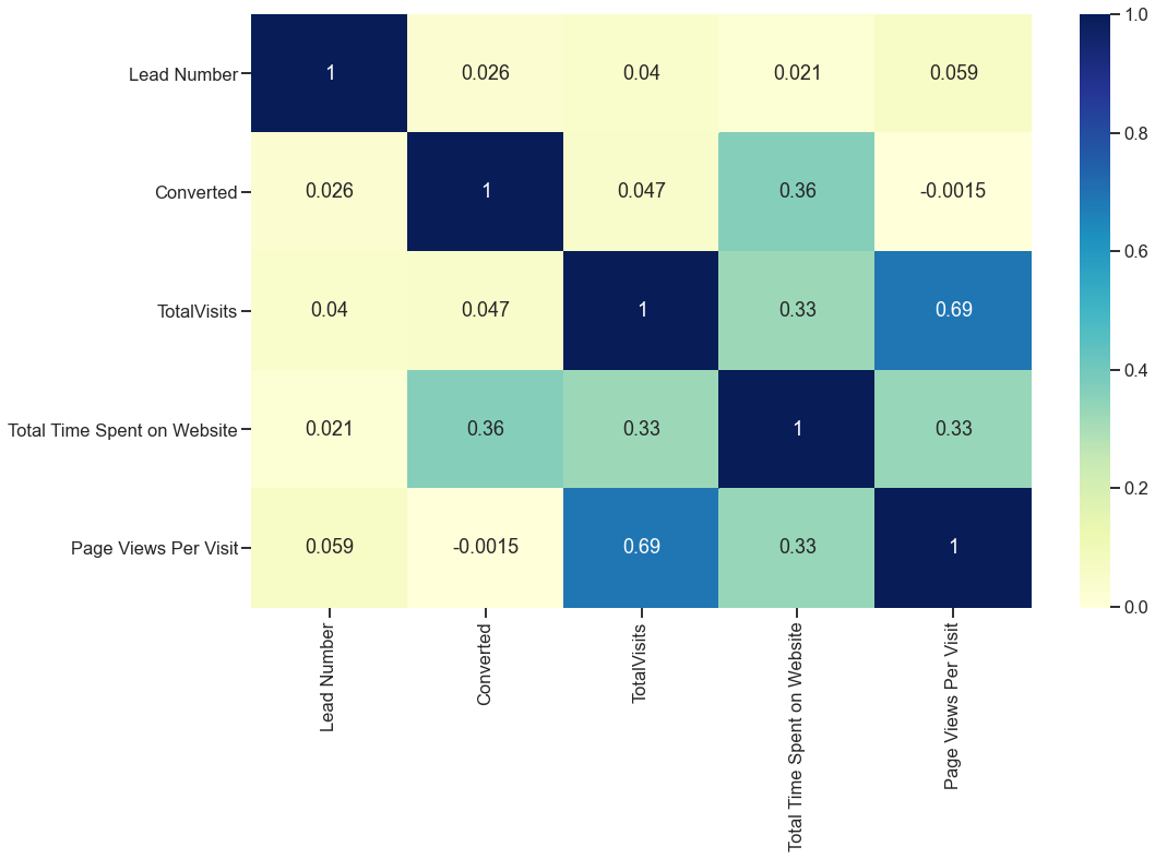
Here the positive value shows a positive correlation and the negative value shows a negative correlation. The color indicates the intensity of the correlation, the darker the color, the higher the positive correlation and the lighter the color, the greater the negative correlation.
Understand visualization with Python
Python offers several libraries to understand the data graphically like Matplotlib Y Seaborn etc. Let's start our journey into the world of visualization.
Anubhav is a product-based company that sells different types of products. Let's explore the data to find your sales over a period, what category / product subcategory generates the highest sales, the ratio of profit to an increase in discount.
1. Let's import the relevant libraries first.
import numpy as np
import pandas as pd
import matplotlib.pyplot as plt
import seaborn as sns
import warnings
warnings.filterwarnings ('ignore')
2. The next step would be to load the dataset.
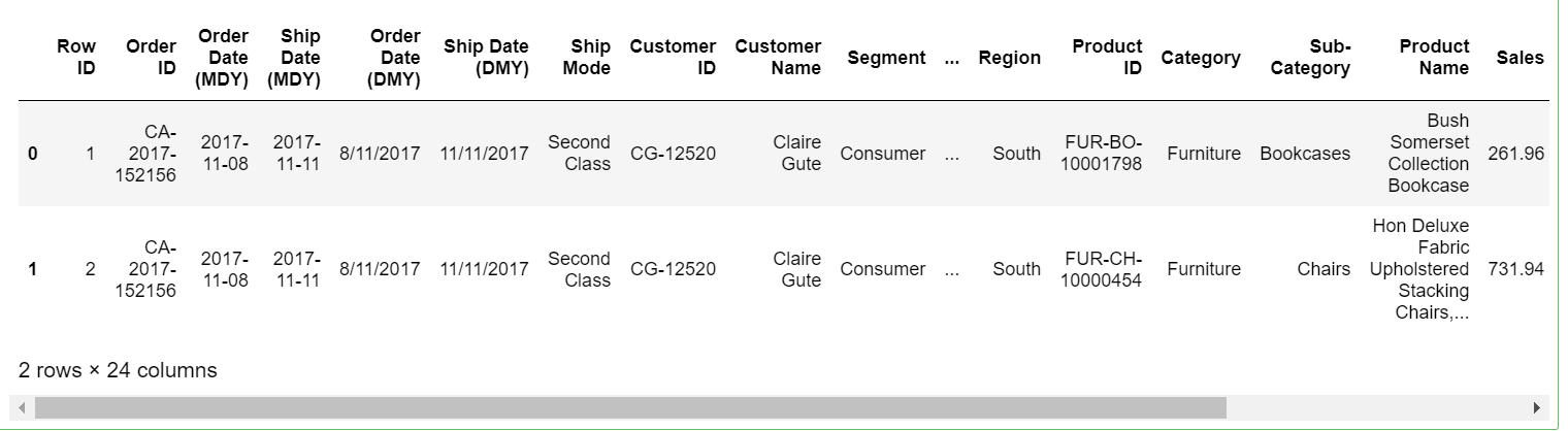
sales=pd.read_excel('Maven Supplies Raw.xlsx',skiprows = 3)
sales.head(2)
3. Taking the dataset with us, let's explore the data
# Check the number of rows and columns in the dataframe
sales.shape
(9994, 24)
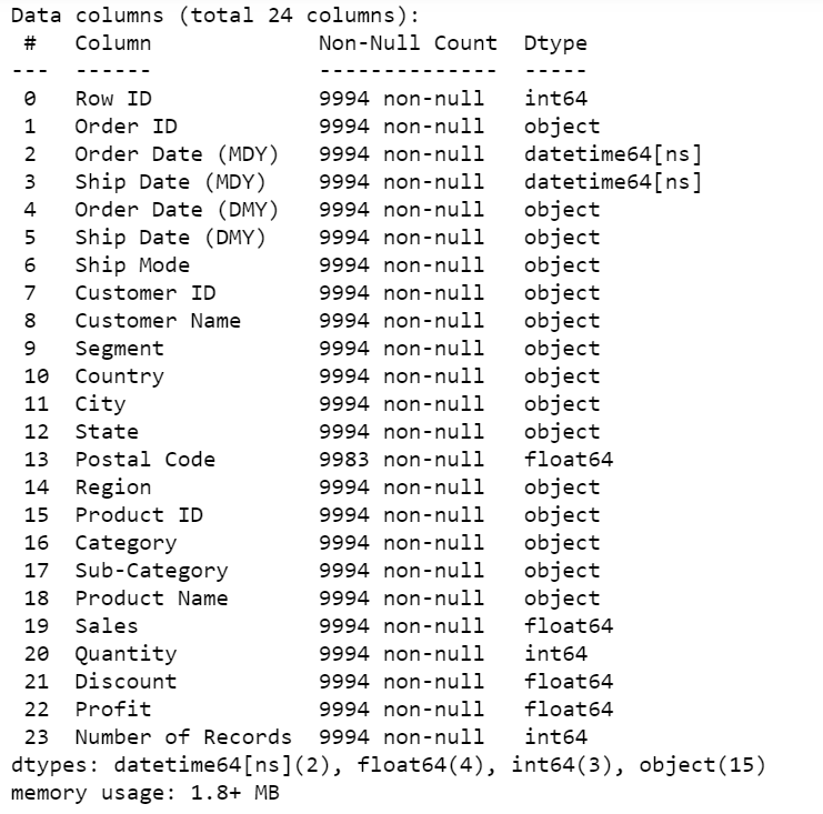
# Check the column-wise info of the dataframe
sales.info()
# Check the summary for the numeric columns
sales.describe()
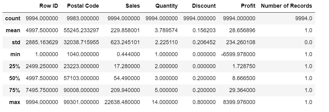
sales.columns
4. Now that we better understand the available data, let's visualize them to understand them better.
– First, explore category composition with% of sales.
sales.groupby(['Category'])['Sales'].sum().plot(kind='pie',autopct="%1.2f%%")
plt.title("Sales% of different category")
plt.ylabel(" ")
plt.show();
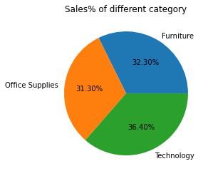
We can see that the technology is working better compared to other categories.
– There are a lot of subcategories within the data, allows you to see how the different subcategories are performing.
plt.figure(figsize=(10,3))
sales.groupby(['Sub-Category'])['Sales'].sum().sort_values(ascending=False).plot(kind='bar',color="seagreen")
plt.show();
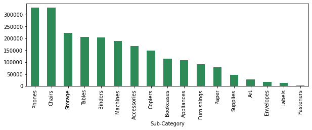
We can see that phone sales are the highest, followed by chairs and so on.
– Sales in different regions will be different. We'll see
sales.groupby(['Region'])['Sales'].sum().sort_values(ascending=False).plot(kind='bar',color="seagreen")
plt.show();
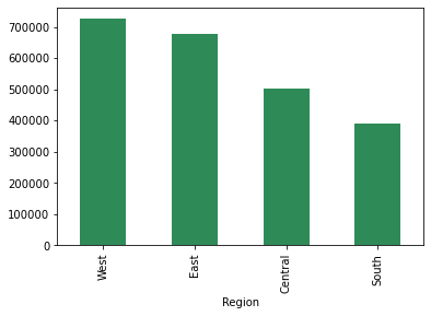
Sales in the west region are high and the south region is the lowest.
– Now let's see how the regions perform in terms of profits.
sales.groupby(['Region'])['Profit'].sum().sort_values(ascending=False).plot(kind='bar',color="seagreen")
plt.show();
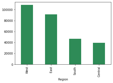
The worst performing southern region in terms of sales is performing better compared to the central region.
– Heat maps give us a better understanding of how different variables are correlated with each other.
plt.figure(figsize = (10, 5))
sns.heatmap(sales.corr(),annot=True,cmap="summer")
plt.show()
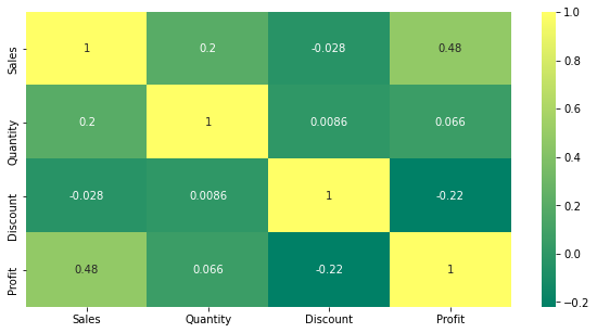
Clearly discounts are negatively correlated with earnings.
– Let's figure out how profit is affected by increased discounts.
sns.scatterplot(x = 'Discount', y='Profit', data = sales ,color="seagreen")
plt.show;
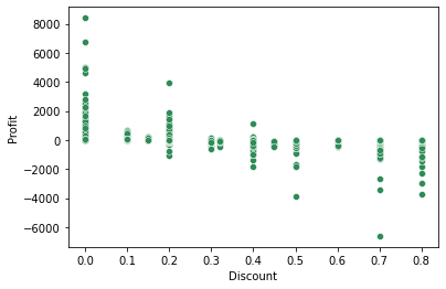
We can see that with the increase of the discount the earnings are also decreasing.
– Sales are not constant, increase or decrease based on various factors. Let's see how sales are performing in the different months.
sales.groupby(['month'])['Sales'].sum().plot(kind='line',color="seagreen")
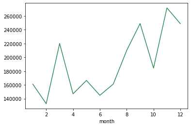
As mentioned earlier, is showing a pattern with the highest sales in the month of November and the lowest sales in the month of February.
– It is not necessary that even if the sales are high, earnings will show a similar pattern. Let's see how earnings change over time. This may be due to the sale of discounted products as seen in the scatterplot.
sales.groupby(['month'])['Profit'].sum().plot(kind='line',color="seagreen")
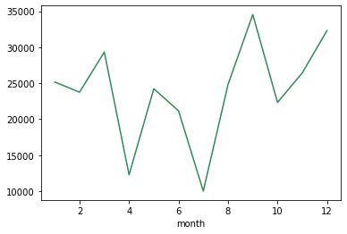
we can see that the benefits are high during the month of September and lower during the month of July.
– Sales can show an increasing or decreasing pattern over the year.
sales.groupby(['year'])['Sales'].sum().plot(kind='line',color="seagreen")
plt.xticks([2015,2016,2017,2018])
plt.show()
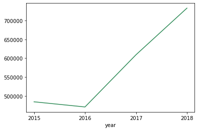
We can see that sales show a downward trend in the year 2016 as it grows in all the years.
From a data set, We were able to understand that phones generated the majority of sales and that the West region contributed the highest sales and profits. Over a period of time, sales increased, but with the increase of the discount, earnings showed a downward trend. We saw that there were particular months in which higher sales and profits were recorded.
Therefore, we can say that the visualization speaks a lot, you will always have a story to tell that helps companies make data-driven decisions.
Conclution
In this article, we talked about various types of charts and their uses. We deal with a dataset to understand how to use Python libraries to visualize the data and make sense of it. Therefore, we can say that through visualization, it's easy to decipher a hidden pattern or trend in the data. With some examples, we saw that the graphs help in the comparison and, the most important, they are easy to understand.
Final notes
Thank you for reading!!!
I hope you have enjoyed reading the article and have increased your knowledge of various types of charts and their use..
If I haven't mentioned anything or if you want to share your thoughts, feel free to comment below in the comment section.
About the Author
Sruthi ER
I am a data science enthusiast with an interest in data analysis and visualization, and I am currently pursuing IIIT-Bangalore Data Science Postgraduate Certification. I come from a career in Civil Engineering with 4 years of experience in the construction industry.
Do not hesitate to contact me at Linkedin
The media shown in this article is not the property of DataPeaker and is used at the author's discretion.


