This post was released as part of the Data Science Blogathon
Introduction
In applied statistics and machine learning, Data visualization is one of the most important skills.
Data visualization provides an important set of tools to identify a qualitative understanding. This can be useful when we are trying to explore the dataset and extract information to know a dataset and can help with pattern identification, corrupt data, Atypical values, and much more.
If we have a little knowledge of the domain, data visualizations can be used to express and identify key relationships in charts and graphs that are more useful to you and your stakeholders than measures of association or relevance.
In this post, we will discuss some of the basic graphics O installments that you can use to better understand and visualize your data.
Table of Contents
1. What is data visualization?
2. Benefits of good data visualization
3. Different types of analysis for data visualization
4. Univariate analysis techniques for data visualization
- Distribution plot
- Box-and-whisker plot
- Violin frame
5. Bivariate analysis techniques for data visualization
- Line graph
- Bar graphic
- Scatter plot
What is data visualization?
The data display is set as graphic representation containing the information and the data.
Using visual items like graphics, graphics, Y maps, data visualization techniques provide an achievable way to view and understand trends, outliers and patterns in the data.
Nowadays, we have a lot of data in our hands, In other words, in the world of Big Data, data visualization tools and technologies are crucial for analyzing massive amounts of information and making data-informed decisions.
It is used in many areas such as:
- To model complex events.
- Visualize phenomena that cannot be observed directly, What weather patterns, medical conditions, O mathematical relationships.
Benefits of good data visualization
Since our eyes can capture the colors and patterns, therefore, we can quickly identify the red part of the blue, the square of the circle, our culture is visual, that includes everything, from art and commercials to television and movies.
Then, data visualization is another visual art technique that captures our interest and keeps our main focus on the message captured with the help of the eyes.
Whenever we visualize a graph, we quickly identify trends and outliers present in the dataset.
The basic uses of the data visualization technique are as follows:
- It is a powerful technique for exploring data with presentable Y interpretable results.
- In the data mining procedure, acts as a main step in the preprocessing part.
- It's compatible with data cleaning procedure finding bad data and missing or corrupted values.
- It also helps construct and choose variables, which means we have to determine which variable to include and discard in the analysis.
- In the procedure of Data decrease, it also plays a crucial role in combining the categories.
Image source: Google images
Different types of analysis for data visualization
Principally, there are three different types of analysis for data visualization:
Univariate analysis: In univariate analysis, we will use a single feature to analyze almost all its properties.
Bivariate analysis: When we compare the data between exactly 2 features, known as bivariate analysis.
Analisis multivariable: In multivariate analysis, Will be comparing more than 2 variables.
NOTE:
In this post, our main goal is to understand the following concepts:
- How to find some inferences from data visualization techniques?
- In what condition, which technique is more useful than others?
We are not going to delve into the coding part / implementation of different techniques in a particular data set, but we try to find the solution to the previous questions and understand only the code of the snippet with the help of sample diagrams for each of the data visualization techniques. .
Now, let's start with the different data visualization techniques:
Univariate analysis techniques for data visualization
1. Distribution plot
- It is one of the best univariate graphs to know the distribution of data.
- When we want to analyze the impact on the target variable (Exit) with respect to an independent variable (entry), we use distribution graphs a lot.
- This graph gives us a combination of probability density functions (pdf) and histogram on a single graph.
Implementation:
- The distribution graph is present in the Seaborn package.
The code snippet is as follows:
sns.FacetGrid(hb,hue="SurvStat",size=5).map(sns.distplot,'age').add_legend()
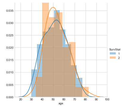
Some conclusions inferred from the distribution diagram above:
From the previous distribution graph we can conclude the following observations:
- We have observed that we create a distribution plot on the characteristic 'Age’(input variable) and we use different colors for the Survival state(output variable) since it is the class to predict.
- There is a large area of overlap between PDFs for different combinations.
- In this graph, the sharp block-shaped structures are called histograms and the smoothed curve is known as the probability density function (PDF).
NOTE:
The probability density function (PDF) of a curve can help us capture the underlying distribution of that characteristic, which is one of the main takeaways from data visualization or exploratory data analysis (EDA).
2. Box-and-whisker plot
- This chart can be used to gain more statistical details about the data.
- The lines at the maximum and minimum are also called whiskers.
- Points outside the whiskers will be considered an outlier.
- The box plot also gives us a description of the Quartiles 25, 50, 75.
- With the help of a box plot, we can also determine the Interquartile range (IQR) where the maximum details of the data will be present. Therefore, furthermore it can give us a clear idea about the outliers in the dataset.
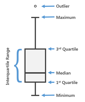
Fig. General diagram for a box plot
Implementation:
- Boxplot is enabled on Seaborn Library.
- Here x is considered as the dependent variable and y is considered as the independent variable. These box plots come below univariate analysis, which means we are exploring data with only one variable.
- Here we are trying to verify the impact of a feature called “Axil_nodes” in the named class “Survival state” and not between two independent characteristics.
The code snippet is as follows:
sns.boxplot(x='SurvStat',y='axil_nodes',data=hb)
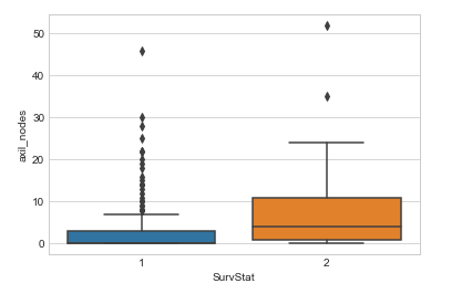
Some conclusions inferred from the box plot above:
From the box-and-whisker plot above, we can conclude the following observations:
- How much data is present in the first quartile and how many points are outliers, etc.
- For the class 1, we can see that there is very little or no data present between the median and the first quartile.
- There are more outliers for the class 1 in the feature named axil_nodes.
NOTE:
We can get details on outliers to help us prepare the data well before sending it to a model, since outliers influence many machine learning models.
3. Violin frame
- Fiddle plots can be thought of as a combination of box plots in the middle and distribution plots(Estimation of grain density) on both sides of the data.
- This can give us the description of the distribution of the data set as if the distribution is multimodal, Obliquityetc.
- It also provides us with useful information such as Confidence interval of 95%.
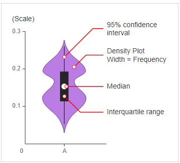
Fig. General diagram for a violin frame
Implementation:
- The plot of the violin is present in the Seaborn package.
The code snippet is as follows:
sns.violinplot(x='SurvStat',y='on_yr',data=hb,size=6)
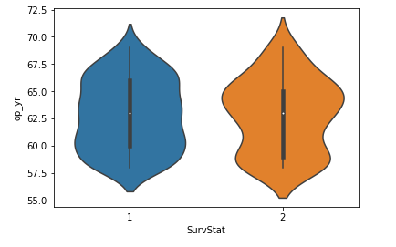
Some conclusions inferred from the violin plot above:
From the previous violin plot we can conclude the following observations:
- The median of both classes is close to 63.
- The maximum number of people with class 2 have a op_yr value of 65 while, for people in the class 1, the maximum value is around 60.
- At the same time, the third quartile to the median has fewer data points than the median to the first quartile.
Bivariate analysis techniques for data visualization
1. Line graph
- This is the graph that can be seen in the corners of any type of analysis between 2 variables.
- Line charts are nothing more than the values of a series of data points to be connected with straight lines.
- The plot may seem very simple but it has more applications not only in machine learning but in many other areas.
Implementation:
- The line graph is present in the Matplotlib package.
The code snippet is as follows:
plt.plot(x,Y)
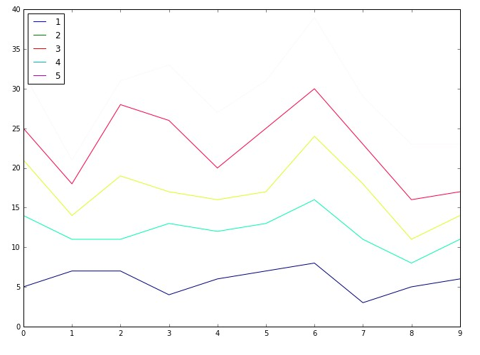
Some conclusions inferred from the previous line diagram:
From the previous line graph we can conclude the following observations:
- These are used directly from performing the distribution comparison using QQ installments to tune CV using the elbow method.
- It is used to analyze the performance of a model using the ROC curve- AUC.
2. Bar graphic
- This is one of the most used graphics, that we would have seen several times not only in data analysis, but we also use this graph whenever there is a trend analysis in many fields.
- Even though it seems simple, is powerful to analyze data like sales figures every week, revenue from a product, Number of visitors to a site each day of the weeketc.
Implementation:
- The bar graph is present in the Matplotlib package.
The code snippet is as follows:
plt.bar(x,Y)
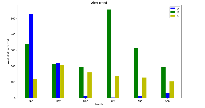
Some conclusions inferred from the previous bar chart:
From the previous bar graph we can conclude the following observations:
- We can visualize the data in a cool plot and we can convey the details directly to others.
- This graph can be simple and clear, but not used very often in data science applications.
3. Dispersion diagram
- It is one of the most used graphs to visualize simple data in machine learning and data science.
- This graph describes us as a representation, where each point in the complete data set is present with respect to 2 O 3 features (columns).
- Scatter diagrams are available in both 2-D and 3-D. The 2-D scatter plot is the most common, where we will mainly try to find the patterns, groups and separability of data.
Implementation:
- The scatter diagram is present in the Matplotlib package.
The code snippet is as follows:
plt.scatter(x,Y)
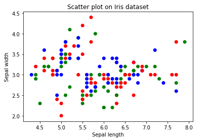
Some conclusions inferred from the scatterplot above:
From the previous scatter diagram we can conclude the following observations:
- Colors are assigned to different data points based on how they were present in the data set. In other words, representation of the target column.
- We can color the data points based on their given class label in the data set.
This completes today's discussion!!
Final notes
Thank you for reading!
Hope you enjoyed the post and increased your knowledge of data visualization techniques.
Please feel free to contact me about Email
Anything not mentioned or do you want to share your thoughts? Feel free to comment below and I'll get back to you.
For the remaining posts, Ask the Link.
About the Author
Aashi Goyal
At the moment, I am pursuing my Bachelor of Technology (B.Tech) in Electronic and Communication Engineering from Universidad Guru Jambheshwar (GJU), Hisar. I am very excited about the statistics, machine learning and deep learning.
Your suggestions and doubts are welcome here in the comments section. Thanks for reading my post!!


