Este artigo foi publicado como parte do Data Science Blogathon.
Introdução
A visualização de dados em Python é talvez um dos recursos mais usados para ciência de dados com Python atualmente.. As bibliotecas Python vêm com muitos recursos diferentes que permitem aos usuários criar gráficos altamente personalizados., elegante e interativo.
Neste artigo, vamos cobrir o uso do Matplotlib, Seaborn, bem como uma introdução a outros pacotes alternativos que podem ser usados na visualização do Python.
Dentro do Matplotlib e Seaborn, abordaremos alguns dos gráficos mais usados no mundo da ciência de dados para facilitar a visualização.
Mais adiante no artigo, veremos outro recurso poderoso nas visualizações do Python, a subtrama, e cobrimos um tutorial básico para criar subtramas.
Pacotes úteis para visualização em python
Matplotlib
Matplotlib é uma biblioteca de visualização Python para plotagem 2D de matrizes.. Matplotlib é escrito em Python e faz uso da biblioteca NumPy.. Pode ser usado em shells Python e IPython, Laptops Jupyter e servidores de aplicativos da web. Matplotlib vem com uma grande variedade de gráficos como linha, barra, dispersão, histograma, etc. que podem nos ajudar a aprofundar nossa compreensão das tendências, padrões e correlações. Foi introduzido por John Hunter em 2002.
Seaborn
Seaborn é uma biblioteca orientada a conjuntos de dados para realizar representações estatísticas em Python.. É desenvolvido em cima do matplotlib e para criar diferentes visualizações. É integrado com estruturas de dados pandas. A biblioteca realiza internamente o mapeamento e a agregação necessários para criar visuais informativos. Recomenda-se usar uma interface Jupyter / IPython e modo matplotlib.
Bokeh
Bokeh é uma biblioteca de visualização interativa para navegadores modernos.. É adequado para ativos de dados grandes ou de streaming e pode ser usado para desenvolver gráficos e painéis interativos.. Há uma ampla variedade de gráficos intuitivos na biblioteca que podem ser aproveitados para desenvolver soluções. Trabalhe em estreita colaboração com as ferramentas PyData. A biblioteca é adequada para criar imagens personalizadas de acordo com os casos de uso necessários. As imagens também podem ser interativas para servir como modelo de cenário hipotético. Todos os códigos são de código aberto e estão disponíveis no GitHub.
Altair
Altair é uma biblioteca de visualização estatística declarativa para Python. A API do Altair é fácil de usar e consistente, e é construído sobre a especificação Vega-Lite JSON. A biblioteca declarativa afirma que ao criar qualquer, precisamos definir os links entre as colunas de dados e os canais (eje x, Eixo y, Tamanho, cor). Com a ajuda de Altair, é possível criar imagens informativas com o mínimo de código. O Altair possui uma gramática declarativa para exibição e interação.
tramadamente
plotly.py é uma biblioteca de visualização interativa, Código aberto, alto nível, declarativo e baseado em navegador para Python. Contém uma variedade de visualizações úteis, incluindo gráficos científicos, Gráficos 3D, gráficos estatísticos, gráficos financeiros, entre outros. Gráficos de plotagem podem ser visualizados em notebooks Jupyter, Arquivos HTML autônomos ou hospedados online. A biblioteca Plotly oferece opções para interação e edição. API robusta funciona perfeitamente no modo de navegador local e web.
ggplot
ggplot é uma implementação Python da gramática do grafo. A gramática dos gráficos está preocupada em mapear dados para atributos estéticos (cor, forma, Tamanho) e objetos geométricos (pontos, linhas, barras). Os blocos de construção básicos de acordo com a gramática dos gráficos são dados, geometria (objetos geométricos), Estatisticas (transformações estatísticas), escala, sistema de coordenadas e faceta.
Usar ggplot em Python permite que você crie visualizações informativas de forma incremental, primeiro entendendo as nuances dos dados e depois ajustando os componentes para melhorar as representações visuais.
Como usar a visualização correta?
Para extrair as informações necessárias dos diferentes elementos visuais que criamos, é essencial que usemos a representação correta com base no tipo de dados e nas perguntas que estamos tentando entender. A seguir, discutiremos um conjunto de representações mais usadas e como podemos usá-las de maneira mais eficaz.
Gráfico de barras
Um gráfico de barras é usado quando queremos comparar valores de métricas em diferentes subgrupos de dados.. Si tenemos un mayor número de grupos, se prefiere un gráfico de barras a un gráfico de columnas.
Gráfico de barras usando Matplotlib
#Creating the dataset
df = sns.load_dataset('titanic')
df=df.groupby('quem')['fare'].soma().to_frame().reset_index()

#Creating the bar chart
plt.barh(df['quem'],df['fare'],color = ['#F0F8FF','#E6E6FA','#B0E0E6'])

#Adding the aesthetics
plt.title('Chart title')
plt.xlabel('X axis title')
plt.ylabel('Y axis title')

#Show the plot
plt.show()
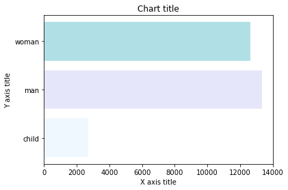
Gráfico de barras con Seaborn
#Creating bar plot
sns.barplot(x = 'fare',y = 'who',data = titanic_dataset,paleta = "Blues")
#Adding the aesthetics
plt.title('Chart title')
plt.xlabel('X axis title')
plt.ylabel('Y axis title')
# Show the plot
plt.show()
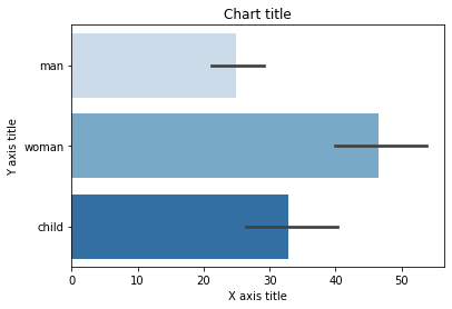
Gráfico de columnas
Los gráficos de columnas se utilizan principalmente cuando necesitamos comparar una sola categoría de datos entre subelementos individuales, por exemplo, al comparar ingresos entre regiones.
Gráfico de columnas usando Matplotlib
#Creating the dataset
df = sns.load_dataset('titanic')
df=df.groupby('quem')['fare'].soma().to_frame().reset_index()
#Creating the column plot
plt.bar(df['quem'],df['fare'],color = ['#F0F8FF','#E6E6FA','#B0E0E6'])
#Adding the aesthetics
plt.title('Chart title')
plt.xlabel('X axis title')
plt.ylabel('Y axis title')
#Show the plot
plt.show()
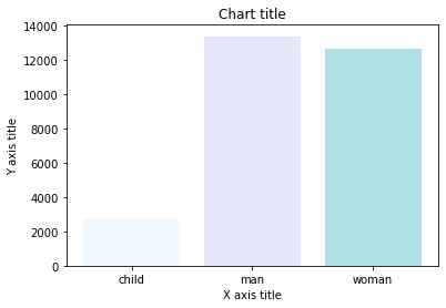
Gráfico de columnas con Seaborn
#Reading the dataset
titanic_dataset = sns.load_dataset('titanic')
#Creating column chart
sns.barplot(x = 'who',y = 'fare',data = titanic_dataset,paleta = "Blues")
#Adding the aesthetics
plt.title('Chart title')
plt.xlabel('X axis title')
plt.ylabel('Y axis title')
# Show the plot
plt.show()
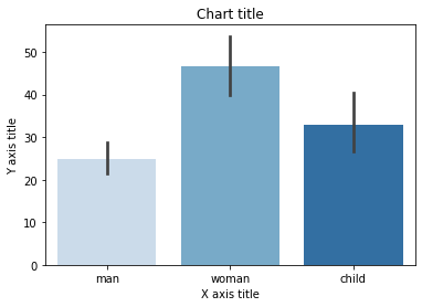
Gráfico de barras agrupadas
Se utiliza un gráfico de barras agrupadas cuando queremos comparar los valores en ciertos grupos y subgrupos.
Gráfico de barras agrupadas usando Matplotlib
#Creating the dataset
df = sns.load_dataset('titanic')
df_pivot = pd.pivot_table(df, valores ="fare",índice ="Who",colunas ="classe", aggfunc = np.mean)
#Creating a grouped bar chart
ax = df_pivot.plot(kind ="bar",alfa = 0,5)
#Adding the aesthetics
plt.title('Chart title')
plt.xlabel('X axis title')
plt.ylabel('Y axis title')
# Show the plot
plt.show()
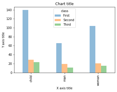
Gráfico de barras agrupadas con Seaborn
#Reading the dataset
titanic_dataset = sns.load_dataset('titanic')
#Creating the bar plot grouped across classes
sns.barplot(x = 'who',y = 'fare',matiz ="classe",data = titanic_dataset, paleta = "Blues")
#Adding the aesthetics
plt.title('Chart title')
plt.xlabel('X axis title')
plt.ylabel('Y axis title')
# Show the plot
plt.show()
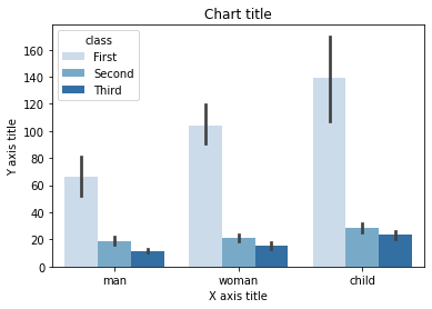
Gráfico de barras apiladas
Se utiliza un gráfico de barras apiladas cuando queremos comparar los tamaños totales de los grupos disponibles y la composición de los diferentes subgrupos.
Gráfico de barras apiladas usando Matplotlib
# Stacked bar chart
#Creating the dataset
df = pd.DataFrame(colunas =["UMA","B", "C","D"],
                  data=[["E",0,1,1],
                        ["F",1,1,0],
                        ["G",0,1,0]])

df.plot.bar(x='A', y =["B", "C","D"],  stacked=True,  width = 0.4,alpha=0.5)

#Adding the aesthetics
plt.title('Chart title')
plt.xlabel('X axis title')
plt.ylabel('Y axis title')

#Show the plot
plt.show()
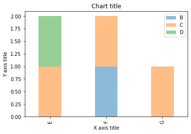
Gráfico de barras apiladas con Seaborn
dataframe = pd.DataFrame(colunas =["UMA","B", "C","D"],
                  data=[["E",0,1,1],
                        ["F",1,1,0],
                        ["G",0,1,0]])
dataframe.set_index('UMA').T.plot(kind = 'bar', stacked=True)
#Adding the aesthetics
plt.title('Chart title')
plt.xlabel('X axis title')
plt.ylabel('Y axis title')
# Show the plot
plt.show()
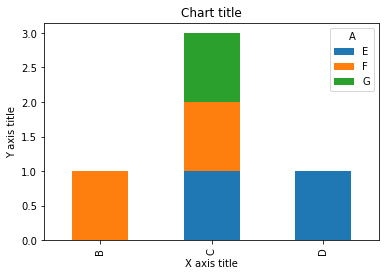
Gráfico de linha
Se utiliza un gráfico de líneas para la representación de puntos de datos continuos. Este elemento visual se puede utilizar de forma eficaz cuando queremos comprender la tendencia a lo largo del tiempo.
Gráfico de líneas usando Matplotlib
#Creating the dataset
df = sns.load_dataset("íris")
df=df.groupby('sepal_length')['sepal_width'].soma().to_frame().reset_index()
#Creating the line chart
plt.plot(df['sepal_length'], df['sepal_width'])
#Adding the aesthetics
plt.title('Chart title')
plt.xlabel('X axis title')
plt.ylabel('Y axis title')
#Show the plot
plt.show()
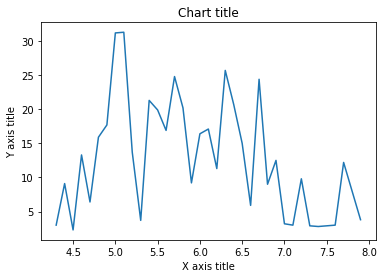
Gráfico de líneas con Seaborn
#Creating the dataset
cars = ['AUDI', 'BMW', 'NISSAN',
        'TESLA', 'HYUNDAI', 'HONDA']
dados = [20, 15, 15, 14, 16, 20]
#Creating the pie chart
plt.pie(dados, labels = cars,cores = ['#F0F8FF','#E6E6FA','#B0E0E6','#7B68EE','#483D8B'])
#Adding the aesthetics
plt.title('Chart title')
#Show the plot
plt.show()
Gráfico de pizza
Los gráficos circulares se pueden utilizar para identificar proporciones de los diferentes componentes en un todo dado.
Gráfico circular con Matplotlib
#Creating the dataset
cars = ['AUDI', 'BMW', 'NISSAN',
        'TESLA', 'HYUNDAI', 'HONDA']
dados = [20, 15, 15, 14, 16, 20]
#Creating the pie chart
plt.pie(dados, labels = cars,cores = ['#F0F8FF','#E6E6FA','#B0E0E6','#7B68EE','#483D8B'])
#Adding the aesthetics
plt.title('Chart title')
#Show the plot
plt.show()
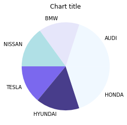
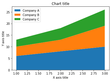
Gráfico de área
Los gráficos de área se utilizan para realizar un seguimiento de los cambios a lo largo del tiempo para uno o más grupos. Se prefieren los gráficos de área sobre los gráficos de líneas cuando queremos capturar los cambios a lo largo del tiempo para más de un grupo.
Gráfico de área usando Matplotlib
#Reading the dataset
x=range(1,6)
y =[ [1,4,6,8,9], [2,2,7,10,12], [2,8,5,10,6] ]
#Creating the area chart
ax = plt.gca()
ax.stackplot(x, e, rótulos =['UMA','B','C'],alfa = 0,5)
#Adding the aesthetics
plt.legend(loc ="superior esquerdo")
plt.title('Chart title')
plt.xlabel('X axis title')
plt.ylabel('Y axis title')
#Show the plot
plt.show()
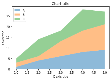
Gráfico de área usando Seaborn
# Data
years_of_experience =[1,2,3]
salary=[ [6,8,10], [4,5,9], [3,5,7] ]
# Plot
plt.stackplot(years_of_experience,salário, rótulos =['Company A','Company B','Company C'])
plt.legend(loc ="superior esquerdo")
#Adding the aesthetics
plt.title('Chart title')
plt.xlabel('X axis title')
plt.ylabel('Y axis title')
# Show the plot
plt.show()
Histograma de columna
Los histogramas de columna se utilizan para observar la distribución de una sola variable con pocos puntos de datos.
Gráfico de columnas usando Matplotlib
#Creating the dataset
penguins = sns.load_dataset("penguins")
#Creating the column histogram
ax = plt.gca()
ax.hist(penguins['flipper_length_mm'], color ="azul",alfa = 0,5, bins=10)
#Adding the aesthetics
plt.title('Chart title')
plt.xlabel('X axis title')
plt.ylabel('Y axis title')
#Show the plot
plt.show()
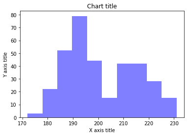
Gráfico de columnas con Seaborn
#Reading the dataset
penguins_dataframe = sns.load_dataset("penguins")
#Plotting bar histogram
sns.distplot(penguins_dataframe['flipper_length_mm'], kde = False, color ="azul", bins=10)
#Adding the aesthetics
plt.title('Chart title')
plt.xlabel('X axis title')
plt.ylabel('Y axis title')
# Show the plot
plt.show()

Histograma de línea
Los histogramas de línea se utilizan para observar la distribución de una sola variable con muchos puntos de datos.
Gráfico de histograma de líneas usando Matplotlib
#Creating the dataset
df_1 = np.random.normal(0, 1, (1000, ))
density = stats.gaussian_kde(df_1)
#Creating the line histogram
n, x, _ = plt.hist(df_1, bins=np.linspace(-3, 3, 50), histtype=u'step', density=True)
plt.plot(x, density(x))
#Adding the aesthetics
plt.title('Chart title')
plt.xlabel('X axis title')
plt.ylabel('Y axis title')
#Show the plot
plt.show()
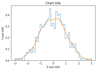
Gráfico de histograma de líneas con Seaborn
#Reading the dataset
penguins_dataframe = sns.load_dataset("penguins")
#Plotting line histogram
sns.distplot(penguins_dataframe['flipper_length_mm'], hist = False, kde = verdadeiro, rótulo ="Africa")
#Adding the aesthetics
plt.title('Chart title')
plt.xlabel('X axis title')
plt.ylabel('Y axis title')
# Show the plot
plt.show()
Gráfico de dispersão
Los gráficos de dispersión se pueden aprovechar para identificar las relaciones entre dos variables. Se puede utilizar de forma eficaz en circunstancias en las que la variable dependiente puede tener varios valores para la variable independiente.
Gráfico de dispersión usando Matplotlib
#Creating the dataset
df = sns.load_dataset("Dicas")
#Creating the scatter plot
plt.scatter(df['total_bill'],df['tip'],alfa = 0,5 )
#Adding the aesthetics
plt.title('Chart title')
plt.xlabel('X axis title')
plt.ylabel('Y axis title')
#Show the plot
plt.show()
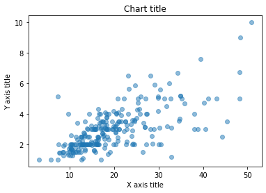
Diagrama de dispersión usando Seaborn
#Reading the dataset
bill_dataframe = sns.load_dataset("Dicas")
#Creating scatter plot
sns.scatterplot(data=bill_dataframe, x ="total_bill", y ="tip")
#Adding the aesthetics
plt.title('Chart title')
plt.xlabel('X axis title')
plt.ylabel('Y axis title')
# Show the plot
plt.show()
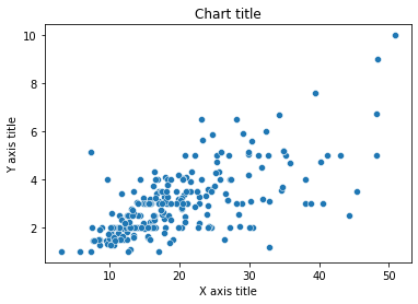
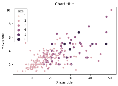
Gráfico de bolhas
Los gráficos de dispersión se pueden aprovechar para representar y mostrar relaciones entre tres variables.
Gráfico de burbujas con Matplotlib
#Creating the dataset
np.random.seed(42)
N = 100
x = np.random.normal(170, 20, N)
y = x + np.random.normal(5, 25, N)
colors = np.random.rand(N)
area = (25 * np.random.rand(N))**2
df = pd.DataFrame({
    'X': x,
    'Y': e,
    'Colors': cores,
    "bubble_size":área})
#Creating the bubble chart
plt.scatter('X', 'Y', s="bubble_size",alfa = 0,5, data = df)
#Adding the aesthetics
plt.title('Chart title')
plt.xlabel('X axis title')
plt.ylabel('Y axis title')
#Show the plot
plt.show()
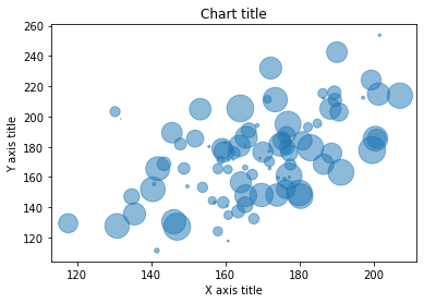
Gráfico de burbujas con Seaborn
#Reading the dataset
bill_dataframe = sns.load_dataset("Dicas")
#Creating bubble plot
sns.scatterplot(data=bill_dataframe, x ="total_bill", y ="tip", matiz ="Tamanho", tamanho ="Tamanho")
#Adding the aesthetics
plt.title('Chart title')
plt.xlabel('X axis title')
plt.ylabel('Y axis title')
# Show the plot
plt.show()
Box plot
Se utiliza un diagrama de caja para mostrar la forma de la distribución, su valor central y su variabilidad.
Diagrama de caja usando Matplotlib
from past.builtins import xrange
#Creating the dataset
df_1 = [[1,2,5], [5,7,2,2,5], [7,2,5]]
df_2 = [[6,4,2], [1,2,5,3,2], [2,3,5,1]]
#Creating the box plot
ticks = ['UMA', 'B', 'C']
plt.figure()
bpl = plt.boxplot(df_1, positions=np.array(xrange(len(df_1)))*2.0-0.4, sym='', widths=0.6)
bpr = plt.boxplot(df_2, positions=np.array(xrange(len(df_2)))*2.0+0.4, sym='', widths=0.6)
plt.plot([], c ="#D7191C", rótulo ="Label 1")
plt.plot([], c ="#2C7BB6", rótulo ="Label 2")
#Adding the aesthetics
plt.title('Chart title')
plt.xlabel('X axis title')
plt.ylabel('Y axis title')
plt.legend()
plt.xticks(xrange(0, len(Carrapatos) * 2, 2), Carrapatos)
plt.xlim(-2, len(Carrapatos)*2)
plt.ylim(0, 8)
plt.tight_layout()
#Show the plot
plt.show()
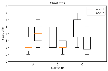
Diagrama de caja utilizando Seaborn
#Reading the dataset
bill_dataframe = sns.load_dataset("Dicas")
#Creating boxplots
ax = sns.boxplot(x ="dia", y ="total_bill", matiz ="fumante", data=bill_dataframe, paleta ="Set3")
#Adding the aesthetics
plt.title('Chart title')
plt.xlabel('X axis title')
plt.ylabel('Y axis title')
# Show the plot
plt.show()
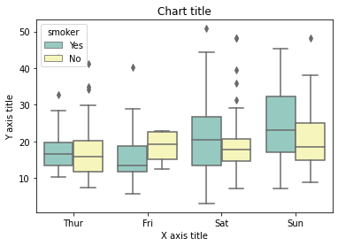
Gráfico de cascada
Se puede utilizar un gráfico de cascada para explicar la transición gradual en el valor de una variable que está sujeta a incrementos o decrementos.
#Reading the dataset
test = pd.Series(-1 + 2 * np.random.rand(10), index=list('abcdefghij'))
#Function for makig a waterfall chart
def waterfall(series):
    df = pd.DataFrame({'pos':np.maximum(series,0),'neg':np.minimum(series,0)})
    blank = series.cumsum().mudança(1).Fillna(0)
    df.plot(kind = 'bar', stacked=True, bottom=blank, color =['r','b'], alfa = 0,5)
    step = blank.reset_index(drop = True).repeat(3).mudança(-1)
    Passo[1::3] = np.nan
    plt.plot(step.index, step.values,'k')
#Creating the waterfall chart
waterfall(teste)
#Adding the aesthetics
plt.title('Chart title')
plt.xlabel('X axis title')
plt.ylabel('Y axis title')
#Show the plot
plt.show()
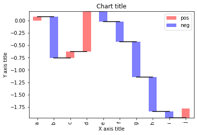
diagrama de Venn
Los diagramas de Venn se utilizan para ver las relaciones entre dos o tres conjuntos de elementos. Destaca las similitudes y diferencias
from matplotlib_venn import venn3
#Making venn  diagram
venn3(subsets = (10, 8, 22, 6,9,4,2))
plt.show()

Mapa de árbol
Los mapas de árbol se utilizan principalmente para mostrar datos agrupados y anidados en una estructura jerárquica y observar la contribución de cada componente.
import squarify
sizes = [40, 30, 5, 25, 10]
squarify.plot(tamanhos)
#Adding the aesthetics
plt.title('Chart title')
plt.xlabel('X axis title')
plt.ylabel('Y axis title')
# Show the plot
plt.show()
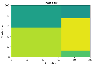
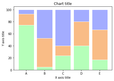
Gráfico de barras 100% apiladas
Se puede aprovechar un gráfico de barras apiladas al 100% cuando queremos mostrar las diferencias relativas dentro de cada grupo para los diferentes subgrupos disponibles.
#Reading the dataset
r = [0,1,2,3,4]
raw_data = {'greenBars': [20, 1.5, 7, 10, 5], 'orangeBars': [5, 15, 5, 10, 15],'blueBars': [2, 15, 18, 5, 10]}
df = pd.DataFrame(dados não tratados)
# From raw value to percentage
totals = [i+j+k for i,j,k in zip(df['greenBars'], df['orangeBars'], df['blueBars'])]
greenBars = [eu / j * 100 para eu,j in zip(df['greenBars'], totals)]
orangeBars = [eu / j * 100 para eu,j in zip(df['orangeBars'], totals)]
blueBars = [eu / j * 100 para eu,j in zip(df['blueBars'], totals)]
# plot
barWidth = 0.85
nomes = ('UMA','B','C','D','E')
# Create green Bars
plt.bar(r, greenBars, color ="#b5ffb9", edgecolor="Branco", width=barWidth)
# Create orange Bars
plt.bar(r, orangeBars, bottom=greenBars, color ="#f9bc86", edgecolor="Branco", width=barWidth)
# Create blue Bars
plt.bar(r, blueBars, bottom=[i+j for i,j in zip(greenBars, orangeBars)], color ="#a3acff", edgecolor="Branco", width=barWidth)
# Custom x axis
plt.xticks(r, nomes)
plt.xlabel("grupo")
#Adding the aesthetics
plt.title('Chart title')
plt.xlabel('X axis title')
plt.ylabel('Y axis title')
plt.show()
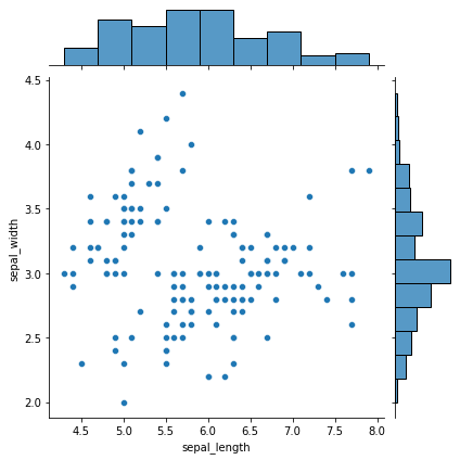
Parcelas marginales
Los gráficos marginales se utilizan para evaluar la relación entre dos variables y examinar sus distribuciones. Tales diagramas de dispersión que tienen histogramas, diagramas de caja o diagramas de puntos en los márgenes de los ejes xey respectivos
#Reading the dataset
iris_dataframe = sns.load_dataset('íris')
#Creating marginal graphs
sns.jointplot(x=iris_dataframe["sepal_length"], y=iris_dataframe["sepal_width"], kind='scatter')
# Show the plot
plt.show()
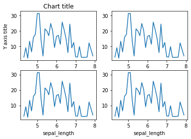
Subparcelas
Las subtramas son visualizaciones poderosas que facilitan las comparaciones entre tramas
#Creating the dataset
df = sns.load_dataset("íris")
df=df.groupby('sepal_length')['sepal_width'].soma().to_frame().reset_index()
#Creating the subplot
fig, axes = plt.subplots(nrows=2, ncols=2)
ax=df.plot('sepal_length', 'sepal_width',ax = axes[0,0])
ax.get_legend().retirar()
#Adding the aesthetics
ax.set_title('Chart title')
ax.set_xlabel('X axis title')
ax.set_ylabel('Y axis title')
ax=df.plot('sepal_length', 'sepal_width',ax = axes[0,1])
ax.get_legend().retirar()
ax=df.plot('sepal_length', 'sepal_width',ax = axes[1,0])
ax.get_legend().retirar()
ax=df.plot('sepal_length', 'sepal_width',ax = axes[1,1])
ax.get_legend().retirar()
#Show the plot
plt.show()
Em conclusão, existe una variedad de bibliotecas diferentes que se pueden aprovechar en todo su potencial al comprender el caso de uso y el requisito. Sintaxe e semântica variam de pacote para pacote e entender os desafios e benefícios de diferentes bibliotecas é essencial. ¡Feliz visualizando!
Cientista de dados e entusiasta de analytics
A mídia mostrada neste artigo não é propriedade da Analytics Vidhya e é usada a critério do autor.


