Introduction
I love the wide variety of charts Tableau offers. If we ever feel confused about which graphic to design, Tableau offers a lot of built-in options to help us.
All common charts are one click away in Tableau:
- Bar graph
- Stacked bar charts
- Map visualizations
- Pie charts (No other chart divides opinion like a pie chart!!)
- Line charts
- Scatter plot
And many others. But here is the question: What if the chart you want is not readily available? What if the visualization is not integrated into Tableau? That's the question we'll tackle today when designing a donut chart in Tableau from scratch..

If you're new to Tableau and want more information, be sure to check the FOR FREE ‘Tableau for beginners‘ course. You will learn about the different functionalities of Tableau and also how to design different types of charts in Tableau. It's the perfect starting point.
Now, before we start Tableau and see how to design a donut chart, let's quickly understand WHY we need it in the first place. It is one of the most useful charts you will use in a business environment, but you must know when to use it.
What is a donut chart?
You may be wondering what the purpose of a donut chart is.. Sounds like a fancy name, but do you have any real world use cases? Or does it just sound like a delicious delicacy?
This is the good news: it's SUPER useful if you know how and when to use it. It is, in a way, a variation on the much debated pie chart, but with additional benefits.
Here's a look at what we'll do in this tutorial:

I love this definition and comparison of DataVizCatalogue:
Pie charts are sometimes criticized for focusing readers on the proportional areas of the cuts to each other and to the chart as a whole. This makes it difficult to see the differences between sectors, especially when trying to compare multiple pie charts together.
A donut chart somewhat solves this problem by downplaying the use of area. However, readers focus more on reading the length of the arches, instead of comparing the proportions between the cuts.
You can also use the hole in the middle of the donut chart to display additional information, as the total sales figures.
Create a donut chart in Tableau
Then, Ready to start Tableau and create your own donut chart?
We will use the popular Superstore dataset here. You will find it in the Tableau repository in your 'My Documents' folder. Tableau downloads it when you install the tool (both desktop and public).
Our goal is to create a donut chart showing sales by category for Superstore. What's more, we also want to show total sales on this donut chart.
Let's start!
Paso 1: set the foundation in Tableau
In your field of ranks, write this:
average (0)
Later, with this, write again:
average (0)
Note: That's the number 0 and not the alphabet.
This is what you should get:

Paso 2: work with the first function
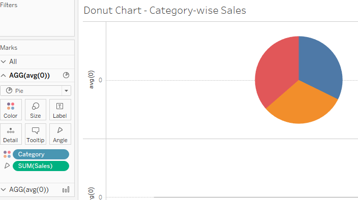
You will notice that there are a couple of new additions under the 'Brands' card’ on the left called ‘AGG (avg (0))’. These are the two empty placeholders we created in the first step. Here, click on the first instance.
- Select the pie chart from the drop-down menu
- Drag and drop the dimension ‘Category’ on the Colors card
- Drag and drop the dimension ‘Sales’ to your Angle card
This is what you must have (can increase card size Marks):
Let's take some aesthetic steps to improve our visualization:
- Drag and drop Sales and Category onto the Tags card
- Right click on Sales (below labels option) -> Quick table calculation -> Percentage of total
The idea is to show the total share of each category in the total value of sales:

Can you see our donut chart taking shape??
Paso 3: work with the second function
Click on the second option 'AGG (avg (0))’ under the Marks card. Let's start with the second part of our donut chart:
- Select the pie chart from the drop-down menu
- Click on the Color card and select white. This will be the hole in our ring chart
- Drag and drop the Sales measure to the Tags card
Paso 4: Putting it all together! Our Donut Chart in Tableau
Let's put everything under the same umbrella. This is where we will combine our two charts with Tableau's dual-axis charting feature..
- Right click on the second instance of 'AGG (avg (0))’ in the Rows field
- Click on 'Dual axis’
- Increase the size of the pie chart and circle on your Marks card
And voila! Here's your donut chart in Tableau:

Let's make some quick cosmetic changes to make our graphic visually appealing:
- Drag and drop all your labels onto the donut chart (just click on each tag and drag it)
- In your second option 'AGG (avg (O))’ under the Marks card on your left, right click on the Sales measure in the labels and select 'Format’
- In the 'Default' option, click on the Numbers drop-down menu and select 'Currency (personalized)’
- In the option 'Prefix / Suffix', replace the default sign with $ (or you can keep the default currency if you want)
This is what your final donut chart should look like in Tableau:
Final notes
Don't you love how easy we can create a custom chart in Tableau?? It only takes a few clicks to assemble a powerful visualization without the need for programming. It's aesthetically pleasing and makes sense from a business perspective: It is beneficial for all!
How would you customize this chart? And what other charts would you like to see in Tableau? I look forward to hearing from you in the comment section below..