
Introduction
Recently, I was reading a video of the SciPy conference 2015, “Building Python Data Applications with Blaze and Bokeh“, Recently held in Austin, Texas, EE. UU. I couldn't stop thinking about the power these two libraries bring to data scientists using Python around the world.. In this article, I will introduce you to the world of possibilities in data visualization using Bokeh and why I think this is a library that all data scientists should learn / to use.
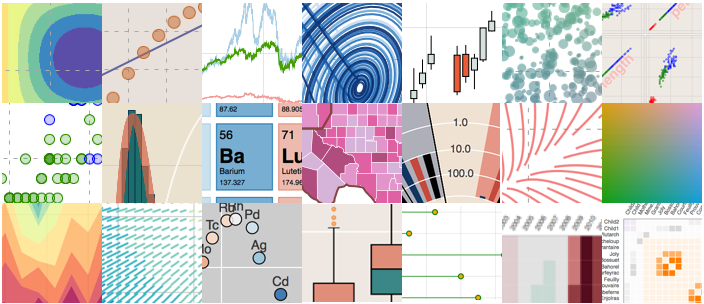 Source: bokeh.pydata.org
What is Bokeh?
Bokeh is a Python library for interactive visualization that targets web browsers for rendering. This is the main difference between Bokeh and other display libraries. Look at the snapshot below, which explains the process flow of how Bokeh helps present data to a web browser.
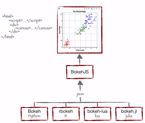 Source: Continuum Analytics
As you can see, Bokeh has multiple language links (Python, R, lua and Julia). Estos enlaces producen un archivo JSONJSON, o JavaScript Object Notation, It is a lightweight data exchange format that is easy for humans to read and write, and easy for machines to analyze and generate. It is commonly used in web applications to send and receive information between a server and a client. Its structure is based on key-value pairs, making it versatile and widely adopted in software development.., which works as input for BokehJS (a javascript library), which in turn presents data to modern web browsers.
Bokeh can produce an elegant and interactive display like D3.js with high performance interactivity on very large or streaming data sets. Bokeh can help anyone who wants to quickly and easily create graphics, interactive data dashboards and apps.
What does Bokeh offer to a data scientist like me?
I started my data science journey as a BI professional and then worked my way through predictive modeling, data science and machine learning. I have relied mainly on tools such as QlikView and Tableau for data visualization and SAS and Python for predictive analytics and data science.. I had almost zero experience using JavaScript.
Then, for all my data or idea products, I had to outsource the work or present my ideas via wire-frames, which are not ideal for building rapid prototypes. Now, Bokeh con, can i keep working in python ecosystem, but still I can create these prototypes quickly.
Bokeh benefits:
- Bokeh allows you to create complex statistical graphs quickly and using simple commands
- Bokeh provides you output in various media like html, notebook and server
- We can also embed Bokeh display in flask and django app
- Bokeh can transform display written in other libraries like matplotlib, seaborn, ggplot
- Bokeh has flexibility to apply interaction, layouts and different display style options.
Challenges with Bokeh:
- As with any upcoming open source library, Bokeh is undergoing great development. Therefore, the code you write today may not be fully reusable in the future.
- Has relatively fewer display options, compared to D3.js. Therefore, unlikely to challenge D3.js for his crown in the near future.
Given the benefits and challenges, today it is ideal to develop prototypes quickly. But nevertheless, if you want to create something for production environment, D3.js might be your best choice.
To install Bokeh, follow the instructions given here.
Visualization with Bokeh
Bokeh offers powerful and flexible features that impart simplicity and highly advanced customization. Provide multiple display interfaces to the user as shown below: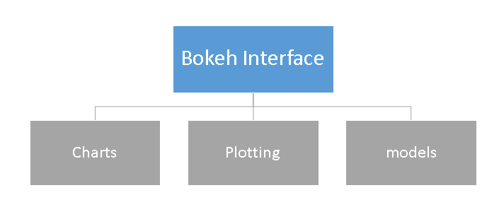
- Graphics: a high level interface used to build complex statistical graphs so fast and in a simplistic way.
- Graphed: a intermediate level interface that focuses on visual glyph composition.
- Models: a low level interface that provides maximum flexibility to application developers.
In this article, we will see only the graphics and the layout of the first two interfaces. We will discuss the models and other advanced features of this library in the next post..
Graphics
As mentioned earlier, is a high-level interface used to present information in the form of a standard display. These forms include box plot, bar graphicThe bar chart is a visual representation of data that uses rectangular bars to show comparisons between different categories. Each bar represents a value and its length is proportional to it. This type of chart is useful for visualizing and analyzing trends, facilitating the interpretation of quantitative information. It is widely used in various disciplines, such as statistics, Marketing and research, due to its simplicity and effectiveness...., area diagram, heat mapa "heat map" is a graphical representation that uses colors to show the density of data in a specific area. Commonly used in data analytics, Marketing and behavioral studies, This type of visualization allows you to identify patterns and trends quickly. Through chromatic variations, Heat maps make it easier to interpret large volumes of information, helping to make informed decisions...., donut diagram and many others. You can generate these charts by simply passing data frames, matrices and dictionaries.
Let's look at the common methodology for creating a chart:
- Import the library and functions / methods
- Prepare the data
- Set the output mode (portable, web browser or server)
- Create graphic with style option (if required)
- View the graph
To better understand these steps, let me demonstrate these steps using the example below:
Graphics example 1: create a bar chart and view it in web browser using Bokeh
We will follow the steps listed above to create a chart:
#Import library
from bokeh.charts import Bar, output_file, show #use output_notebook to visualize it in notebook
# prepare data (dummy data)
data = {"Y": [1, 2, 3, 4, 5]}
# Output to Line.HTML
output_file("lines.html", title="line plot example") #put output_notebook() for notebook
# create a new line chat with a title and axis labels
p = Bar(data, title="Line Chart Example", xlabel="x", ylabel="values", width=400, height=400)
# show the results
show(p)
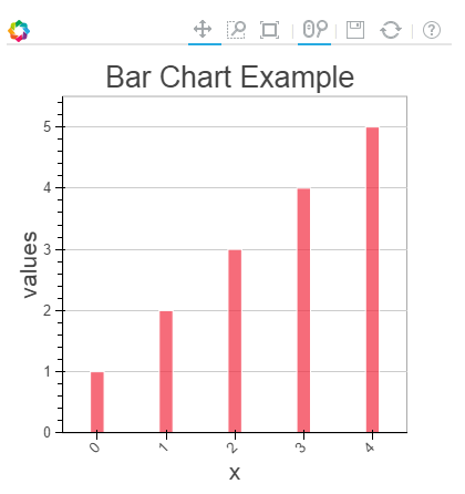
In the graph above, you can see the tools at the top (zoom, resizing, reboot, zoom de rueda) and these tools allow you to interact with the chart. You can also see the multiple chart options (legend, xlabel, ylabel, xgrid, width, high and many others) and various examples of graphics here.
Chart example 2: Compare the distribution of sepal length and petal length from the IRIS data set using the box plot in the notebook
To create this visualization, first, i will import iris dataset using sklearn library. Later, follow the steps described above to display the graph in the ipython notebook.
#IRIS Data Set
from sklearn.datasets import load_iris
import pandas as pd
iris = load_iris()
df=pd.DataFrame(iris.data)
df.columns=['petal_width','petal_length','sepal_width','sepal_length']
#Import library
from bokeh.charts import BoxPlot, output_notebook, show
data=df[['petal_length','sepal_length']]
# Output to Notebook
output_notebook()
# create a new line chat with a title and axis labels
p = BoxPlot(data, width=400, height=400)
# show the results
show(p)
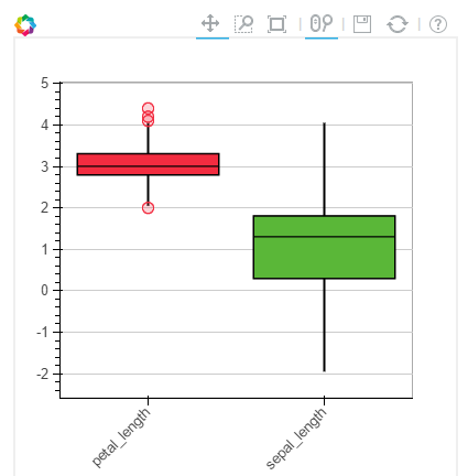
Chart example 3: create a line chart on the bokeh server
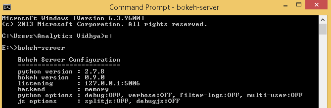
Before plotting the visualization on the Bokeh server, must run it.
If you are using a conda package, you can use run command bokeh server from any directory using the command. The rest, python ./bokeh-server The command should work in general. For more details on this, check this link “Bokeh server implementation“.
There are multiple benefits of plotting display on the Bokeh server:
- Parcels can be published for a wider audience
- Visualize a large dataset interactively
- Data transmission to update graphics automatically
- Dashboard and app creation
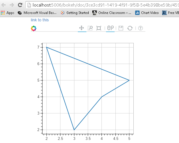
To start plotting on the Bokeh server, I have run the command bokeh server to initialize it followed by the commands used for display.
from bokeh.plotting import figure, output_server, show
output_server("line")
p = figure(plot_width=400, plot_height=400)
# add a line renderer
p.line([5, 2, 3, 4, 5], [5, 7, 2, 4, 5], line_width=2)
show(p)
Graphed
Trace is a intermediate level interface that focuses on visual glyph composition. Here, create a visualization by combining several visual elements (point, circles, line, patch and many others) Y instruments (scroll tool, zoom, save, reset and others).
Bokeh graphics created with the bokeh.plotting The interface comes with a default set of tools and visual styles. To trace, follow the steps below:
- Import library, methods or functions
- Select output mode (portable, Web navigator, server)
- Activar una figure"Figure" is a term that is used in various contexts, From art to anatomy. In the artistic field, refers to the representation of human or animal forms in sculptures and paintings. In anatomy, designates the shape and structure of the body. What's more, in mathematics, "figure" it is related to geometric shapes. Its versatility makes it a fundamental concept in multiple disciplines.... (similar a matplotlib)
- Perform subsequent plotting operations, will affect the generated figure.
- Visualize it
To better understand these steps, let me demonstrate these steps using the examples below:
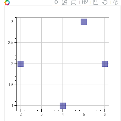
Example graph-1: Create a scatter square mark on the XY frame of the notebook
from bokeh.plotting import figure, output_notebook, show

# output to notebook
output_notebook()
p = figure(plot_width=400, plot_height=400)
# add square with a size, color, and alpha
p.square([2, 5, 6, 4], [2, 3, 2, 1, 2], size=20, color="navy")
# show the results
show(p)
In the same way, can create various other charts like line, wedges and bow, ovals, images, patches and many others, see this Link to see various examples.
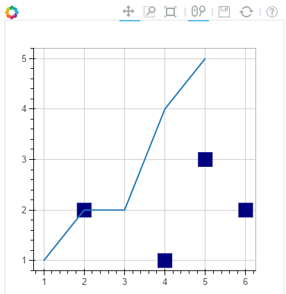
Plot Example-2: Combine two visuals in one chart
from bokeh.plotting import figure, output_notebook, show
# output to notebook
output_notebook()
p = figure(plot_width=400, plot_height=400)
# add square with a size, color, and alpha
p.square([2, 5, 6, 4], [2, 3, 2, 1, 2], size=20, color="navy")
p.line([1, 2, 3, 4, 5], [1, 2, 2, 4, 5], line_width=2) #added a line plot to existing figure
# show the results
show(p)
Plot Example-3: Add a float tool and axis labels to the above chart
from bokeh.plotting import figure, output_notebook, show
from bokeh.models import HoverTool, BoxSelectTool #For enabling tools
# output to notebook
output_notebook()
#Add tools
TOOLS = [BoxSelectTool(), HoverTool()]
p = figure(plot_width=400, plot_height=400, tools=TOOLS)
# add a square with a size, color, and alpha
p.square([2, 5, 6, 4], [2, 3, 2, 1, 2], size=20, color="navy", alpha=0.5)
#Visual Elements
p.xaxis.axis_label = "X-axis"
p.yaxis.axis_label = "Y-axis"
# show the results
show(p)

For more details on visual attributes and tools, check these links:
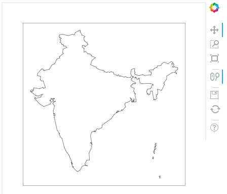
Example graph-4: India map chart using latitude and longitude data for boundaries
Note: I have latitude longitude polygon data for Indian boundaries in csv format. I will use it to trace.
Here, we'll go with patching, let's see the commands below:
#Import libraries
import pandas as pd
from bokeh.plotting import figure, show, output_notebook
#Import Latitude and lanogitude co-ordinates
India=pd.read_csv('E':/India.csv')
of India['ID']
India.index=['IN0','IN1','IN2','IN3','IN4','IN5']
#Convert string values to float as co-ordinates in dataframe are string
for j in range(0,len(India)):
 a = India['lats'][j]
 India['lats'][j] = [float(i) for i in a[1:len(a)-1].split(",")]
for j in range(0,len(India)):
 a = India['lons'][j]
 India['lons'][j] = [float(i) for i in a[1:len(a)-1].split(",")]
# Output option
output_notebook()
# Create your plot
p = figure(plot_height=400, plot_width=400, toolbar_location="right",x_axis_type=None, y_axis_type=None)
p.patches(xs=India['lons'], ys=India['lats'], fill_color="white",line_color="black", line_width=0.5)
#Visualize your chart
show(p)
Final notes
In this article, we analyze the creation of visualizations using Bokeh and methods to present them in notebooks, html y bokeh-server. We also discussed the methods for creating a custom visualization using plotting, here you can combine multiple visuals to represent information.
In my next post on Bokeh, I will discuss about more interactive display models and features. For instance, I have coordinated borders for each country around the world. Now, I want to create a visualization to represent the map of each country in a cycle (loop). Start drawing with a country map and wait 3 seconds and iterates for all countries. Sounds interesting! It is not like this?
Did you find this article useful? Let us know your thoughts on this article in the comment section below..





