Overview
- Excel charts are a powerful way to display your analysis profile
- Here are three ambitious Excel charts that every analyst should be familiar with
Introduction
I love creating out-of-the-box visualizations. Most analytics professionals can create a bar chart or a line chart, But the ability to take your visualization skill one level further is where analysts start to excel.. And let me be honest: a well-crafted visualization will take you far into the analytics space.
Being a good storyteller is key here. Then, the question is: How do we use the immense flexibility and depth of Microsoft Excel charts to tell our story in a powerful and effective way??
There is a wide variety of graphics that we can select, but we need to understand which visualization suits our use case. These charts should strengthen our analysis profile, our most diverse portfolio and must also tell a coherent story. The problem is that there is no one size chart.
Then, in this post, we will discuss 3 advanced Excel charts that will make you a professional in the field of analytics and visualization. Y, anyway, we will use Excel, which is still the most widely used analysis tool, to make these graphics.
This is the second post in my Excel charts series. I highly recommend reading the above post to become a more efficient analyst:
I encourage you to check out the resources below if you are a beginner to Excel and Business Analytics:
Table of Contents
- Excel table n. ° 1 – Cascading graphics
- Excel table n. ° 2: funnel charts
- Excel chart n. ° 3 – Pareto graphics
Excel table n. ° 1 – Cascading graphics
One of the most advanced charts in Excel, Waterfall Chart gets its name thanks to the similarity of its structure to waterfalls. This powerful graph provides a visual snapshot of positive and negative changes in value over a period of time.
In a waterfall chart, start and end values are represented by columns. The columns representing the positive and negative impacts are represented by floating columns in the respective colors. Here is an example of a waterfall chart that we will be making:
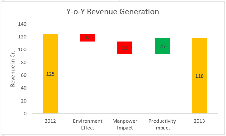
These are widely used in all industries, specifically in the financial industry.
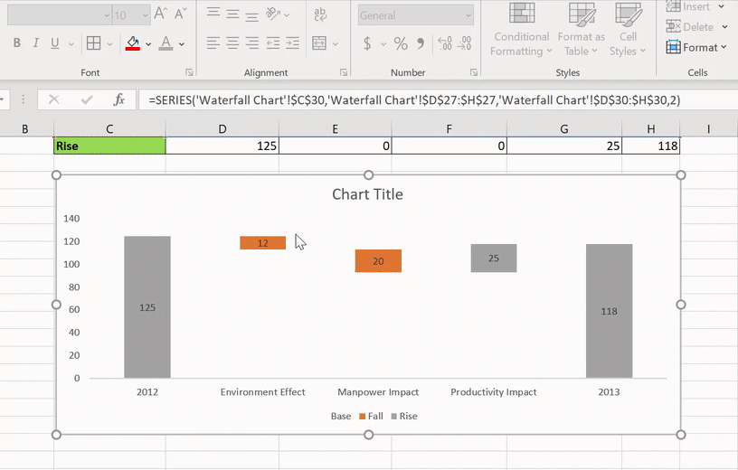
Let's take an example and create a waterfall chart from scratch in Excel. We have year-on-year revenue generation data (YoY) of a company along with some of the factors that influence: environmental effect, labor impact, productivity impact. We will follow the steps below to make a waterfall chart. Also you can follow the video for better understanding:
Note: This video is part of the DataPeaker Beginner to Advanced Excel course. You can consult the complete course here.

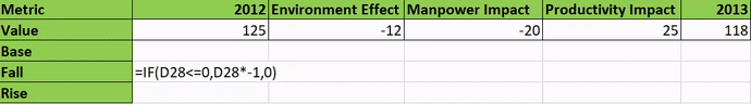
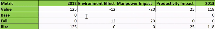
Paso 1: add Base columns, Fall y Rise
To make a waterfall chart, we need to make some changes to the data table. We are going to distribute the value column in 3 columns – autumn, base, Y upload. Let's see what it is for and how to add these columns.
- Autumn – This column will only mean the values that are falling over time (negative values). For this, we will use this formula:
- Upload – This column will only mean the values that increase over time (positive values). To do this, we will use this formula:
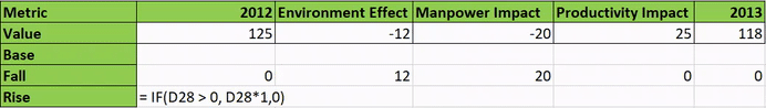
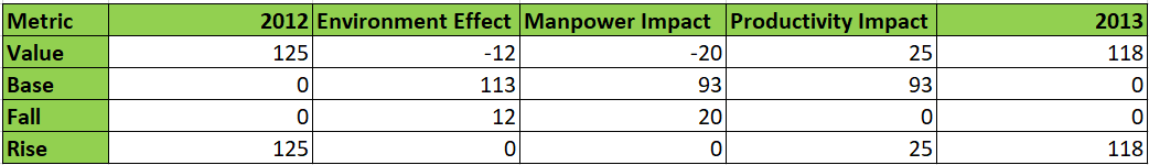
- Base – The base column represents the starting point of the rise and fall column. We calculate this column using:
- Add 0 to the columns of 2012 Y 2013
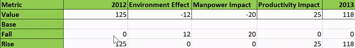
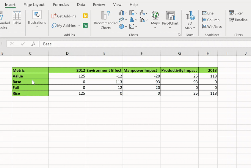
Now, our data table looks like this:
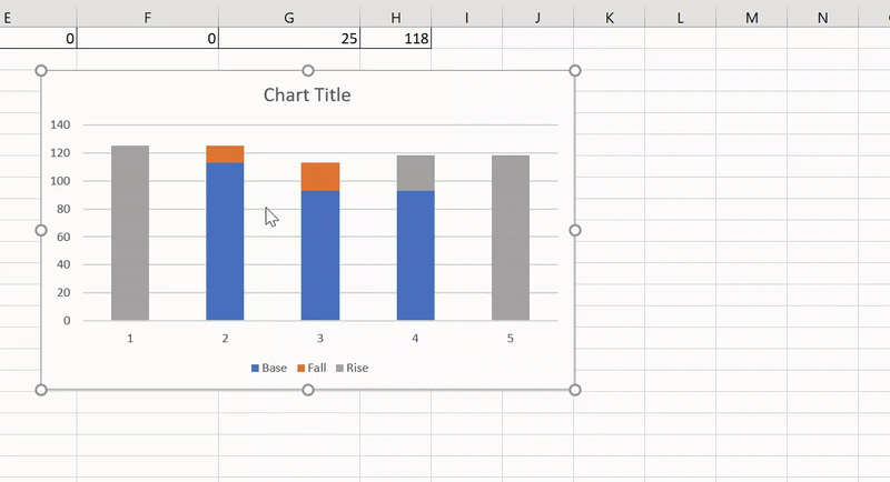
Paso 2: make a group chart
The waterfall chart is essentially a clustered bar chart with a bit of customization. So let's add one here. We will only use the rows – Metrics, Base, Drop, Rise.
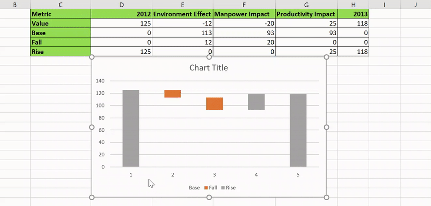
Paso 4: make changes to the base column
The base column means the starting point of the rising and falling column. In simple words, this column helps us to lift the fall and rise columns to the desired height. Now we will choose “Unfilled” for this:
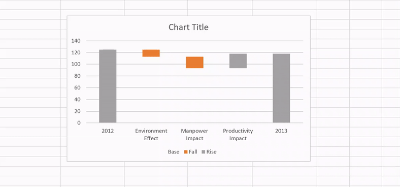
Paso 5: add horizontal axis labels
Labels on the horizontal axis do not provide intuitive understanding. So let's go ahead and change them:
Paso 6 – Proper formatting
Now, we have achieved a skeletal figure of the waterfall chart using the above steps. We just need to perform a few additional maneuvers.
All we will do is format a little:
- Add data labels
- Clear grid lines
- Clear unwanted data labels
- Add the desired color for the Raise and Lower columns. We have chosen red to indicate falling revenue and green to indicate revenue growth.
After a few more formatting changes, our waterfall chart looks like this:
Congratulations on building your first waterfall chart!! You can think of different scenarios to use this powerful graphic in your domain.
Excel table n. ° 2: funnel charts
Funnel charts are my favorite charting option for representing sales flow or marketing lead generation.. These charts are also one of the most used visualizations in the sales and marketing domain..
Funnel charts are used to visualize data decline from one stage to another.
Let's understand this better by taking an example.
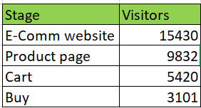
We have the stage flow data from an e-commerce company. The flow can be visualized like this:
Web portal> Product page> Trolley> Payment page
To understand the drop in traffic from one stage to another, we will plot a funnel chart by following the video or steps given below:
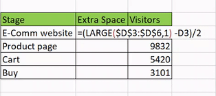
Paso 1: add a column for “Additional spaces”
If you look closely, funnel charts have an inverted pyramid structure. How can we make this structure using bar charts?
We need to provide an additional column to achieve this “extra space”. To do this, we can use this formula:
- = (GREAT ($ D $ 3: $ D $ 6,1) -D3) / 2
The LARGE function () takes a range of values and returns the k-th highest value. In this circumstance, k = 1. We will understand why we apply this formula in the next step.
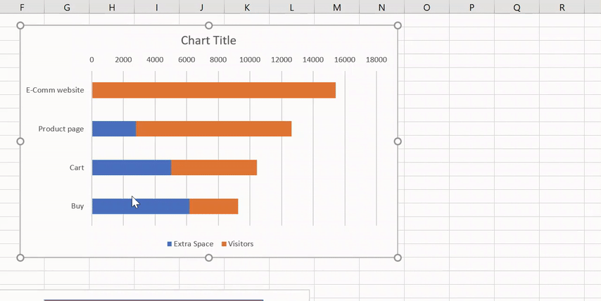
Paso 2: add a stacked chart
A funnel chart is simply a bar chart or a stacked chart with added formats. So let's add the bar chart in Excel:
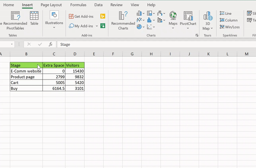
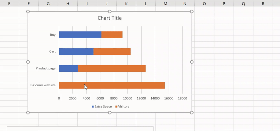
Here, the blue columns are the “Extra space“.
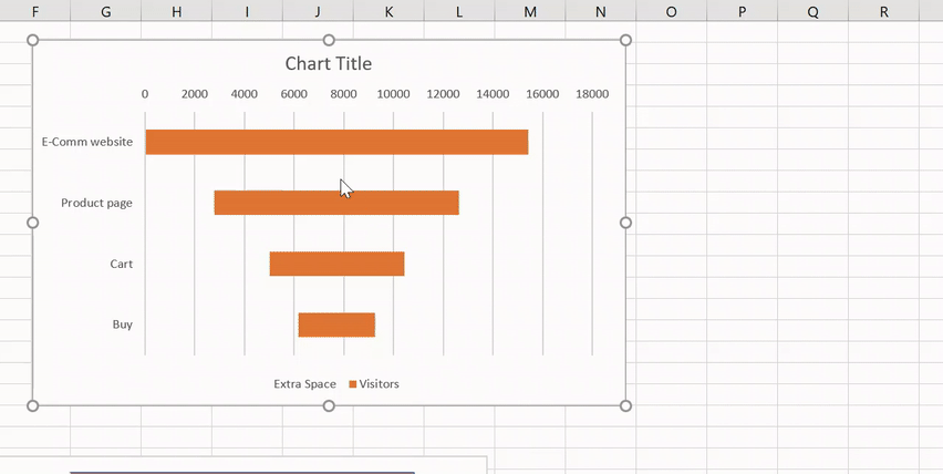
Did you understand why we added the Extra Space column? It's because we needed the space to make it look like a pyramid. But there is still an anomaly: Not an inverted pyramid! So let's do it that way:
Paso 3: “Do not fill” the extra spaces column
There is no actual relevance of the calculated Extra Spaces column. Therefore we will go ahead and “Do not fill”:
Paso 4: proper formatting
We have the skeletal structure ready for the funnel chart. Let's do a bit of formatting and make it easy on the eyes:
- Reduce the width of the gap by 0%
- Add data labels
- Clear grid lines
- Clear unwanted data labels
- Clear chart title
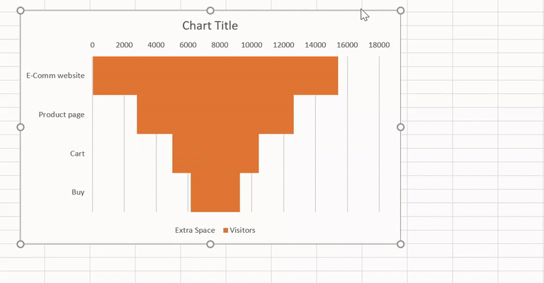
Excellent! Now you can go ahead and create a sales funnel on your own!!
Excel chart n. ° 3 – Pareto graphics
Pareto charts are specifically interesting for anyone in analysis or statistics. Many institutions rely on Pareto charts to make data-informed decisions.
According to the Pareto rule, or the rule 80/20, about the 80% of the output results or effects are obtained with the 20% of the input or causes.
In simple words, about the 80% of the company's income is due to 20% of their products, while the other 80% of the products contributes only the 20% of the incomes. Confused? Do not worry, we will understand it better with an example.
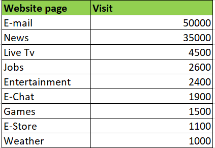
There is a main web portal that has several different subdomain services within the web portal, as news, Employment website, email services, etc. The company has spent a lot of resources on each of these subdomains, but now they want to reduce their costs due to recurring losses. A Pareto chart can help aid in the decision-making process. Let's see how to make one in Excel!!
You can follow the video or check the steps below:
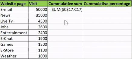
Paso 1: add columns for cumulative percentage
We need to calculate the cumulative percentage of visits to the web portal. To do it, we will add columns: cumulative sum and cumulative percentage. Let's see how:
To add the cumulative sum, just enter the formula – “= SUM ($ C $ 17: C17)”
To add the cumulative percentage, enter the formula: “= D17 / $ D $ 25”
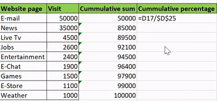
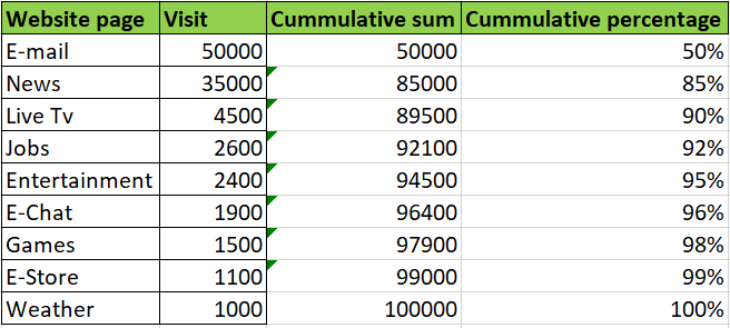
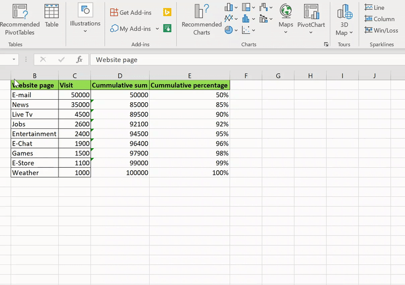
To end, our data looks like this:
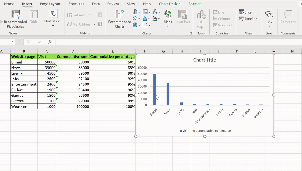
Paso 2: add a cluster chart
Let's add our bar chart. We will not select the cumulative sum column, since it is used for calculation purposes only.
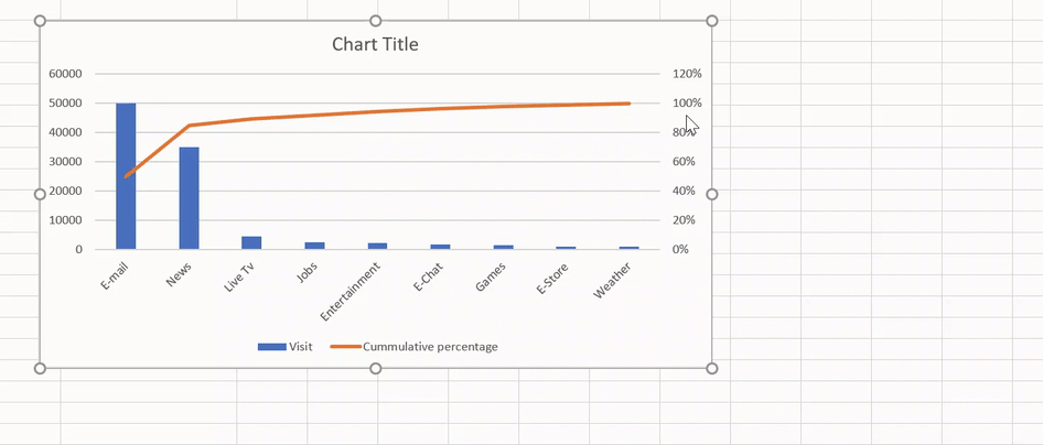
Paso 3: change chart type for cumulative percentage
In the graph above, we have a grouped bar chart consisting of Visit and accumulated percentage. The latter is not visible due to the difference in the value scale.
We need a line chart for the cumulative percentage, so we will change its chart type:
Paso 4: scaling and formatting
The Pareto chart is ready, but we need to make it more understandable and aesthetically pleasing, so we will do some scaling and formatting.
We will change the scale of the secondary axis of the 120% al 100% and also its units:
To finish we made our Pareto chart and it looks like this:
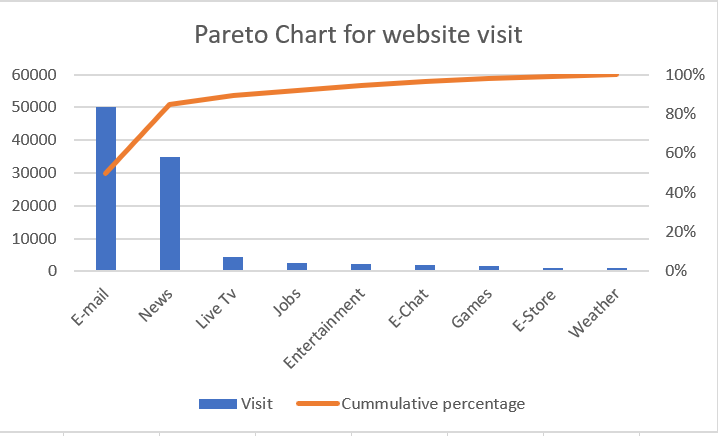
Looking at the Pareto chart, we notice that the 80% of visits to the web portal come from the email and news subdomains. Other subdomains only make up the 20% of the visits!
Final notes
In this post, we cover three beautiful excel charts of different types to help you become an efficient analyst and a better storyteller. Hope these graphics help you create amazing visualizations and save you a lot of time. and impress your boss. 🙂
Let me know your favorite Excel Charts that you think make a great visualization.


