This article was published as part of the Data Science Blogathon
Introduction
We often come across some situations where it is better to display the data on a map for better understanding. The data we deal with in our daily lives is generally limited to rows and columns, bar graphs, pie charts and histograms.
But, today, with more data collection resources and more computational power, Businesses may also use location data and maps to meet their data and analytics needs.

Importance of location-based maps and data
Maps and location data make it easy to see hidden data and patterns, that previously might have been unrecognizable in spreadsheets / Excel.
For instance, a dataset contains food delivery locations in a city, together with the costs of the orders, the ordered items and other parameters. These dates, when viewed on a map, will help identify factors such as distance, the proximity, the groups, etc.
Location-based data plotted on maps gives you the option of displaying much more information and with easier visibility.
What is geospatial analysis?
Geospatial analysis is a technique for creating and analyzing map-based visualizations from GPS data, sensors, mobile devices, satellite images and other sources. Visuals can be maps, cartograms, graphics, etc.
Recognizable maps make it easy to understand and operate. Location-based events are easily understood by geospatial analysis. Aspects of location often dictate various trends.
For instance, a residential area in a city that has more expensive property is likely to have higher income earners and they will spend larger amounts of money.
Applications and uses of geospatial analysis
There are several uses of geospatial analysis.
They can be used to map natural resources or track weather events such as rain, snow or humidity, air pressure, etc. With the location of the past meteorological phenomenon, trends can be analyzed and understood / predict future instances.
Also for telecommunications data, we can use geospatial analysis and understand the strength of the connection, the extension of the subscribers and other parameters. Network strengths fluctuate over time and using maps to visualize data is the most efficient way.
We can also use maps to plot various business data, the sales of a store by the points of sale, for instance, all Mc Donalds in a city or region can plot their sales on the map. This will help analyze the most profitable locations and make better decisions..
Town planning and town planning can also be assisted by map-based analysis techniques. The growing population in cities has often increased the needs for electricity and water, and demand and supply in large cities continue to vary.
City councils and municipal corporations do have the necessary data in many cases, but not a good way to visualize and analyze the data. If you have the demand for electricity by region in a city, drawn on a map, you can determine which regions need an urgent update and more offer. All aspects of urban planning can be easily accomplished with proper geospatial analysis.
Introduction to the folio
Folium is a Python library that can be used to visualize geospatial data. Folium's simple commands make it the best choice for graphing on maps. Folium has several sets of built-in Mapbox tiles, OpenStreetMap and Stamen and also supports custom tile sets.
Folium installation:
pip install folium
Now, after installing Folium, we started.
import numpy as np
import pandas as pd
We import NumPy and pandas.
# Create a map
kol = folium.Map(location=[22.57, 88.36], tiles="openstreetmap", zoom_start=12)
col
We create a basic map of Kolkata in Python.
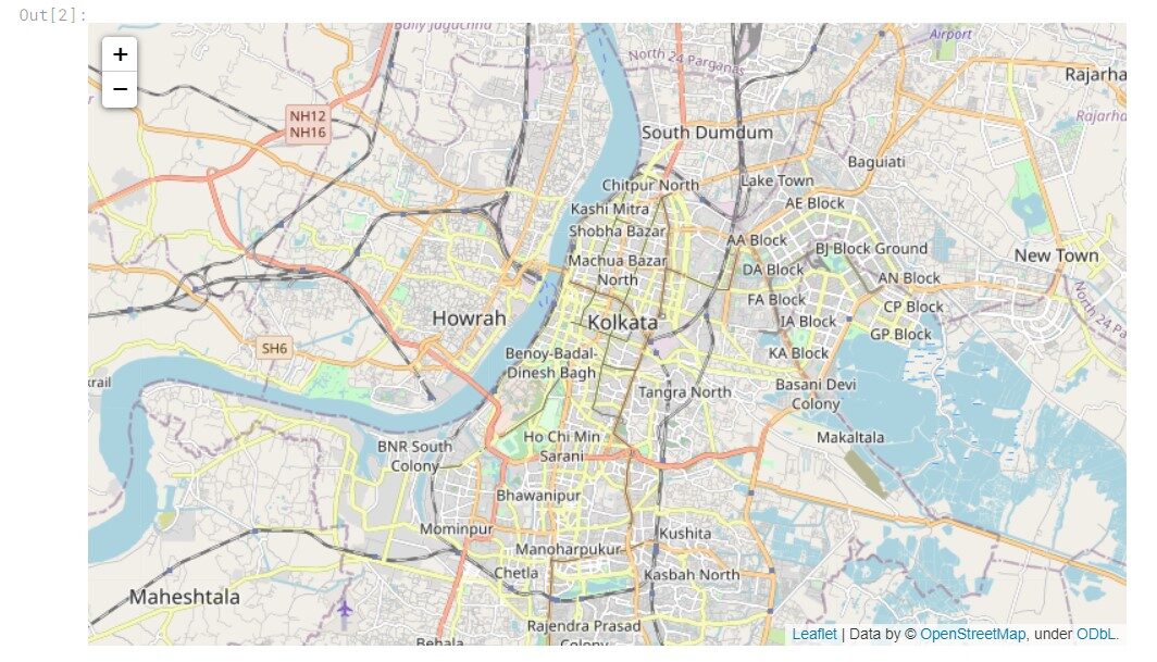
Can be zoomed in and out and moved, I will share Kaggle's live notebook link at the end of the article. Now let's draw some interesting places. Here's a leaf, plotting locations if you know the map coordinates is very easy.
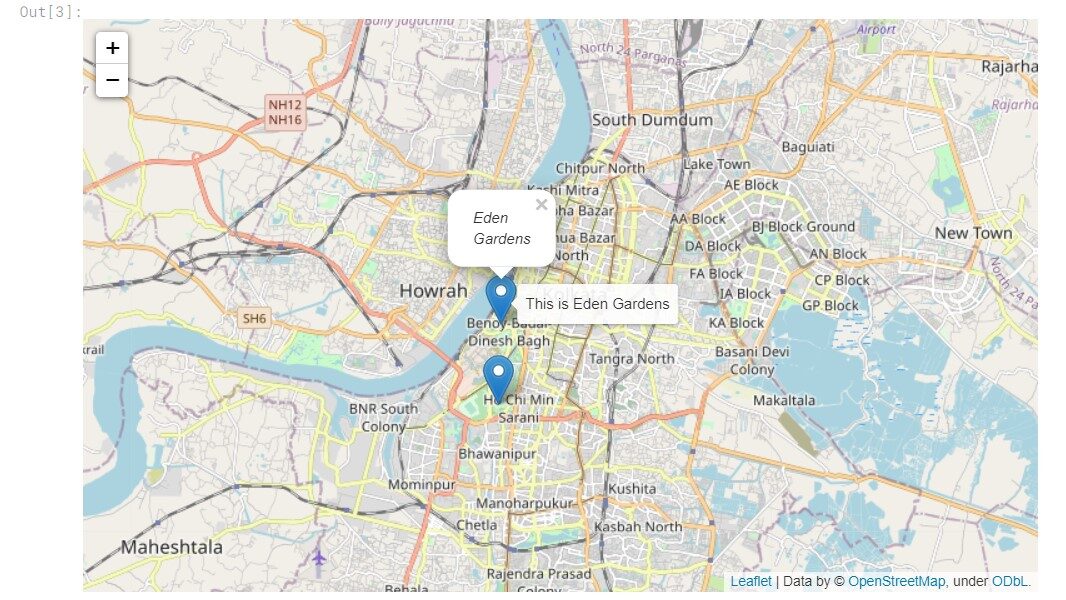
#add marker for a place

#victoria memorial
tooltip_1 = "This is Victoria Memorial"
tooltip_2 ="This is Eden Gardens"

folium.Marker(
    [22.54472, 88.34273], popup="Victoria Memorial", tooltip=tooltip_1).add_to(col)

folium.Marker(
    [22.56487826917627, 88.34336378854425], popup="Eden Gardens", tooltip=tooltip_2).add_to(col)

col
Let's take a look at the plot.
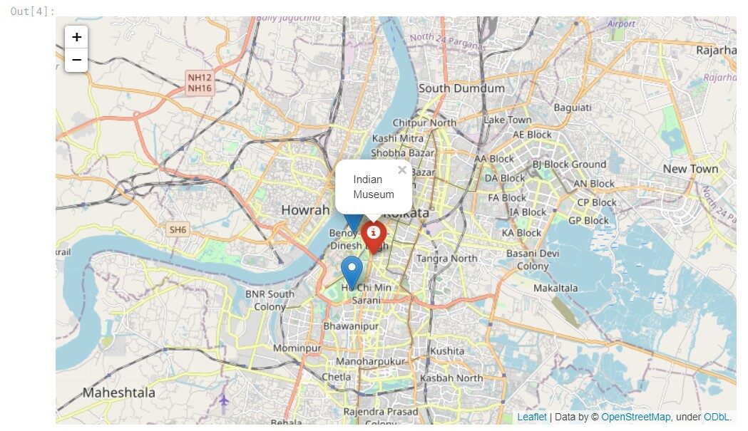
Now, let's add a different type of marker to our map.
folium.Marker(
    location=[22.55790780507432, 88.35087264462007],
    popup="Indian Museum",
    icon=folium.Icon(color="red", icon="info-sign"),
).add_to(col)

col
Here are the results of the above code. To know the types of markers, you can consult the documentation.
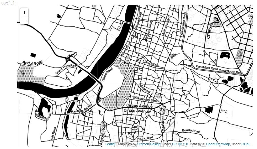
Let's now look at a different kind of map, Stamen Toner.
kol2 = folium.Map(location=[22.55790780507432, 88.35087264462007], tiles="Stamen Toner", zoom_start=13)
kol2
Now, let's see the output generated.
Adding markers to the map is used to label and identify something. With labeling, any particular point of interest can be marked on the map.
Now let's add circles to our map.
#adding circle

folium.Circle(
    location=[22.585728381244373, 88.41462932675563],
    radius=1500,
    popup="Salt Lake",
    color="blue",
    fill=True,
).add_to(kol2)

folium.Circle(
    location=[22.56602918189088, 88.36508424354102],
    radius=2000,
    popup="Old Kolkata",
    color="red",
    fill=True,
).add_to(kol2)


kol2
Let's take a look at the output.
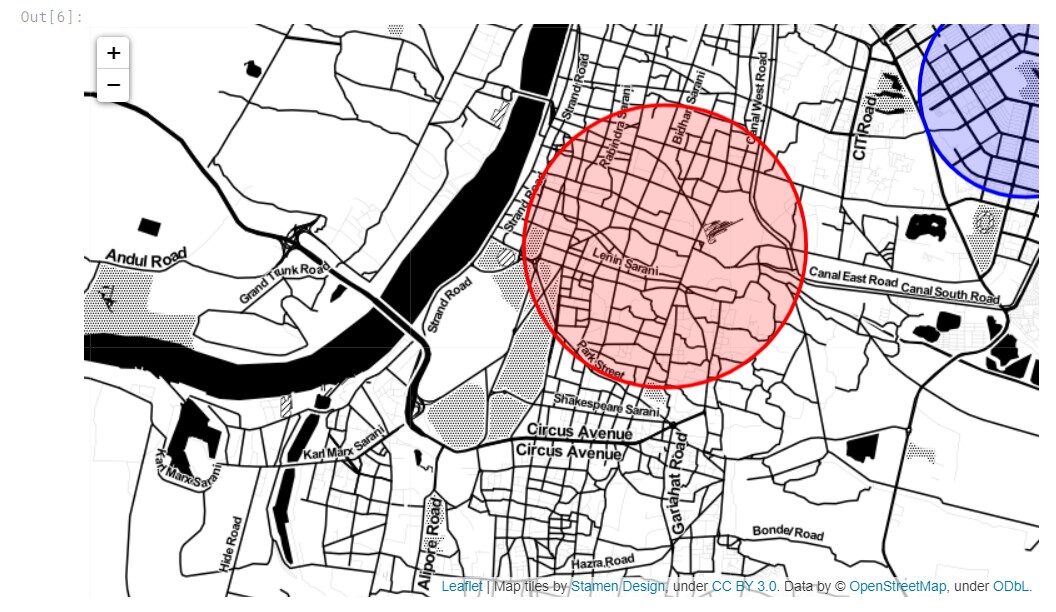
The map can be moved and interacted. Use of circles can be used for zoning and zone marking purposes in the case of real life data.
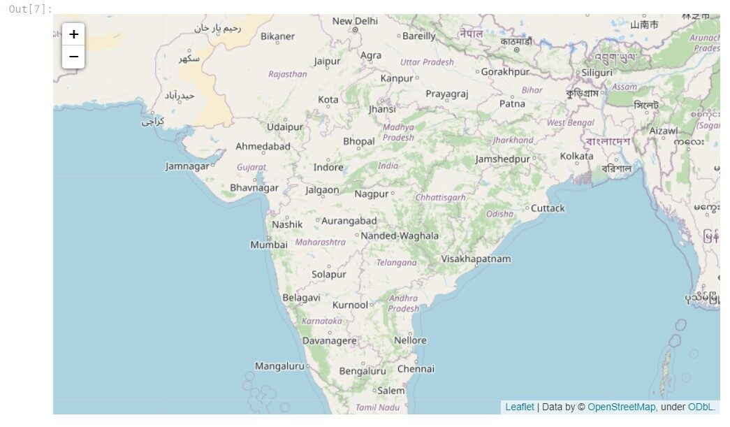
Let's work now on the map of India.
# Create a map
india = folium.Map(location=[20.180862078886562, 78.77642751195584], tiles="openstreetmap", zoom_start=5)
india
To, choose any specific place on the map, we can change the coordinates and edit the zoom_start parameter.
#adding 3 locations, Mumbai, Delhi and Kolkata
loc= [(19.035698150834815, 72.84981409864244),(28.61271068361265, 77.22359851696532) ,
      (22.564213404457185, 88.35872006950966)]
We will take three cities in India and draw a line between them.
folium.PolyLine(locations = loc,
                line_opacity = 0.5).add_to(india)

india
Let's take a look at the output.
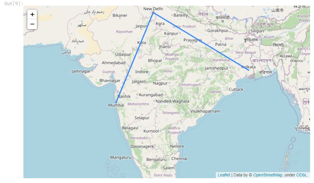
Thus, we can plot some basic data based on coordinates.
Now, let's work with a Kaggle dataset, having the population centers of the states of India according to the census data of 2011. Let's move on.
df_state=pd.read_csv("/kaggle/input/indian-census-data-with-geospatial-indexing/state wise centroids_2011.csv")
df_state.head()
The data looks like this:
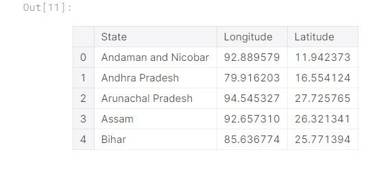
The data has 35 tickets, now let's graph the data.
#creating a new map for India, for all states population centres to be plotted
# Create a map
india2 = folium.Map(location=[20.180862078886562, 78.77642751195584], tiles="openstreetmap", zoom_start=4.5)
#adding the markers

for i in range (0,35):
    state=df_state["State"][i]
    lat=df_state["Latitude"][i]
    long=df_state["Longitude"][i]
    folium.Marker(
    [years, long], popup=state, tooltip=state).add_to(india2)
india2
Now, let's take a look at the plot.
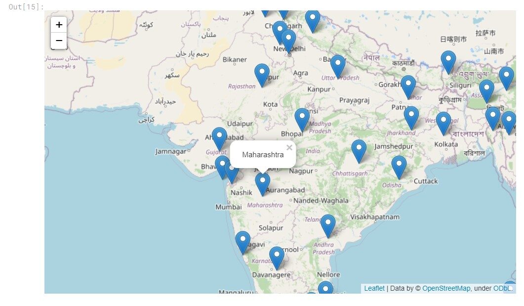
The plot is generated and the location of each of the markers is the population center of the respective state / OUT.
Conclution
When using maps, we can understand and analyze data more easily and efficiently. Con Leaf, we get an easy way to plot points on the map and make sense of our data.
About me
Hello there, soy Prateek Majumder, I'm a data science and analytics enthusiast. You can connect with me at:
Complete exercise code in Kaggle
Thanks.
The media shown in this article is not the property of DataPeaker and is used at the author's discretion.


