
This article was published as part of the Data Science Blogathon.
“Visualization is the human being's vehicle towards the future: good, bad or indifferent. It is strictly under our control “. Earl Nightingale
We are all aware of the power of visualization in our lives.. You may be wondering why a motivational blog is published on DataPeaker. Do not worry, this is not a motivational or spiritual blog, but a blog that discusses the power of visualization in data analysis. We'll also go through the basic Power BI operations to help you set up our data visualization journey..
Data visualization

Data visualization is the graphical representation of data. We use tables, charts and maps to view and understand trends, outliers and patterns.
We all know the importance of data analysis, “if it can't be measured, can't be improved”. To properly analyze the collection and management of data it becomes essential. In the world of Industry 4.0, Business Intelligence tools are essential to analyze massive amounts of information to make data-driven decisions.
A picture is worth a thousand words.
We live in the world of reels and shorts. Nobody wants to read long paragraphs or watch long videos. This does not make the videos or detailed reports out of date. At the time of detailed analysis, are required, but the real power of visualization is in saying a lot in less.
Today we are generating tons and tons of data in real time, Thus, if we don't have an automated system that cleans, preprocess and also present data in an easy way, our life would be in trouble. Data visualization is important throughout the race. This tool is not limited to data scientists.
Excels are out of date
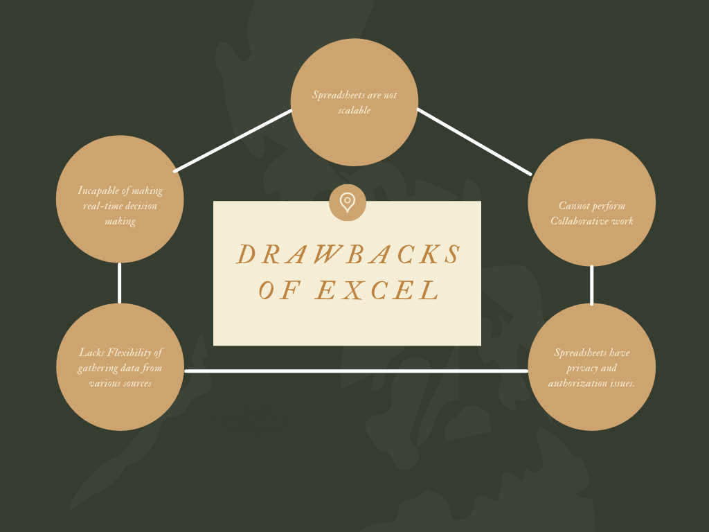
You may be thinking that we already have a powerful tool like Excel that is irreplaceable and has the ability to perform all those tasks.. But there are some drawbacks to using Excel for data visualization.
Can't collaborate with Excel. We have all faced this problem where we cannot edit an Excel file if it is open on another desktop. Only one person at a time can edit, which takes a lot of time.
Excel sheets are not scalable with current technology. Many IoT devices and mobile devices generate tons of data. Excel is unable to process such data streams.
Sharing Excel sheets has privacy and authorization issues. You can't consolidate data in one place and share it safely.
Excel sheets are unable to support real-time decision making due to outdated and inaccurate data.
Excel sheets lack flexibility, as they are unable to accumulate data from different sources and format the data according to personal preferences.
This does not mean that people stop using Excel. Excel is a great tool and is like a grandfather to all newcomer BI software.
Business intelligence software
Business intelligence software is used to visualize, process and analyze large amounts of data to generate business information and reports. Business Intelligence tools facilitate and simplify decision making. You will find solutions for all the gaps we found in Excel.
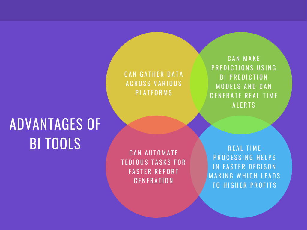
Advantages of BI tools:
Gather all relevant data: in any industry, we collect data from various sources such as spreadsheets, ERP, CRM, records, API, etc. BI tools work as data connectors and help us centralize data for visualization.
We can use forecast engines / Prediction models available in BI tools for predictive analytics. We can also create smart data alerts to detect anomalies that will allow us to react immediately.
Manual tasks are greatly reduced. We can automate common reporting tasks. There are drag and drop options available through which you don't have to learn coding and syntax.
BI tools offer real-time process monitoring that enables planning, faster analysis and report processing. This has led to a reduction in business costs and an increase in profits..
Today in the market you will find many BI software available in the market. Some of the most popular are PowerBI, Painting, QlikView, ZOHO Analytics.
POWER BI
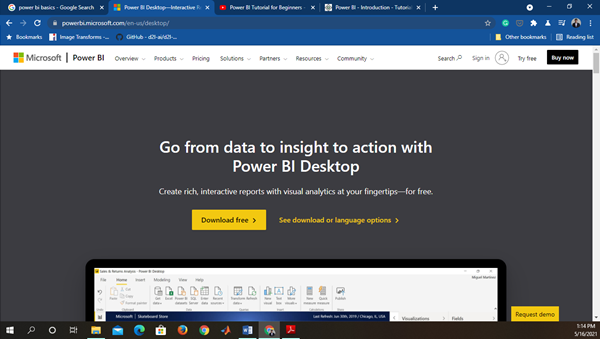
Microsoft Power BI is a business intelligence tool that brings data from different data sources to create interactive dashboards and reports. You can download Power BI from the internet and install it with your wizard.
Power BI provides three versions for different utilities.
Power BI Desktop: provides data connectivity with various software, connectors and services. You can download its latest version depending on the type and version of your operating system.
Power BI services (software as a service – SaaSSoftware as a Service (SaaS) is a software distribution model that allows users to access applications over the Internet. Instead of installing and maintaining programs on your devices, Users can use cloud-hosted solutions, making collaboration easier and reducing costs. This approach has become popular in various industries, offering flexibility and scalability to businesses of all sizes....) are used to publish the reports. We can edit the dashboard directly on a web server using SaaS. PBi Services is also important to establish access rights and permissions.
Power BI mobile app: it is used to view the report and the panelA panel is a group of experts that meets to discuss and analyze a specific topic. These forums are common at conferences, seminars and public debates, where participants share their knowledge and perspectives. Panels can address a variety of areas, from science to politics, and its objective is to encourage the exchange of ideas and critical reflection among the attendees..... The Mobile View Editor is in Power BI Desktop, so we can customize mobile panels differently than web panel.
Installation and first steps with PowerBI
Find the appropriate version of Power BI software from the link provided: https://powerbi.microsoft.com/en-us/desktop/ . After downloading and installing, you will see this screen when you start.
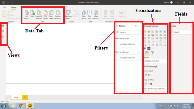
Let's briefly understand some important buttons and columns in desktop software.
First, PBi has three points of view:
1. Report view – In report view, we create our control panel. This is responsible for the front view of our Control Panel.
2. Data viewThe "Data view" It is an essential tool in the analysis of information, that allows you to visualize and structure data in a clear and concise way. Makes it easy to identify patterns, Trends and relationships within large volumes of information. Its implementation on various platforms helps users make informed decisions, optimizing processes and promoting a deeper understanding of the available data....– In Data View, we play with data. We create additional rows and columns using Query, Measure or Columns to organize our data.
3. Model view– In Model View, we describe a relationship of several available tables. We can create one-to-one relationships, one to many and many to many.
You can switch between different views from the buttons available on the left side of the bar.
Then, we will import data sets to create dashboards. On the Data tab, select Get data à More. In this, you will find numerous ways through which we can obtain our data.
Display
In the Display column, you will find many different types of visual graphics, boards, trees, slicers and cards. Select any visual, drag table column into Values, and "TADA" already has its graphic ready. Next to the value tab, you will find the format tab. All types of formatting as font size, color, bottom, etc. will be available in the format tab.
Fields
Right next to the display, you will find the columns Fields. Here you will find all the columns and measures once you load and transform the data.
We have analyzed all the main Power BI tabs. Now let me show you how to load the data and create images.
Go to Get Data -> Excel and select the dataset.
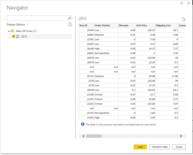
Click Transform Data to preprocess data. Clicking Power Query Editor, the window will open. All cleaning operations and Data FusionData fusion is a process that integrates information from various sources to obtain a unified and coherent whole. This technique is fundamental in areas such as artificial intelligence, Data mining and analytics, as it improves the accuracy and quality of analyses. By combining heterogeneous data, Patterns and trends can be discovered that, else, pasarían desapercibidos.... are carried out in the editor. Once you have done the data cleaning, click on “close and apply”.
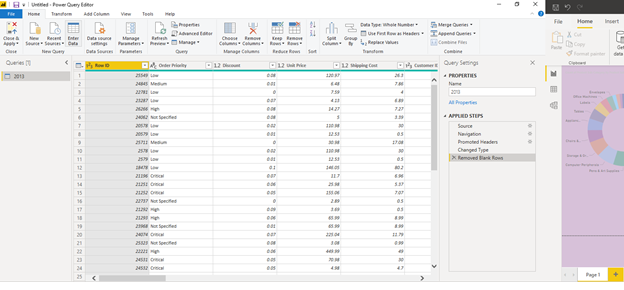
Clicking “Close and apply”, will return to the main window. Now we will create a column chart from our data.
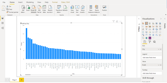
In our data set, we have two columns city and profit. We will create a column chart that describes the earnings versus the city. Please select “stacked column chart” on display. In Axis drag the column “Town” and in the values drag the column “Benefit” and your chart is ready.
Similarly, can create different visualizations and charts. You can also add multiple pages in Power BI. Design your entire dashboard and then publish it to the Power BI service. Once you have published your dashboard, you can see it from anywhere.
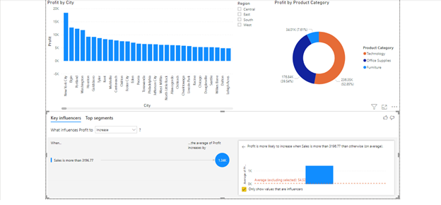
To sum up, we discuss the importance of visualization and how it can be easily done using BI tools. With the newest visualization tools on the market, report generation and analysis have become faster and easier. Decision making has gotten faster, which leads to higher profits. Finally, we discussed how to start data visualization in Power BI. Power BI is a powerful BI tool, popular and easy to use from Microsoft. I hope this blog helps you start your data visualization journey..
I am an Industry enthusiast 4.0 who likes to learn and experiment in the domain of IoT, data science, machine learning and deep learningDeep learning, A subdiscipline of artificial intelligence, relies on artificial neural networks to analyze and process large volumes of data. This technique allows machines to learn patterns and perform complex tasks, such as speech recognition and computer vision. Its ability to continuously improve as more data is provided to it makes it a key tool in various industries, from health....
You can follow me on my Instagram: https://www.instagram.com/pandaspython/
The media shown in this article is not the property of DataPeaker and is used at the author's discretion.





