Curva AUC-ROC: The star artist!
You have created your machine learning model, then, Whats Next? You must evaluate it and validate how good (or bad) it is, to later decide whether to implement it. That's where the AUC-ROC curve comes in..
The name may be a mouthful, but it only says that we are calculating the “Area down the curve” (AUC) of the “Receiver characteristics operator” (ROC). Confused? I feel you! I've been in your shoes. But do not worry, We will see in detail what these terms mean and everything will be a piece of cake!!

For now, just know that the AUC-ROC curve helps us visualize how well our machine learning classifier is performing. Although it only works for binary classification problems, we will see towards the end how we can extend it to also evaluate multiple class classification problems.
We will also cover topics such as sensitivity and specificity., as these are key issues behind the AUC-ROC curve.
I suggest reading the article about Confusion matrix as it will introduce some important terms that we will use in this article.
Table of Contents
- What are sensitivity and specificity?
- Probability of predictions
- What is the AUC-ROC curve?
- How does the AUC-ROC curve work?
- AUC-ROC in Python
- AUC-ROC for Multiple Class Classification
What are sensitivity and specificity?
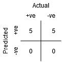
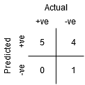
This is what a confusion matrix looks like:
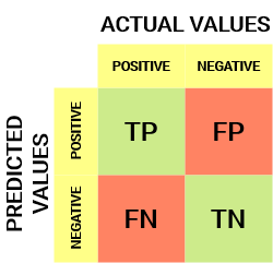
From the confusion matrix, we can derive some important metrics that were not discussed in the previous article. Let's talk about them here.
Sensitivity / True positives rate / Recovery
![]()
Sensitivity tells us what proportion of the positive class was classified correctly.
A simple example would be to determine what proportion of the actual sick people were correctly detected by the model.
False negative rate
![]()
The False Negative Rate (FNR) tells us what proportion of the positive class was incorrectly classified by the classifier.
A higher TPR and a lower FNR is desirable as we want to correctly classify the positive class.
Specificity / True Negative Rate
![]()
Specificity tells us what proportion of the negative class was classified correctly.
Taking the same example as in Sensitivity, Specificity would mean determining the proportion of healthy people who were correctly identified by the model.
False positive rate
![]()
FPR tells us what proportion of the negative class was incorrectly classified by the classifier.
A higher TNR and a lower FPR is desirable as we want to correctly classify the negative class.
Of these metrics, Sensitivity Y Specificity are perhaps the most important and we will see later how they are used to build an evaluation metric. But before that, let's understand why prediction probability is better than predicting target class directly.
Probability of predictions
A machine learning classification model can be used to predict the actual class of the data point directly or predict its probability of belonging to different classes. The latter gives us more control over the result. We can determine our own threshold to interpret the result of the classifier. This is sometimes wiser than just building a brand new model!!
Setting different thresholds to classify the positive class for the data points will inadvertently change the sensitivity and specificity of the model.. And one of these thresholds will probably give a better result than the others., depending on whether our goal is to reduce the number of false negatives or false positives.
Take a look at the following table:
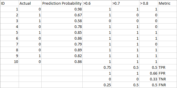
Metrics change with changing threshold values. We can generate different confusion matrices and compare the different metrics that we discussed in the previous section.. But that would not be wise. However, what we can do is generate a graph between some of these metrics so that we can easily visualize which threshold is giving us a better result.
The AUC-ROC curve solves that problem!!
What is the AUC-ROC curve?
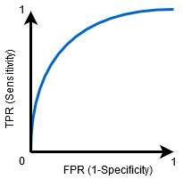
the Receiver operator characteristic (ROC) The curve is an evaluation metric for binary classification problems. It is a probability curve that draws the TPR against FPR at various threshold values and essentially separate the 'signal’ of 'noise’. the Area down the curve (AUC) is the measure of a classifier's ability to distinguish between classes and is used as a summary of the ROC curve.
The higher the AUC, the better the model will perform in distinguishing between positive and negative classes.
When AUC = 1, then the classifier can perfectly distinguish between all positive and negative class points correctly. But nevertheless, if the AUC had been 0, then the classifier would be predicting all negatives as positives and all positives as negatives.
When 0.5 <AUC <1, there is a high probability that the classifier can distinguish positive class values from negative class values. This is because the classifier can detect more numbers of true positives and true negatives than false negatives and false positives..
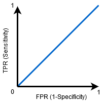
When AUC = 0.5, then the classifier cannot distinguish between positive and negative class points. Which means that the classifier predicts a random class or a constant class for all data points.
Therefore, the higher the AUC value of a classifier, the better your ability to distinguish between positive and negative classes.
How does the AUC-ROC curve work?
In a ROC curve, a higher X-axis value indicates a greater number of false positives than true negatives. While a higher value on the Y axis indicates a greater number of true positives than false negatives.. Therefore, the choice of threshold depends on the ability to balance between false positives and false negatives.
Let's dig a little deeper and understand what our ROC curve would look like for different threshold values and how specificity and sensitivity would vary..
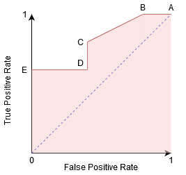
We can try to understand this graph by generating a confusion matrix for each point corresponding to a threshold and talk about the performance of our classifier:
Point A is where sensitivity is highest and specificity is lowest.. This means that all positive class points are classified correctly and all negative class points are incorrectly classified..
In fact, any point on the blue line corresponds to a situation where the true positive rate equals the false positive rate.
All points above this line correspond to the situation in which the proportion of correctly classified points belonging to the Positive class is greater than the proportion of incorrectly classified points belonging to the Negative class.
Although point B has the same sensitivity as point A, has a higher specificity. Which means that the number of incorrectly negative class points is less compared to the previous threshold. This indicates that this threshold is better than the previous one.
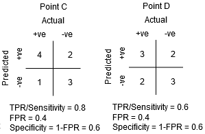
Between points C and D, sensitivity at point C is higher than at point D for the same specificity. This means that, for the same number of incorrectly classified negative class points, the classifier predicted a greater number of positive class points. Therefore, the threshold at point C is better than at point D.
Now, depending on how many incorrectly classified points we want to tolerate for our classifier, we would choose between point B or C to predict if you can beat me in PUBG or not.
“False hopes are more dangerous than fears”. – JRR Tolkein
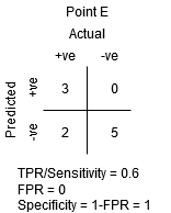
Point E is where the specificity becomes highest. Which means there are no false positives classified by the model. The model can correctly classify all negative class points! We would choose this point if our problem was to give perfect song recommendations to our users..
Following this logic, Can you guess where the point corresponding to a perfect classifier would be on the graph?
Yes! It would be in the upper left corner of the ROC graph corresponding to the coordinate (0, 1) in the Cartesian plane. This is where both Sensitivity and Specificity would be highest and the classifier would correctly classify all Positive and Negative class points..
Understand the AUC-ROC curve in Python
Now, we can manually test sensitivity and specificity for each threshold or let sklearn do the work for us. We are definitely going with the latest!
Let's create our arbitrary data using the sklearn make_classification method:
I will test the performance of two classifiers on this data set:
Sklearn has a very powerful roc_curve method () which calculates the ROC for your classifier in seconds. Returns the threshold values, TPR y FPR:
The AUC score can be calculated using the roc_auc_score method () de sklearn:
0.9761029411764707 0.9233769727403157
Try this code in the live encoding window below:
We can also plot the ROC curves for the two algorithms using matplotlib:
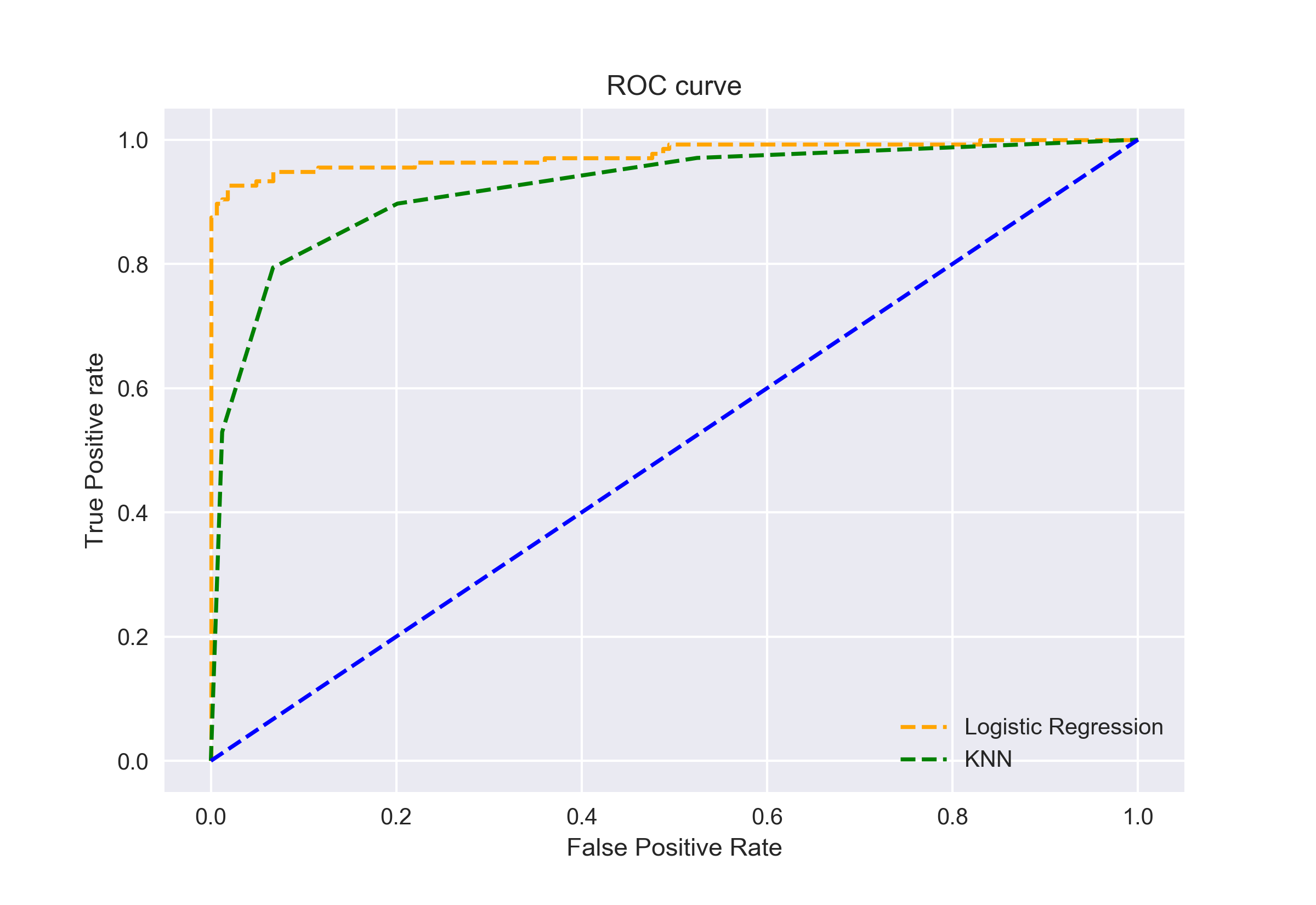
It is evident from the graph that the AUC of the logistic regression ROC curve is greater than that of the KNN ROC curve.. Therefore, we can say that the logistic regression did a better job of classifying the positive class in the data set.
AUC-ROC for Multiple Class Classification
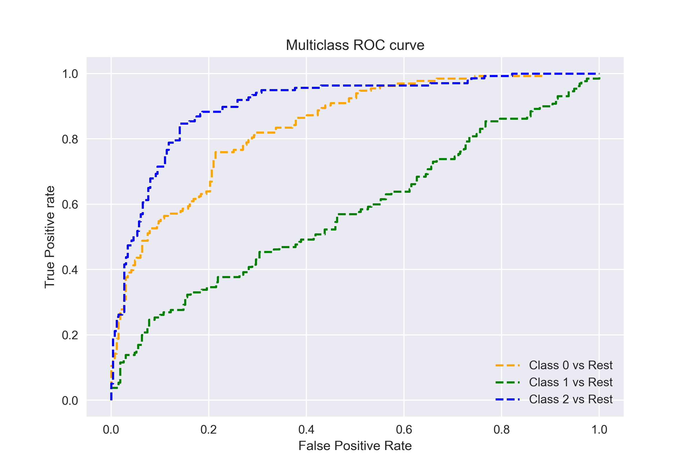
As I said before, the AUC-ROC curve is only for binary classification problems. But we can extend it to multiclass classification problems using the One Against All technique..
Then, if we have three classes 0, 1 Y 2, the ROC for the class 0 will be generated by classifying 0 against no 0, namely, 1 Y 2. The ROC for the class 1 will be generated by classifying 1 against no 1, and soon.
The ROC curve for multiple class classification models can be determined as follows:
Final notes
I hope this article has been helpful to you in understanding how powerful the AUC-ROC curve metric is for measuring the performance of a classifier. You will use it a lot in industry and even in data science or machine learning hackathons. Better get acquainted with it!
Going further, I would recommend the following courses that will be helpful in developing your data science acumen:


