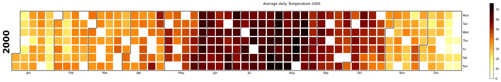
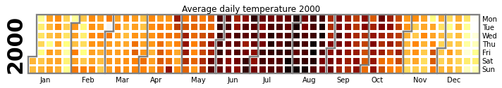
According to the heat map above, the month of June to August has a high temperature compared to other months due to the summer and the low temperature in the month of December, since it is the winter season. When using the heat map, can easily display extremely low and high temperatures. In the FEB period, note the white block because FEB has only 28 days.
The calplot application separates each month of the year and the days of the week and provides a clean image. we can customize the images as you need by adding the custom color or style to the heatmap.
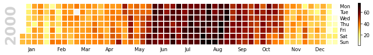
Here you can easily relate to the temperature with the added line border of the colormap gradient not enabled.
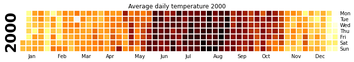
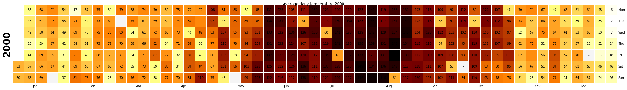
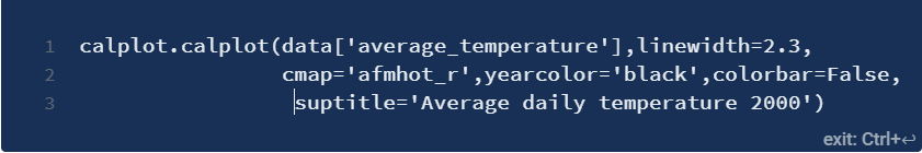
In the heatmap above, we included a title and made the year text color black.
We can also display the values inside the block and resize the image using the size of the figure for better visualization.. Here the missing values are filled with '-'. But nevertheless, we do not have any missing data in this dataset.
Viewing Missing Values on the Heat Map
The white block above indicates the missing value. when the corresponding values are shown in the square, each missing value is replaced with '-‘ as we discussed before.
and calplot, if the data contains the missing value, are filled in by default and some value is replaced with zero if it cannot fill in the missing value. If drop zero = False is not set, is filled with '-'.
we can make the border of the line that separates the month thicker using the line width.
Custom colormap in calplot
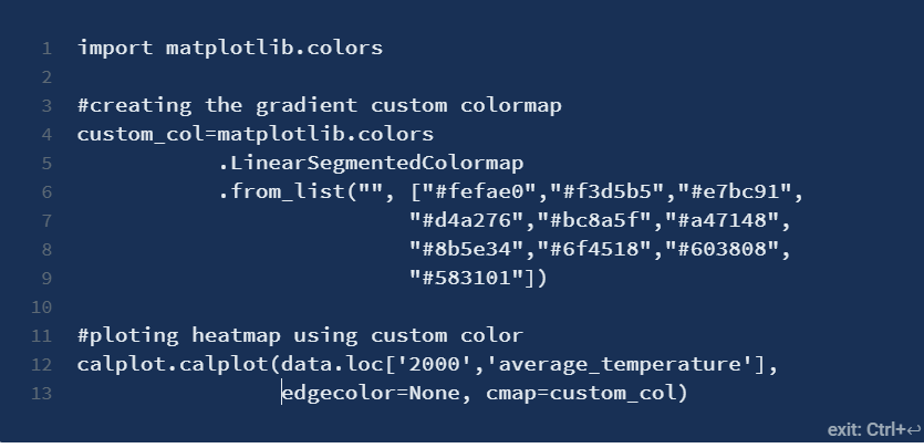
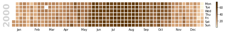
To make the custom color scale, make the hex color list and assign it to calplot. By giving the series of hexadecimal values, is arranged according to the gradient color. To invert the gradient, rearrange the list of hex values.
When to use a calendar map?
A calendar heatmap is useful for analyzing daily values or the day of the week. If we want to see the daily data for the whole year, calendar heat maps are helpful.
I hope you enjoyed reading about my work and my knowledge!! Any suggestion and feedback is always welcome.
About the Author
Soy Kavitha, a software developer and machine learning enthusiast fascinated by computing and artificial intelligence.
The media shown in this article is not the property of DataPeaker and is used at the author's discretion.


