Overview
- Pivot tables are a powerful Excel feature for quickly analyzing data and extracting business insights
- Here are five pivot table tips in Excel to make you an efficient analyst
Introduction
Suppose you have a huge data set with thousands of rows and multiple columns. You need to quickly analyze what you have in Excel and get some ideas before confronting your supervisor or shareholder.. Sounds familiar? It is a situation that I have been in many times as an analyst.
There is a powerful feature of Excel that always works: dynamic tables.

I am at a stage where I instinctively think of pivot tables in Excel when I receive large data sets. It's such a wonderfully flexible and deep tool, there is simply no comparison. Pivot tables have helped me summarize massive amounts of data into simple and powerful reports. These tables reveal a lot about the data by turning any column-based data into reports.
Las tablas dinámicas son el sistema nervioso de la analyticsAnalytics refers to the process of collecting, Measure and analyze data to gain valuable insights that facilitate decision-making. In various fields, like business, Health and sport, Analytics Can Identify Patterns and Trends, Optimize processes and improve results. The use of advanced tools and statistical techniques is essential to transform data into applicable and strategic knowledge.... in excel.
Here, I will share some of the most useful pivot table tricks that I have used in my career. These will help you analyze your data at an even more granular level with the click of a few buttons..
This is the third article in my series of tricks, Excel tips and tricks. I highly recommend reading the previous articles to become a more efficient analyst.:
I encourage you to check out the resources below if you are a beginner to Excel and Business Analytics:
Table of Contents
- Truco n. ° 1 from dynamic tablePivotTable is a powerful tool in spreadsheet programs, such as Microsoft Excel and Google Sheets. Allows you to summarize, Analyze and visualize large volumes of data efficiently. Through its intuitive interface, users can rearrange information, apply filters and create custom reports, facilitating informed decision-making in various contexts, from the business field to academic research....: average values
- Truco n. ° 2 from the pivot table: percentage of total rows
- Pivot table n trick. ° 3: dynamic graphics
- Pivot table trick n. ° 4: add number format
- Truco n. ° 5 of the pivoting table: pivoting table slicers
Truco n. ° 1 from the pivot table: average values
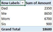
Pivot tables provide many calculation options to summarize your data. From the count of values to the variation of values, the options are endless. Excel provides the sum of values as the default calculation, so let's see how we can use other useful calculations.
Here we will see how to use the average of a set of values.
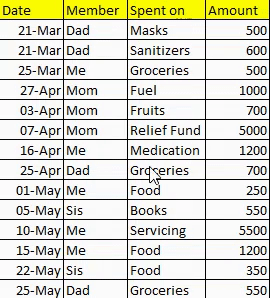
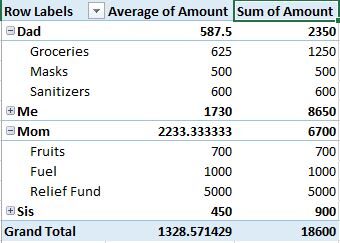
Let's consider an interesting problem statement that will help you in your daily life!! We have the daily expenses of a particular family. We need to calculate the average amount spent by each family member (does it sound familiar to you?).

You can check the video below or follow the steps below:
https://player.vimeo.com/external/463713844.sd.mp4?s=c3f22e21e10e67db24c8162274e81eab0903efd7&profile_id=165
Paso 1: select a table cell
Click on any cell present in the table:
Paso 2: locate the pivot table
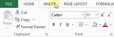
We will locate the pivot table in the Excel ribbon. Go to Insert -> Dynamic table:
Paso 3: create a pivot table
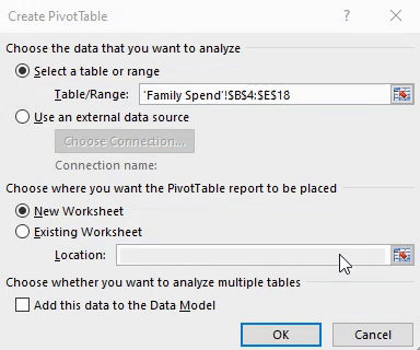
Finally, we create our pivot table. In the Create Pivot Table window, you will notice that the entire table range is selected automatically.
You also have the flexibility to form this pivot table on the existing sheet or on a new sheet. Here, we will form it on a new sheet:
Paso 4: select the fields from the pivot table
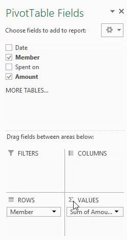
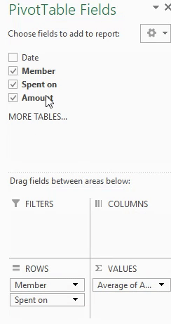
We do not require all columns to complete our analysis, so we will choose only the necessary fields. On the right side, a toolbar will appear: Pivot table fields. We will choose the required field, in our case, these are Member Y Amount:
Paso 5: drag fields between areas.
Since we are using only two fields in our analysis, Excel automatically detects the Member field as a row and the Amount field as a value, so no need to drag fields in this case.
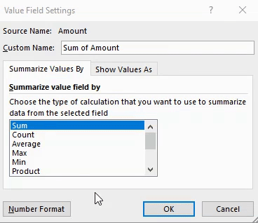
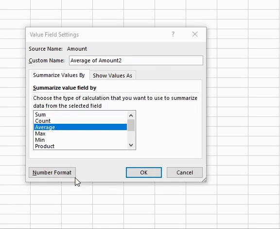
Paso 6: choose Average as the value field calculation
If you realize, Excel has taken the sum of the quantity as the default calculation, but we require the average of values in our analysis. So let's see how we can do this.
In the panelA panel is a group of experts that meets to discuss and analyze a specific topic. These forums are common at conferences, seminars and public debates, where participants share their knowledge and perspectives. Panels can address a variety of areas, from science to politics, and its objective is to encourage the exchange of ideas and critical reflection among the attendees.... Pivot table fields, click drop down menu – Sum of quantity. Go to Value Field Settings. Here you will find a lot of different calculations. Let's select Average:
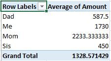
There you go! We can see the average spending of all family members. Congratulations on making your first pivot table!!
But do you wonder why mom spent the most of all family members? What if I want to check the reason for the extremely high spending?
Professional advice: double click on the cell item to see more information
To find out where mommy spent her money, just double click on the Mother cell. You will get options to choose the detail field. We will select the field – Spent on and press 'OK':

We can see that his biggest expense went to a donation for a relief fund. What a great cause!
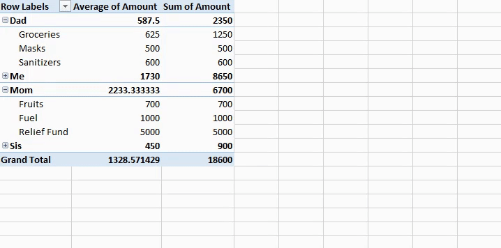
Up to now, we have only understood the average amount spent by each family member. But nevertheless, does not provide a clear image. U.S, as humans, we tend to understand much more intuitively in terms of percentages, so let's see how we can get that in excel.
Truco n. ° 2 from the pivot table: percentage of total rows
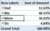
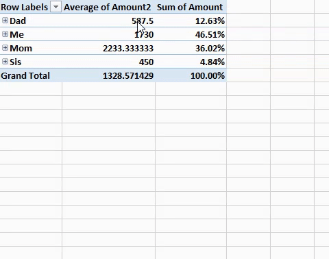
This simple hack can provide some really interesting information and is definitely my all-time favorite!! Let's look at the percentage distribution of the amount spent by individual family members.
You can check the video or follow the steps after the video:
Paso 1 – Re-add the amount field
To obtain the percentage distribution, we need to add the Amount field back to value field. We will do this by dragging the field to values zone:
Paso 2: show the value as
In the newly added column, select one of the cells and right click on it.
You will find an option of show value as. It has a lot of options that you can explore. We will choose “% of the total of the main row"For our analysis:
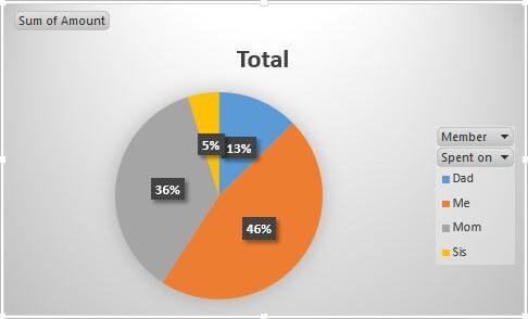
In this analysis, we realize that the member – Me, maybe the person who made the data, has actually spent the 46,5% of money. That's almost half of the entire family's spending!! To understand more about the underlying trend, you can double click and get more details.
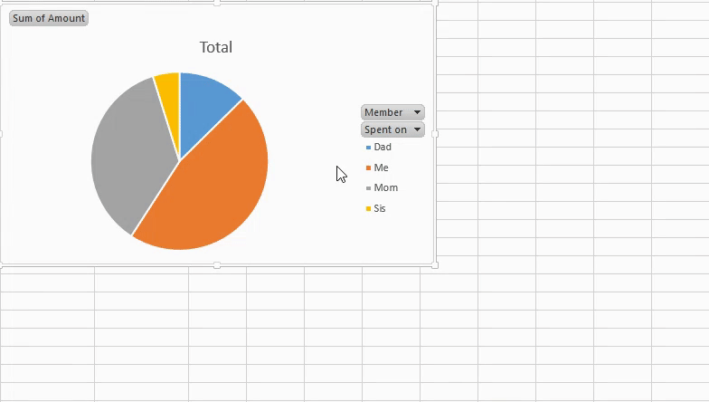
Pivot table n trick. ° 3: dynamic graphics
Now, here's a challenge: What if other family members demand the result of this analysis? We assume they are not as well versed in numbers as we are. What is a better way to present this analysis to a non-technical audience?
A visual representation that we can easily generate using dynamic graphics!!
Note: We are using the same pivot table and working on the same sheet as the pivot table.
Paso 1: choose columns for analysis
Since we require the percentage of the sum of the amount spent by each family member, we will eliminate the average amount field of analysis:
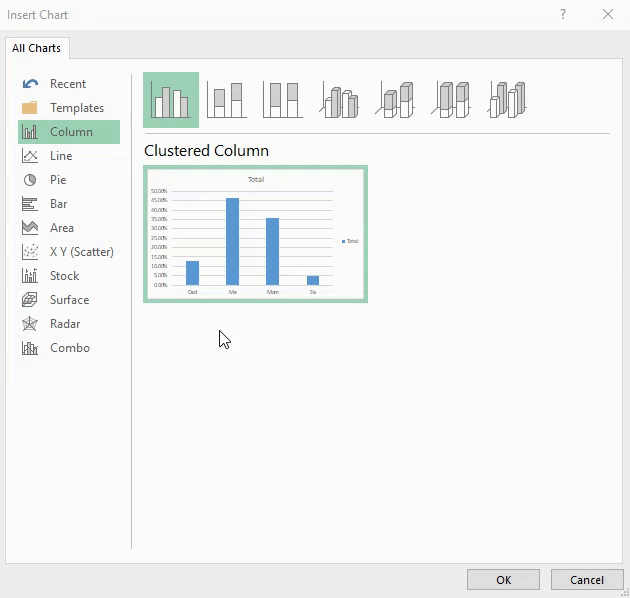
Paso 2: locate dynamic graphics
Go to Insert -> Dynamic graphics:
Paso 3: select a desirable plot
Excel has many plots to choose from. Iremos con un pie chartThe pie chart, Also known as pie chart, is a visual representation that shows the proportion of different parts to a whole. It is commonly used in statistics to illustrate the distribution of categorical data. Each section of the chart represents a percentage of the total, making it easier to compare between categories. Its clear and concise design makes it an effective tool for the presentation of quantitative information.... ya que es el más adecuado para nuestro análisis:
Paso 4: customize the design
You can customize your pie chart with one click and choose from a variety of beautiful options provided by Excel.
Now our analysis is summarized in the form of a dynamic chart which makes our analysis really easy to understand!!
Did you notice that something is missing from the analysis? Can you guess what that is? The quantity field is not really formatted and that can make it confusing. Let's learn how to add a number format in Excel with just a few clicks.
Pivot table trick n. ° 4: add number format
The number formats are very important and provide the identity to the numbers present in the pivot table. In the data we are using, the family belongs to an indian household, so the expense should be in rupees. Let's add this to our existing values!!
You can follow the steps or check this video:
Paso 1: locate value field setting
In the existing pivot table, click the cell you want to change the format for. Go to Value Field Settings:
Paso 2: change the number format
In the Value field settings, go to Number format.
On the right side, a list of categories will appear. We are going to go to Split and choose the Rupees symbol:
Impressive! Now our pivot table also contains the number format.
Truco n. ° 5 of the pivoting table: pivoting table slicers
The pivot table cutter provides a very simple way to filter our data in a fast and efficient way. All we have to do is press buttons!! It's that easy!
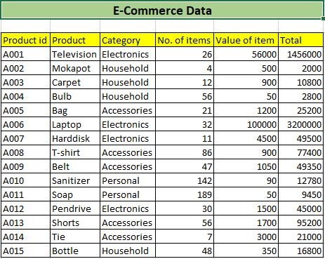
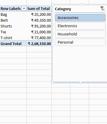
Let's take a problem statement where we are provided with data from an e-commerce company. This data contains different products and their respective sales information.. We want to see the sum of individual category sales. Let's see how to do it.
Follow this concise video or refer to the steps below:
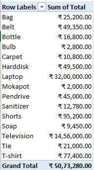
Follow the step 1 and the step 2 to make a pivot table with this data. Here we will choose the fields as Products (Line) and Total (Value).
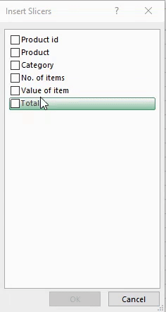
Paso 3: locate the insert slicer
On the top belt, go to Analyze -> Insert slicers:
Paso 4 – Slicer
Choose the field you want to use as a filter. How we require the total amount earned for each category, we will filter the data in the field: Category:
Now you have the category in the form of a button. Just press the button to filter the data!!
Professional advice: make your pivot table dynamic
Add your data in table form. As usual, the data is updated again and again and it is desirable that our pivot table is dynamic.
The solution to make your pivot table is to add data in table form and then just update to get the updated pivot table.
Final notes
In this article, we covered five tricks, PivotTable Tips and Tricks for Excel. Hope these tricks help you with day-to-day niche tasks and save you a lot of time as a business analyst or data science professional..
Do you have your own pivot table tricks to share?? Or any other Excel trick, in general, you would like the community to know? Share them in the comment section below!!


