
Overview
- Qlik is widely associated with powerful business intelligence dashboards and reports.
- Did you know that you can use the power of Qlik to perform predictive modeling and build models?
- Learn how to do just that with this really cool guide on how to build a linear regression model using Qlik Sense.
Introduction
“Can I use Qlik Sense to create a YES YES analysis build a simple linear regression model so that my business users can forecast future earnings based on target sales?”
An intriguing question! Qlik is widely associated with creating business intelligence dashboards and reports., not with predictive modeling. If you had the same thought, you're not alone!
Qlik is like a wind in the back for any business leader. Makes analyzing and presenting data to end users extremely easy and fast. Not surprisingly, Qlik is regularly named a Leader in Gartner's Magic Quadrant for Business Intelligence and Analytics Platforms..

What I really like about Qlik is that its associative model offers free-form data discovery. This helps our end user quickly find trends and outliers to gain valuable insights.. Qlik is well known for its associative model and for the incredible speed with which it reveals associations between fields within a data model..
With its paradigm shift of displaying all data, including outliers, our customers and stakeholders can quickly find information to make critical business decisions. Qlik applications span multiple industries such as:
- In health care, an insurance company may want to predict the future cost of patient care using costs, demographics and previous diagnoses.
- Product defects can be predicted using the efficiency of the process based on the previous defects and the precision of the equipment in the manufacturing sector.
- In human resources, we can predict the future cost of an employee's payroll based on their age and experience.
Think about the possibilities, They are infinite!
After reading this article, you can put on a data scientist's hat, since both QlikView and Qlik Sense offer a large number of statistical functions that you can take advantage of to build your first predictive model using linear regression. Let's start!
Table of Contents
- Introduction to simple linear regression
- Implementing linear regression in Qlik
- Comparison of our results with a model created with Python
Introduction to simple linear regression

Source: xkcd.com
Let's start with the concept of regression analysis. It is a form of predictive modeling that reveals the relationship between a variableIn statistics and mathematics, a "variable" is a symbol that represents a value that can change or vary. There are different types of variables, and qualitative, that describe non-numerical characteristics, and quantitative, representing numerical quantities. Variables are fundamental in experiments and studies, since they allow the analysis of relationships and patterns between different elements, facilitating the understanding of complex phenomena.... independent and a dependent. This is perhaps the most common technique that aspiring data science professionals learn first..
Regression is used to evaluate the contribution of one or more variables “causing” (independent variables) to a variable “caused” (dependent). We can also use it to predict the value of the dependent variable from the values of the independent variables. Some popular examples include predicting the price of a house, the salary of an employee, etc. (I'm sure your mind must be full of ideas!).
When there is only one independent variable and when the relationship can be expressed as a straight line, the procedure is called simple linear regression.
A straight line can be defined by the mathematical equation y = mx + b:
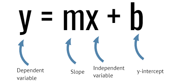
- y is a dependent variable and is represented on the vertical axis
- x is an independent variable and is represented on the horizontal axis
- m is the slope (amount of change in y corresponding to one unit increase in x)
- b is the intersection
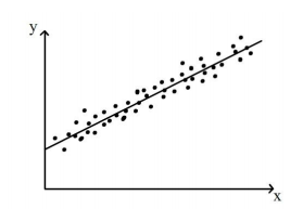 Source: http://www.statstutor.ac.uk
The regression procedure fits the best possible straight line to a matrix of data points. If a single line cannot be drawn so that all the points fall on it, which is the “best” line? Think about it before reading the answer.
The best line is the one that minimizes the distance of all data points to the line.
The correlation coefficient indicates the strength of the relationship between the independent and dependent variables., while the coefficient of determination (r square) explains to what extent the variance of the independent variable explains the variance of the dependent variable.
A correlation coefficient close to 1 indicates a positive relationship between the independent and dependent variable and a coefficient of determination closer to 1 indicates a good fit of the data to the predictive model.
Armed with this knowledge, we can create our first simple linear regression model in Qlik Sense or QlikView.
Implementing linear regression in Qlik
Recently, I ran into this very interesting article showing the nexus between teenage pregnancy and the poverty rate in the United States. These facts are worth reflecting on the reasons why teenage pregnancy leads to a higher rate of poverty:
- Only the 38 percent of girls who have a child before 18 years earn their high school diploma at 22
- Two-thirds of adolescent mothers who move out of their family home live in poverty, and a similar proportion receive public benefits in the first year of their child's life..
- Seventy-eight percent of children born to never-married teenage mothers who did not graduate from high school live below the federal poverty level.
It is a problem that we should all be aware of and if we can help in any way, we should at least try. I was lucky to find a dataset on this at Pennsylvania State University statistics website, STAT462.
Then, we will use this data set to create a simple linear regression model in Qlik Sense. Go ahead and save it to your machine. Here is a snapshot of the dataset:
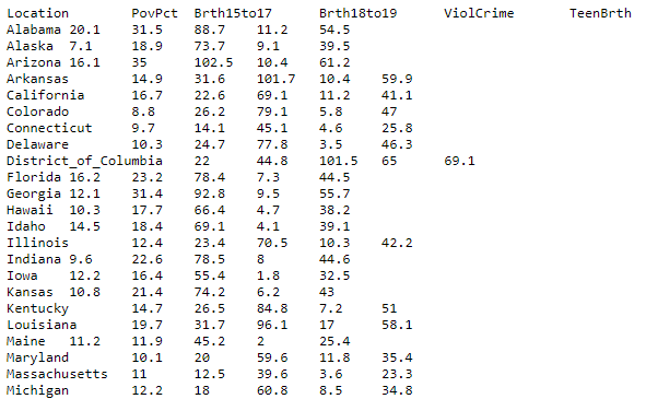
This data set of size n = 51 is for the 50 states and the District of Columbia in the United States.
Then, Let's take a look at the steps and I want you to follow them in Qlik Sense as we go through them.
Paso 1: create a scatter plot
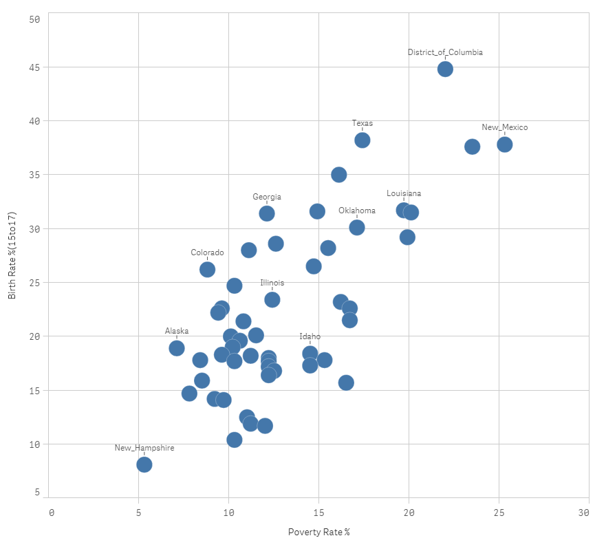
Paso 2: Calculate the correlation coefficient
Create a text and image chart with the following expression:

Paso 3: Calculate the coefficient of determination.
Create a text and image chart with this expression:

Paso 4: calculate the slope

Paso 5: Find the y-intercept

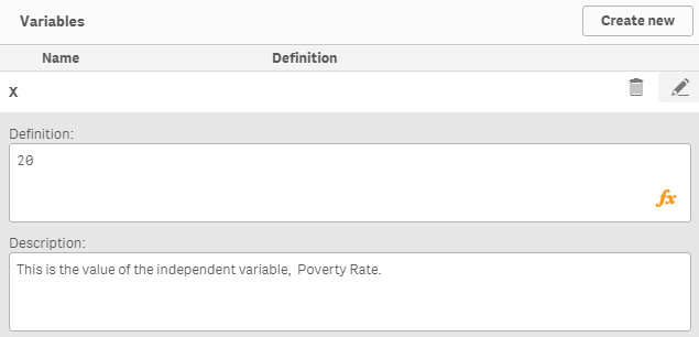
Paso 6: create a variable x with initial value = 0
This variable will allow us to change the value of the independent variable, birth rate (15 a 17), to predict the poverty rate. Click the variable option in the lower left corner of the sheet editor:
Paso 7: Calculate the expected birth rate for the teen group (15 a 17)
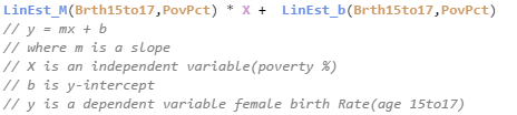
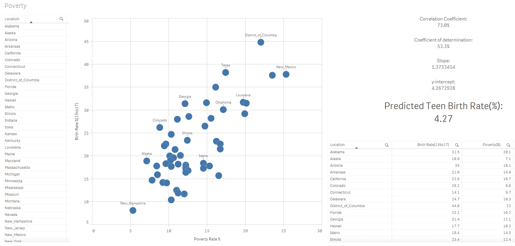
As stated here, our Qlik Sense linear regression model matches the fitted line equation:
Y = 1.373X + 4,267
With a poverty rate of 0%, the adolescent birth rate would be 4,27%. A change of one unit in the value of the independent variable is equivalent to a change of 1,373 in the value of the dependent variable.
What would the adolescent birth rate be if the poverty rate were 15%? This is the answer:
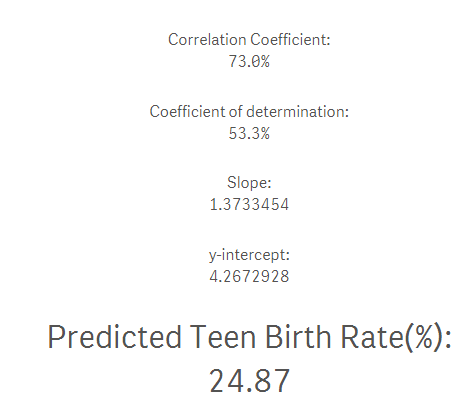
Now I can combine the power of the associative motor to narrow down the list of states and predict the birth rate for an age group of women from 15 a 17 years based on my selections using the poverty rate of the 15%:
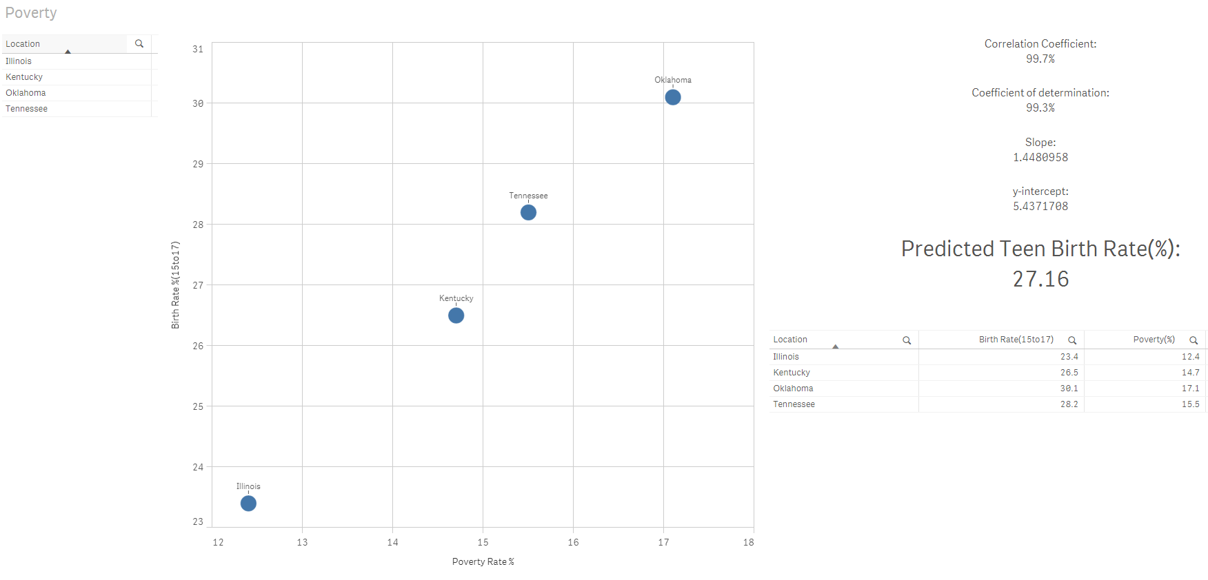
Fabulous! Don't you love the power of Qlik?
Comparison of our results with a model created with Python
Then, we will create a similar simple regression model in Python using the Pandas and scikit-learn libraries. I want to compare the accuracy of the predictive model that we create in Qlik Sense with one that we will create in Python.
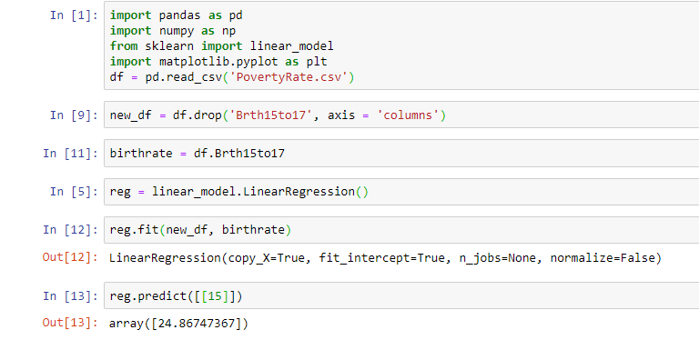
The result of our simple Python regression model matches that of Qlik Sense. Let's compare the predictive value of our Qlik Sense linear regression model with the one we created in Python:
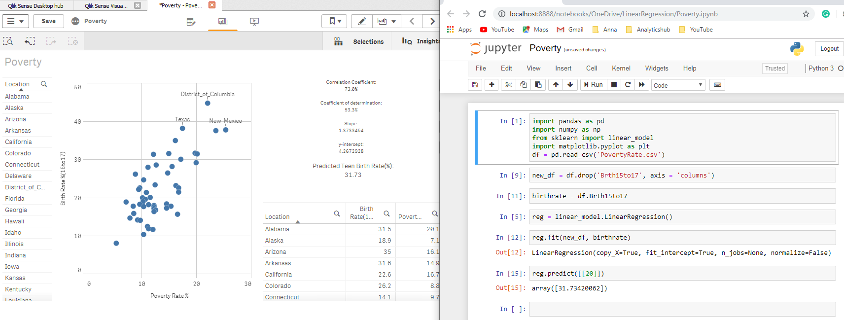
Final notes
We can create a simple regression model to show the scenario “What if” in Qlik Sense as long as we first validate that the relationship between the independent and dependent variable is positive or negative using a built-in correlation function to see the relationship .
What's more, make sure the data is suitable for modeling using the coefficient of determination (R-square). If a value is closer to 1, so our data is suitable for simple regression modeling in Qlik Sense.
Let me know your suggestions and comments for this article in the comment section below..
About the Author
Shilpan Patel – Co-founder, Analyticshub.io Y Qlik Luminary 2018, 2019

Shilpan is a Qlik Luminary and is passionate about enabling students to develop their full potential through lifelong learning and mentoring. He believes that the best way to learn and master a skill is by doing. Has more than 15 years of data and analytics experience, and has taught and mentored thousands of students.





