Introduction
All models are wrong, but some are useful – George Box
Regression analysis marks the first step in predictive modeling. Undoubtedly, it is quite easy to implement. Neither its syntax nor its parameters create any kind of confusion. But, just run just one line of code, does not solve the purpose. Not just looking at the R² or MSE values. Regression says much more than that!!
An R, regression analysis returns 4 graphics using plot(model_name) function. Each of the plots provides significant information or rather an interesting story about the data. Regrettably, many of the beginners fail to decipher the information or do not care what these plots say. Once you understand these charts, you can bring a significant improvement in your regression model.
To improve the model, you also need to understand regression assumptions and ways to correct them when they are violated.
In this article, I have explained the important regression assumptions and graphs (with fixes and solutions) to help you understand the concept of regression in more detail. As stated above, with this knowledge you can bring drastic improvements to your models.
Note: To understand these graphs, you must know the basics of regression analysis. If you are completely new to it, you can start here. Later, continue with this article.

Regression assumptions
Regression is a parametric approach. ‘Parametric’ means you make assumptions about the data for analytics purposes. Due to its parametric side, regression is restrictive in nature. Doesn't work well with data sets that don't meet your assumptions. Therefore, for a successful regression analysis, it is essential to validate these assumptions.
Then, How would you check (would validate) if a data set follows all regression assumptions? Check it using regression graphs (explained below) along with some statistical proof.
Let's look at the important assumptions in regression analysis:
- There must be a linear and additive relationship between the dependent variable (answer) and the independent variable (predictora). A linear relationship suggests that a change in response Y due to a one-unit change in X¹ is constant, regardless of the value of X¹. An additive relationship suggests that the effect of X¹ on Y is independent of other variables.
- There should be no correlation between the residual terms (error). The absence of this phenomenon is known as autocorrelation..
- The independent variables must not be correlated. The absence of this phenomenon is known as multicollinearity..
- The error terms must have a constant variance. This phenomenon is known as homoscedasticity.. The presence of non-constant variance refers to heteroscedasticity.
- The error terms should be distributed normally.
What if these assumptions are violated?
Let's analyze specific assumptions and learn about your results (if they are raped):
1. Linear and additive: If you fit a linear model to a non-linear, non-additive data set, the regression algorithm would not capture the trend mathematically, which would result in an inefficient model. What's more, this will result in wrong predictions in an invisible data set.
How to check: Look for residual vs adjusted value graphs (explained below). What's more, can include polynomial terms (X, X², X³) in your model to capture the non-linear effect.
2. Autocorrelation: The presence of correlation in terms of error drastically reduces the precision of the model. This usually occurs in time series models where the next instant depends on the previous instant.. If the error terms are correlated, estimated standard errors tend to underestimate the true standard error.
If this happens, makes confidence intervals and prediction intervals narrower. A narrower confidence interval means that a confidence interval of the 95% would have a probability less than 0,95 to contain the real value of the coefficients. Let's understand narrow prediction intervals with an example:
For instance, the least squares coefficient of X¹ is 15.02 and its standard error is 2.08 (no autocorrelation). But in the presence of autocorrelation, the standard error is reduced to 1,20. As a result, the prediction interval is reduced to (13.82, 16.22) from (12.94, 17.10).
What's more, lower standard errors would make the associated p-values lower than the actual ones. This will cause us to incorrectly conclude that a parameter is statistically significant..
How to check: Look up the Durbin-Watson statistic (DW). It must be between 0 Y 4. If DW = 2, does not imply autocorrelation, 0 <DW <2 implies positive autocorrelation while 2 <DW <4 indicates negative autocorrelation. What's more, you can view the residual plot versus time and look for the seasonal or correlated pattern in the residuals.
3. Multicollinearity: This phenomenon exists when the independent variables are found to have a moderate or high correlation. In a model with correlated variables, it becomes a difficult task to find out the true relationship of a predictor with a response variable. In other words, difficult to figure out which variable actually contributes to predicting the response variable.
Another point, with presence of correlated predictors, standard errors tend to increase. Y, with large standard errors, the confidence interval becomes wider, leading to less accurate estimates of slope parameters.
What's more, when predictors are correlated, the estimated regression coefficient of a correlated variable depends on what other predictors are available in the model. If this happens, you will end up with an incorrect conclusion that a variable affects strongly / weakly to the target variable. Given the, even if you remove a correlated variable from the model, your estimated regression coefficients would change. That's not good!
How to check: You can use the scatter plot to visualize the correlation effect between variables. What's more, you can also use the VIF factor. The value of VIF = 10 implies serious multicollinearity. Above all, a correlation table should also solve the purpose.
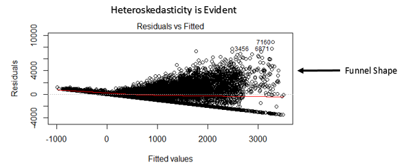
4. Heteroscedasticity: The presence of non-constant variance in the error terms results in heteroscedasticity. Generally, non-constant variance arises in the presence of outliers or extreme leverage values. These values seem to have too much weight, so they disproportionately influence the performance of the model. When this phenomenon occurs, the confidence interval for out-of-sample prediction tends to be unrealistically wide or narrow.
How to check: You can see the plot of residuals vs fitted. If there is heteroscedasticity, the graph will display a funnel-shaped pattern (shown in the next section). What's more, you can use the Breusch-Pagan test / Cook – Weisberg or White's general test to detect this phenomenon.
5. Normal distribution of error terms: If the error terms are not distributed normally, confidence intervals may become too wide or too narrow. Once the confidence interval becomes unstable, the estimation of coefficients based on least squares minimization is difficult. The presence of an abnormal distribution suggests that there are some unusual data points that need to be studied closely to make a better model..
How to check: You can see the QQ chart (shown below). You can also perform statistical tests for normality such as the Kolmogorov-Smirnov test, the Shapiro-Wilk test.
Interpretation of regression graphs
Up to this point, We have learned about important regression assumptions and methods to undertake, if those assumptions are violated.
But that's not the end. Now, you should know the solutions also to address the violation of these assumptions. In this section, I have explained the 4 regression graphs along with methods to overcome the limitations of the assumptions.
1. Residual Values vs. Fitted Values
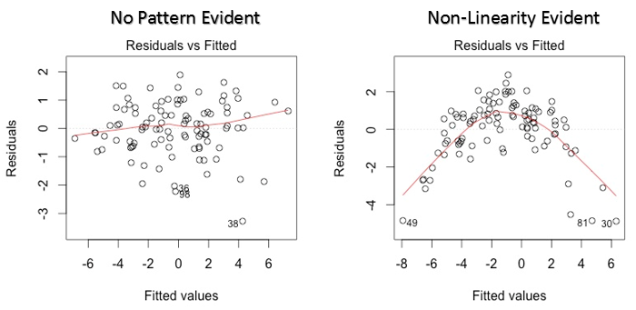
This scatter plot shows the distribution of the residuals (mistakes) versus fitted values (predicted values). It is one of the most important plots that everyone should learn. Reveals various useful insights, including outliers. The outliers in this graph are labeled by their observation number, which makes them easy to spot.
There are two important things you must learn:
- If there is any pattern (could be, a parabolic shape) in this graph, consider it as signs of non-linearity in the data. It means that the model does not capture non-linear effects.
- If the shape of a funnel is evident in the graph, consider it as a sign of non-constant variance, namely, heteroscedasticity.
Solution: To overcome the problem of non-linearity, you can do a nonlinear transformation of predictors like log (X), √X or X² transform the dependent variable. To overcome heteroscedasticity, one possible way is to transform the response variable as log (Y) the √Y. What's more, you can use the weighted least squares method to address heteroscedasticity.
2. Normal QQ chart
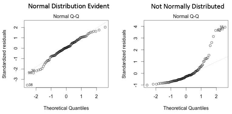
This qq or quantile-quantile is a scatter diagram that helps us validate the assumption of normal distribution in a data set. Using this graph we can infer if the data come from a normal distribution. If so, the graph would show a fairly straight line. There is an absence of normality in errors with deviation in a straight line.
If you wonder what a 'quantile' is, here is a simple definition: think of quantiles as points in your data below which a certain proportion of data falls. The quantile is often called percentiles. For instance: when we say that the percentile value 50 it is 120, means that half of the data is below 120.
Solution: If the errors are not distributed normally, the non-linear transformation of the variables (response or predictors) can bring an improvement in the model.
3. Scale location chart
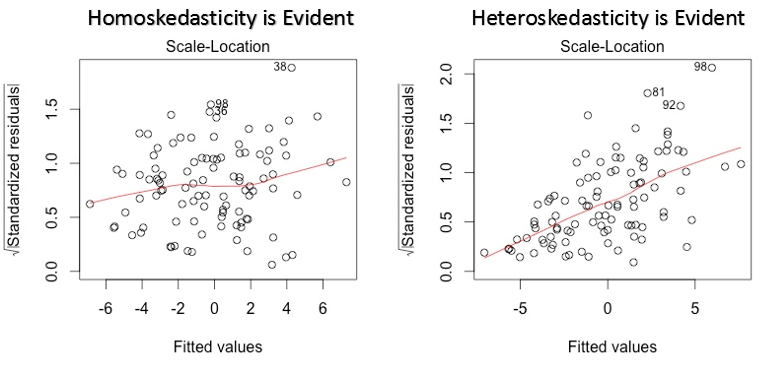
This graph is also used to detect homoscedasticity (assumption of equal variance). Shows how the residuals are distributed across the range of predictors.. It is similar to the residual value vs adjusted graph except that it uses standardized residual values. Ideally, there should be no discernible pattern in the plot. This would imply that the errors are normally distributed. But, in case the graph shows any discernible pattern (probably a funnel shape), would imply a non-normal error distribution.
Solution: Follow the solution for heteroscedasticity given in the graph 1.
4. Residual vs leverage graph
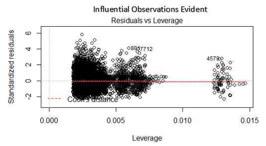
Also known as Cook's distance diagram. Cook's distance tries to identify the points that have more influence than other points. Such influence points tend to have a considerable impact on the regression line.. In other words, adding or removing such points from the model can completely change the model statistics.
But, Can these influential observations be treated as outliers?? This question can only be answered after looking at the data. Therefore, in this graph, large values marked by cooking distance may require further investigation.
Solution: For influencing observations that are nothing more than outliers, yes not many, you can delete those rows. Alternatively, you can reduce the observation of outliers with the maximum value in the data or treat those values as missing values.
Case study: How I improved my regression model using logarithmic transformation
Final notes
You can harness the true power of regression analysis by applying the solutions described above.. Implementing these fixes in R is pretty easy. If you want to know some specific solution in R, you can leave a comment, I will be happy to help you with the answers..
The purpose of this article was to help you gain the underlying insight and perspective of the regression diagrams and assumptions.. This way, you will have more control over your analysis and can modify the analysis according to your needs.
Did you find this article useful? Have you used these fixes to improve the performance of the model? Share your experience / suggestions in the comments.


