Introduction
Here is a famous quote about learning:
we learn . . .
10% of what we read
20% from what we hear
30% of what we see
50% of what we see and hear
70% what we discussed
80% of what we experience
95% of what we teach others.
If we create a similar order in ability to interpret data in various ways – the order will surely look like this:
Text <Table <Graphics <Interactive graphics
Secondly, the amount of data that needs processing and interpretation increases by the second. Combined, These two factors make data visualization an integral form of the data science workflow, probably more important than ever.
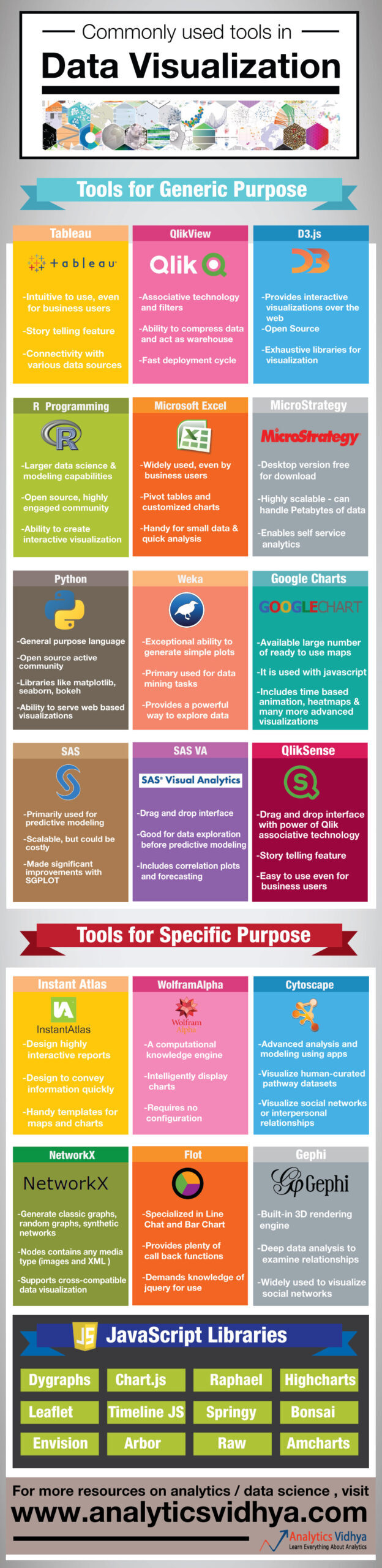
To address this need to create a simple yet powerful visualization, there are multiple tools that can be useful. But nevertheless, many analysts and data scientists are unaware of these tools. Therefore, we have created an infographic, which provides a high-level overview of various tools that people use to create data visualization.
What do you think of the infographic? Do you think there are other tools that should be part of this infographic? If so, let us know via the comments below.


