Let's start by taking a short statement of the problem.
Problem statement: create a simple linear regression model to predict salary increase using years of experience.
Start by importing the necessary libraries
the libraries needed are pandas, NumPy for working with data frames, matplotlib, seaborn for visualizations and sklearn, statsmodels to construct regression models.
import pandas as pd
import numpy as np
import matplotlib.pyplot as plt
%matplotlib inline
import seaborn as sns
from scipy import stats
from scipy.stats import probplot
import statsmodels.api as sm
import statsmodels.formula.api as smf
from sklearn import preprocessing
from sklearn.linear_model import LinearRegression
from sklearn.model_selection import train_test_split
from sklearn.metrics import mean_squared_error, r2_score
Once we are done with importing libraries, we create a pandas data frame from the CSV file
df = pd.read_csv(“Salary_Data.csv”)
Perform EDA (exploratory data analysis)
The basic steps of EDA are:
- Identify the number of features or columns
- Identify the characteristics or columns
- Identify the size of the data set
- Identification of the data types of the characteristics
- Checking if the dataset has empty cells
- Identify the number of empty cells by characteristics or columns
- Handling missing values and outliers
- Coding of categorical variables
- Univariate graphical analysis, bivariado
- NormalizationStandardization is a fundamental process in various disciplines, which seeks to establish uniform standards and criteria to improve quality and efficiency. In contexts such as engineering, Education and administration, Standardization makes comparison easier, interoperability and mutual understanding. When implementing standards, cohesion is promoted and resources are optimised, which contributes to sustainable development and the continuous improvement of processes.... y escalado
len(df.columns) # identify the number of featuresdf.columns # idenfity the features
df.shape # identify the size of of the datasetUn "dataset" o conjunto de datos es una colección estructurada de información, que puede ser utilizada para análisis estadísticos, machine learning o investigación. Los datasets pueden incluir variables numéricas, categóricas o textuales, y su calidad es crucial para obtener resultados fiables. Su uso se extiende a diversas disciplinas, como la medicina, la economía y la ciencia social, facilitando la toma de decisiones informadas y el desarrollo de modelos predictivos....df.dtypes # identify the datatypes of the featuresdf.isnull().values.any() # checking if dataset has empty cellsdf.isnull().sum() # identify the number of empty cellsOur dataset has two columns: Years of experience, Salary. And both are of float data type. Have 30 records and we have no null values or outliers in our dataset.
Univariate graphical analysis
For univariate analysis, have Histogram, density graph, box plot O fiddle, Y Normal QQ chart. They help us understand the distribution of data points and the presence of outliers.
a fiddle diagramThe violin diagram is a graphical representation that combines features of a boxplot and a density graph. Used to visualize the distribution of a dataset, showing both the median and variability through their shape, that resembles a violin. This type of graph is very useful in statistical analysis, ya que permite comparar múltiples distribuciones de forma clara y efectiva.... es un método para trazar datos numéricos. It is similar to a box plot, with the addition of a grain density diagram rotated on each side.
Python code:
# Histogram
# We can use either plt.hist or sns.histplot
plt.figure(figsize=(20,10))
plt.subplot(2,4,1)
plt.hist(df['YearsExperience'], density=False)
plt.title("Histogram of 'YearsExperience'")
plt.subplot(2,4,5)
plt.hist(df['Salary'], density=False)
plt.title("Histogram of 'Salary'")

# Density plot
plt.subplot(2,4,2)
sns.distplot(df['YearsExperience'], kde=True)
plt.title("Density distribution of 'YearsExperience'")
plt.subplot(2,4,6)
sns.distplot(df['Salary'], kde=True)
plt.title("Density distribution of 'Salary'")

# boxplot or violin plot
# A violin plot is a method of plotting numeric data. It is similar to a box plot,
# with the addition of a rotated kernel density plot on each side
plt.subplot(2,4,3)
# plt.boxplot(df['YearsExperience'])
sns.violinplot(df['YearsExperience'])
# plt.title("Boxlpot of 'YearsExperience'")
plt.title("Violin plot of 'YearsExperience'")
plt.subplot(2,4,7)
# plt.boxplot(df['Salary'])
sns.violinplot(df['Salary'])
# plt.title("Boxlpot of 'Salary'")
plt.title("Violin plot of 'Salary'")

# Normal Q-Q plot
plt.subplot(2,4,4)
probplot(df['YearsExperience'], plot=plt)
plt.title("Q-Q plot of 'YearsExperience'")
plt.subplot(2,4,8)
probplot(df['Salary'], plot=plt)
plt.title("Q-Q plot of 'Salary'")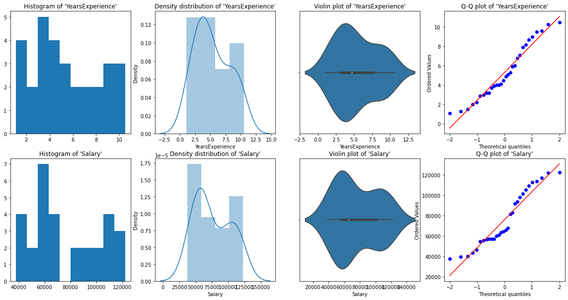
From the graphic representations above, we can say that there are no outliers in our data, Y YearsExperience looks like normally distributed, and Salary doesn't look normal. We can verify this using Shapiro Test.
Python code:
# Def a function to run Shapiro test

# Defining our Null, Alternate Hypothesis
Ho = 'Data is Normal'
Ha="Data is not Normal"

# Defining a significance value
alpha = 0.05
def normality_check(df):
    for columnName, columnData in df.iteritems():
        print("Shapiro test for {columnName}".format(columnName=columnName))
        res = stats.shapiro(columnData)
#         print(res)
        pValue = round(res[1], 2)

        # Writing condition
        if pValue > alpha:
            print("pvalue = {pValue} > {alpha}. We fail to reject Null Hypothesis. {Ho}".format(pValue=pValue, alpha=alpha, Ho=Ho))
        else:
            print("pvalue = {pValue} <= {alpha}. We reject Null Hypothesis. {Ha}".format(pValue=pValue, alpha=alpha, Ha=Ha))


# Drive code
normality_check(df)
Our graphics instinct was correct. Years Experience is normally distributed and salary is not normally distributed.
Bivariate display
for numeric data vs numeric data, we can draw the following graphs
- Scatter plot
- Line graph
- Heat map for correlation
- Joint plot
Python code for multiple parcels:
# Scatterplot & Line plots
plt.figure(figsize=(20,10))
plt.subplot(1,3,1)
sns.scatterplot(data=df, x="YearsExperience", y="Salary", hue="YearsExperience", alpha=0.6)
plt.title("Scatter plot")
plt.subplot(1,3,2)
sns.lineplot(data=df, x="YearsExperience", y="Salary")
plt.title("Line plot of YearsExperience, Salary")
plt.subplot(1,3,3)
sns.lineplot(data=df)
plt.title('Line Plot')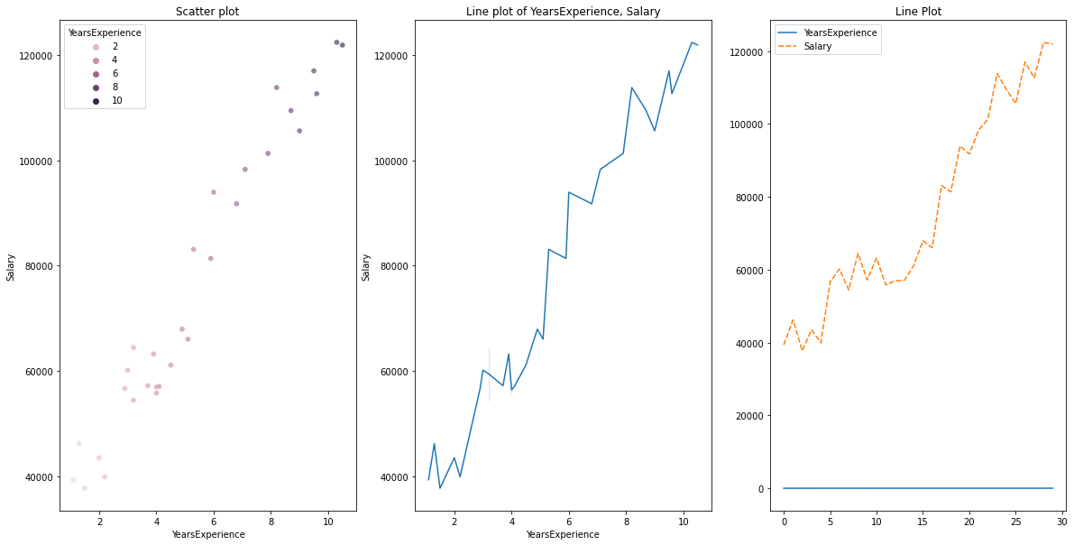
# heatmap
plt.figure(figsize=(10, 10))
plt.subplot(1, 2, 1)
sns.heatmap(data=df, cmap="YlGnBu", annot = True)
plt.title("Heatmap using seaborn")
plt.subplot(1, 2, 2)
plt.imshow(df, cmap ="YlGnBu")
plt.title("Heatmap using matplotlib")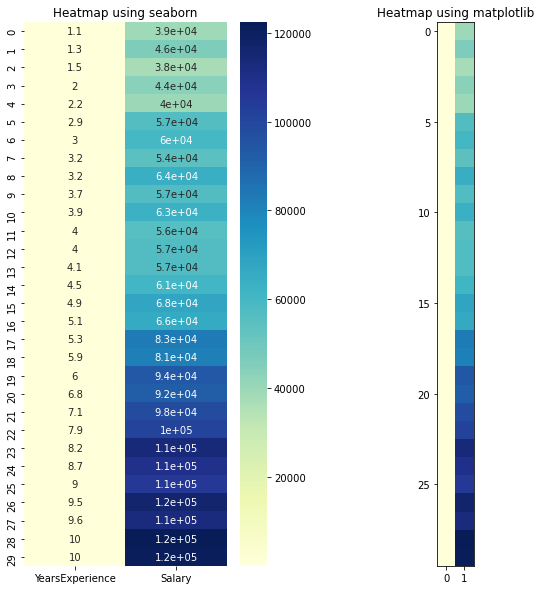
# Joint plot
sns.jointplot(x = "YearsExperience", y = "Salary", kind = "reg", data = df)
plt.title("Joint plot using sns")
# kind can be hex, kde, scatter, reg, hist. When kind='reg' it shows the best fit line.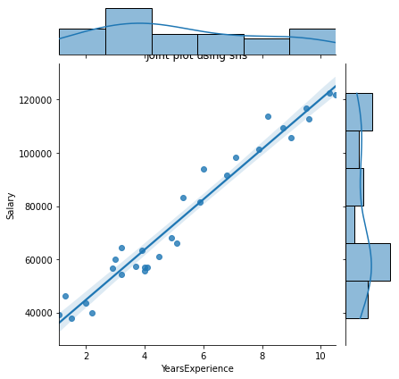
Check if there is any correlation between the variables using df.corr ()
print("Correlation: "+ 'n', df.corr()) # 0.978 which is high positive correlation
# Draw a heatmap for correlation matrix
plt.subplot(1,1,1)
sns.heatmap(df.corr(), annot=True)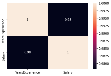
correlation = 0,98, which is a high positive correlation. Esto significa que la variableIn statistics and mathematics, a "variable" is a symbol that represents a value that can change or vary. There are different types of variables, and qualitative, that describe non-numerical characteristics, and quantitative, representing numerical quantities. Variables are fundamental in experiments and studies, since they allow the analysis of relationships and patterns between different elements, facilitating the understanding of complex phenomena.... dependiente aumenta a measureThe "measure" it is a fundamental concept in various disciplines, which refers to the process of quantifying characteristics or magnitudes of objects, phenomena or situations. In mathematics, Used to determine lengths, Areas and volumes, while in social sciences it can refer to the evaluation of qualitative and quantitative variables. Measurement accuracy is crucial to obtain reliable and valid results in any research or practical application.... que aumenta la variable independiente.
Normalization
As we can see, there is a big difference between the values of the YearsExperience columns, Salary. We can use Normalization to change the values of numeric columns in the dataset to use a common scale, without distorting differences in value ranges or losing information.
We use sklearn.preprocessing.Normalize to normalize our data. Returns values between 0 Y 1.
# Create new columns for the normalized values
df['Norm_YearsExp'] = preprocessing.normalize(df[['YearsExperience']], axis=0)
df['Norm_Salary'] = preprocessing.normalize(df[['Salary']], axis=0)
df.head()
Linear regression using scikit-learn
LinearRegression(): LinearRegression conforms to a linear model with coefficients β = (β1,…, βp) to minimize the residual sum of squares between the observed targets in the data set and the targets predicted by the linear approximation.
def regression(df):
#     defining the independent and dependent features
    x = df.iloc[:, 1:2]
    y = df.iloc[:, 0:1]
    # print(x,y)

    # Instantiating the LinearRegression object
    regressor = LinearRegression()

    # Training the model
    regressor.fit(x,y)

    # Checking the coefficients for the prediction of each of the predictor
    print('n'+"Coeff of the predictor: ",regressor.coef_)

    # Checking the intercept
    print("Intercept: ",regressor.intercept_)

    # Predicting the output
    y_pred = regressor.predict(x)
#     print(y_pred)

    # Checking the MSE
    print("Mean squared error(MSE): %.2f" % mean_squared_error(y, y_pred))
    # Checking the R2 value
    print("Coefficient of determination: %.3f" % r2_score(y, y_pred)) # Evaluates the performance of the model # says much percentage of data points are falling on the best fit line

    # visualizing the results.
    plt.figure(figsize=(18, 10))
    # Scatter plot of input and output values
    plt.scatter(x, y, color="teal")
    # plot of the input and predicted output values
    plt.plot(x, regressor.predict(x), color="Red", linewidth=2 )
    plt.title('Simple Linear Regression')
    plt.xlabel('YearExperience')
    plt.ylabel('Salary')


# Driver code
regression(df[['Salary', 'YearsExperience']]) # 0.957 accuracy
regression(df[['Norm_Salary', 'Norm_YearsExp']]) # 0.957 accuracy
We achieve a precision of 95,7% con scikit-learn, pero no hay mucho marginMargin is a term used in a variety of contexts, such as accounting, Economics and printing. In accounting, refers to the difference between revenue and costs, which allows the profitability of a business to be evaluated. In the publishing field, The margin is the white space around the text on a page, that makes it easy to read and provides an aesthetic presentation. Its correct management is essential.. para comprender la información detallada sobre la relevancia de las características de este modelo. So let's build a model using statsmodels.api, statsmodels.formula.api
Linear regression using statsmodel.formula.api (smf)
Predictors in statsmodels.formula.api must be listed individually. And in this method, a constant is automatically added to the data.
def smf_ols(df):
    # defining the independent and dependent features
    x = df.iloc[:, 1:2]
    y = df.iloc[:, 0:1]
#     print(x)
    # train the model
    model = smf.ols('y~x', data=df).fit()
    # print model summary
    print(model.summary())

    # Predict y
    y_pred = model.predict(x)
#     print(type(y), type(y_pred))
#     print(y, y_pred)

    y_lst = y.Salary.values.tolist()
#     y_lst = y.iloc[:, -1:].values.tolist()
    y_pred_lst = y_pred.tolist()

#     print(y_lst)

    data = [y_lst, y_pred_lst]
#     print(data)
    res = pd.DataFrame({'Actuals':data[0], 'Predicted':data[1]})
#     print(res)

    plt.scatter(x=res['Actuals'], y=res['Predicted'])
    plt.ylabel('Predicted')
    plt.xlabel('Actuals')

    res.plot(kind='bar',figsize=(10,6))

# Driver code
smf_ols(df[['Salary', 'YearsExperience']]) # 0.957 accuracy
# smf_ols(df[['Norm_Salary', 'Norm_YearsExp']]) # 0.957 accuracy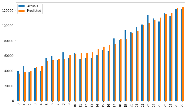
Regression using statsmodels.api
It is no longer necessary to list predictors individually.
statsmodels.regression.linear_model.OLS (even, exog)
endogis the dependent variableexogis the independent variable. An intercept is not included by default and must be added by the user (using add_constant).
# Create a helper function
def OLS_model(df):
    # defining the independent and dependent features
    x = df.iloc[:, 1:2]
    y = df.iloc[:, 0:1]
    # Add a constant term to the predictor
    x = sm.add_constant(x)
#     print(x)
    model = sm.OLS(y, x)
    # Train the model
    results = model.fit()
    # print('n'+"Confidence interval:"+'n', results.conf_int(alpha=0.05, cols=None)) #Returns the confidence interval of the fitted parameters. The default alpha=0.05 returns a 95% confidence interval.
    print('n'"Model parameters:"+'n',results.params)
    # print the overall summary of the model result
    print(results.summary())

# Driver code
OLS_model(df[['Salary', 'YearsExperience']]) # 0.957 accuracy
OLS_model(df[['Norm_Salary', 'Norm_YearsExp']]) # 0.957 accuracy
We achieve a precision of 95,7%, which is pretty good 🙂
¿Qué dice la Summary TableThe "Summary Table" is an effective tool that condenses key information from a specific topic into a visual and accessible format. Used in various fields, such as education and research, facilitates data understanding and analysis. Its structure allows users to quickly identify essential points, promoviendo una mejor retención del conocimiento y una comparación más sencilla entre diferentes conceptos o variables.... of the model? 😕
It is always important to understand certain terms in the summary table of the regression model so that we can know the performance of our model and the relevance of the input variables.
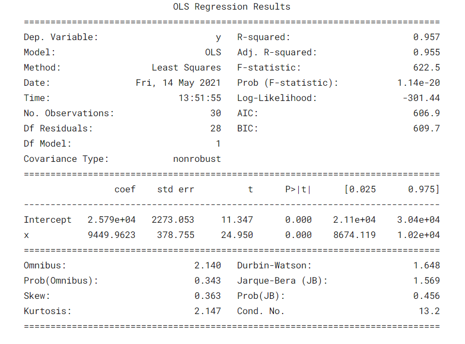
Some parametersThe "parameters" are variables or criteria that are used to define, measure or evaluate a phenomenon or system. In various fields such as statistics, Computer Science and Scientific Research, Parameters are critical to establishing norms and standards that guide data analysis and interpretation. Their proper selection and handling are crucial to obtain accurate and relevant results in any study or project.... importantes que deben tenerse en cuenta son el valor de R cuadrado, Adj. R-squared value, F statistic, prob (F statistic), intercept coefficient and input variables, p> | t |.
- R-Squared is the coefficient of determination. A statistical measure that says that a large part of the data points are on the line of best fit. A value of R squared closer to 1 for a model to fit well.
- Adj. R-squared penalizes the value of R-squared if we keep adding the new features that do not contribute to the prediction of the model. Si Adj. R squared value <R-squared value, is a sign that we have irrelevant predictors in the model.
- La estadística F o prueba F nos ayuda a aceptar o rechazar la null hypothesisThe null hypothesis is a fundamental concept in statistics that establishes an initial statement about a population parameter. Its purpose is to be tested and, if refuted, allows us to accept the alternative hypothesis. This approach is essential in scientific research, as it provides a framework for evaluating empirical evidence and making data-driven decisions. Its formulation and analysis are crucial in statistical studies..... Compare the intercept-only model with our model with features. The null hypothesis is “all regression coefficients are equal to zero and that means that both models are equal”. The alternative hypothesis is ‘intercepting the only model is worse than our model, which means that our added coefficients improved the performance of the model. If prob (F statistic) <0.05 and the F statistic is a high value, we reject the null hypothesis. It means that there is a good relationship between the input and output variables.
- coef displays the estimated coefficients of the corresponding input characteristics
- T-test talks about the relationship between the output and each of the input variables individually. The null hypothesis is 'the coefficient of an input characteristic is 0'. The alternative hypothesis is 'the coefficient of an input characteristic is not 0'. If pvalue 0.05.
Good, now we know how to draw important inferences from the model summary table, so now let's look at the parameters of our model and evaluate our model.
In our case, the value of R squared (0,957) is close to Adj. The value of R squared (0,955) is a good sign that the input characteristics are contributing to the predictor model.
The F statistic is a high number and p (F statistic) is almost 0, which means that our model is better than the single intersection model.
The p-value of the t-test for the input variable is less than 0.05, so there is a good relationship between the input variable and the output variable.
Therefore, we conclude by saying that our model is working well ✔😊
In this blog, We learned the basics of Simple Linear Regression (SLR), building a linear model using different Python libraries and making inferences from the summary table of OLS statistics models.
References:
Interpreting the summary table from the OLS statistics model
Visualizations: Histogram, Density graph, violin weft, box plot, Normal QQ chart, Scatter plot, line graph, heat map, joint plot
See the full notebook of my GitHub repository.
I hope this is an informative blog for beginners. Please, vote for if you find this useful 🙌 Your comments are greatly appreciated. Happy learning !! 😎
The media shown in this article is not the property of DataPeaker and is used at the author's discretion.


