
Introduction
In this article, we will go through the popular Titanic dataset and try to predict if a person survived the wreck. You can get this dataset from Kaggle, linked here. This article will focus on how to think about these projects, more than in the implementation. Many of the beginners are confused on how to get started, when to finish and everything else, I hope this article serves as a beginner's manual for you.. I suggest you practice the project in Kaggle.
The objective: predict whether or not a passenger survived. 0 for not surviving, 1 For surviving.
Describing the data
In this article, we will do a basic data analysis, then a little feature engineering and, in the end, we will use some of the popular models for prediction. Let us begin.
Data analysis
Paso 1: Importing Basic Libraries
import numpy as np
import pandas as pd
import seaborn as sns
import matplotlib.pyplot as plt
%matplotlib inline
Paso 2: read data
training = pd.read_csv('/kaggle/input/titanic/train.csv')
test = pd.read_csv('/kaggle/input/titanic/test.csv')
training['train_test'] = 1
test['train_test'] = 0
test['Survived'] = np.NaN
all_data = pd.concat([training,test])
all_data.columns

Paso 3: data exploration
In this section, we will try to extract knowledge from the data and become familiar with it in order to create more efficient models.
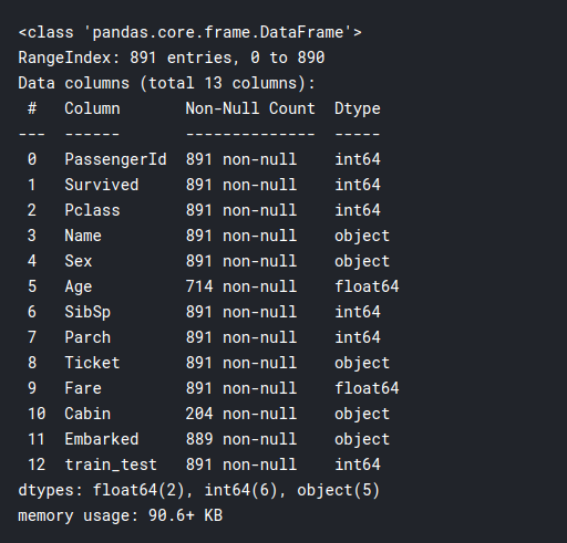
training.info()
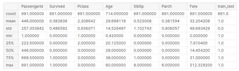
training.describe()
# seperate the data into numeric and categorical
df_num = training[['Age','SibSp','Parch','Fare']]
df_cat = training[['Survived','Pclass','Sex','Ticket','Cabin','Embarked']]
Now let's graph the numerical data:
for i in df_num.columns:
    plt.hist(df_num[i])
    plt.title(i)
    plt.show()
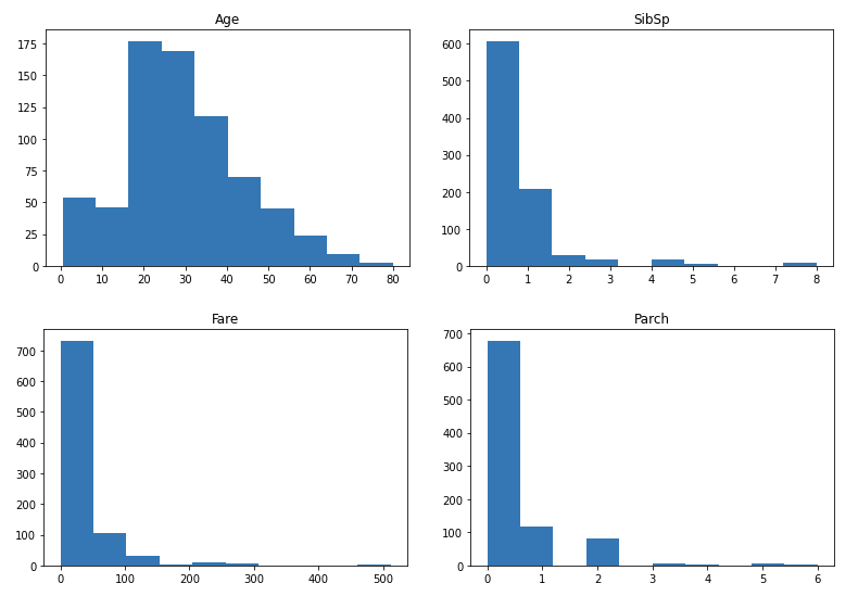
Then, as you can see, most distributions are scattered, excepto Age, is quite normalized. We might consider normalizing them later. Then, trazamos un heat mapa "heat map" is a graphical representation that uses colors to show the density of data in a specific area. Commonly used in data analytics, Marketing and behavioral studies, This type of visualization allows you to identify patterns and trends quickly. Through chromatic variations, Heat maps make it easier to interpret large volumes of information, helping to make informed decisions.... de correlación entre las columnas numéricas:
sns.heatmap(df_num.corr())
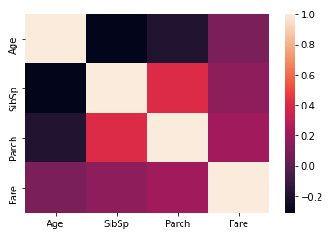
Here we can see that Parch and SibSp have a higher correlation, which generally makes sense as parents are more likely to travel with their multiple children and spouses tend to travel together. Then, let's compare survival rates between numerical variables. This could reveal some interesting ideas:
pd.pivot_table(training, index = 'Survived', values = ['Age','SibSp','Parch','Fare'])
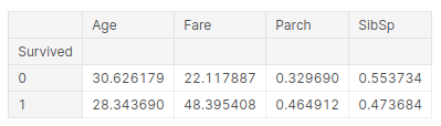
The inference that we can draw from this table is:
- The average age of the survivors is 28 years, so young people tend to survive longer.
- People who paid higher rates were more likely to survive, more than double. This could be the people who travel first class. This is how the rich survived, which is a sad story on this stage.
- In the third column, if you have parents, has a higher chance of surviving. Then, parents could have saved the children before themselves, thus explaining the rates
- And if you are a child and you have siblings, you have less chance of surviving.
Now we do something similar with our categorical variables:
for i in df_cat.columns:
    sns.barplot(df_cat[i].value_counts().index,df_cat[i].value_counts()).set_title(i)
    plt.show()
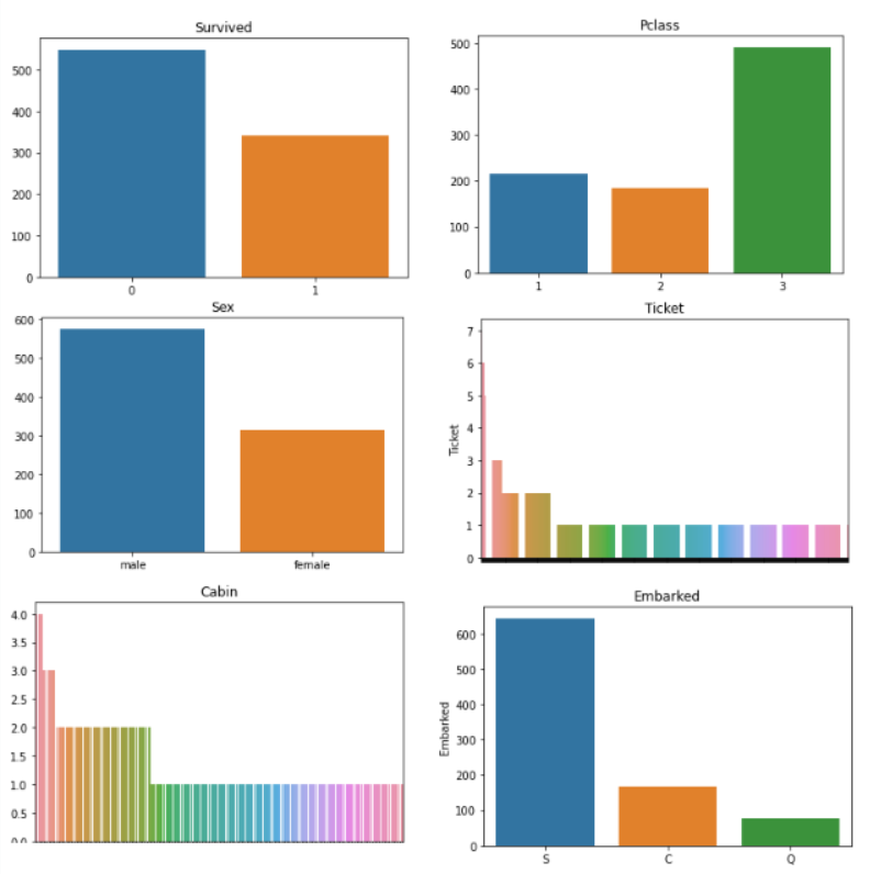
Ticket and Cabin graphics look very messy, We may have to design them! Other than that, the rest of the graphs tell us:
- Survived: most of the people died in the shipwreck, just a few 300 people survived.
- Pclass: Most of the people who were traveling had tickets for the 3rd class.
- Sex: there were more men than women on board the ship, about double the amount.
- Embarked: Most of the passengers boarded the ship from Southampton.
Ahora haremos algo similar a la dynamic tablePivotTable is a powerful tool in spreadsheet programs, such as Microsoft Excel and Google Sheets. Allows you to summarize, Analyze and visualize large volumes of data efficiently. Through its intuitive interface, users can rearrange information, apply filters and create custom reports, facilitating informed decision-making in various contexts, from the business field to academic research.... anterior, but with our categorical variables, y las compararemos con nuestra variableIn statistics and mathematics, a "variable" is a symbol that represents a value that can change or vary. There are different types of variables, and qualitative, that describe non-numerical characteristics, and quantitative, representing numerical quantities. Variables are fundamental in experiments and studies, since they allow the analysis of relationships and patterns between different elements, facilitating the understanding of complex phenomena.... dependent, what if people survived:
print(pd.pivot_table(training, index = 'Survived', columns="Pclass",
                     values="Ticket" ,aggfunc="count"))
print()
print(pd.pivot_table(training, index = 'Survived', columns="Sex",
                     values="Ticket" ,aggfunc="count"))
print()
print(pd.pivot_table(training, index = 'Survived', columns="Embarked",
                     values="Ticket" ,aggfunc="count"))
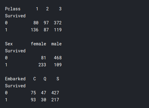
- Pclass: Here we can see that many more people survived from the First class than from the Second or Third class., even though the total number of passengers in First class was much lower than in Third class. Therefore, here our earlier assumption that the rich survived, what might be relevant to model building.
- Sex: most of the women survived and most of the men died in the shipwreck. Therefore, it seems that the saying “Woman and children first” actually applies in this scenario.
- Embarked: This doesn't seem very relevant., maybe if someone were from “Cherburgo"I had a greater chance of surviving.
Paso 4: Function engineering
We saw that our ticket Y cabin the data doesn't really make sense to us, and this could hamper the performance of our model, so we have to simplify some of this data with function engineering.
If we look at the real data of the cabin, we see that basically there is a letter and then a number. Letters can mean what kind of stateroom it is, where you are on the ship, on which floor, what class is it for, etc. And the numbers can mean the cabin number. Let's first divide them into individual cabins and see if anyone had more than one cab.
df_cat.Cabin
training['cabin_multiple'] = training.Cabin.apply(lambda x: 0 if pd.isna(x)
                                                    else len(x.split(' ')))
training['cabin_multiple'].value_counts()
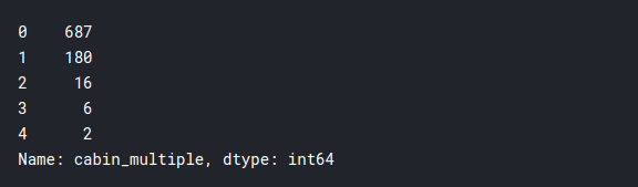
It seems that the vast majority did not have individual cabins, and only a few people had more than one cabin. Now let's see if survival rates depend on this:
pd.pivot_table(training, index = 'Survived', columns="cabin_multiple",
               values="Ticket" ,aggfunc="count")
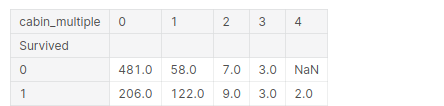
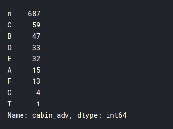
Then, Let's see the actual letter of the cabin they were in. Therefore, you could expect cabins with the same letter to be in roughly the same locations or on the same floors and, logically, if a cabin was near the lifeboats, had a better chance of surviving. Let's take a look at that:
# n stands for null
# in this case we will treat null values like it's own category
training['cabin_adv'] = training.Cabin.apply(lambda x: str(x)[0])
#comparing survival rates by cabin
print(training.cabin_adv.value_counts())
pd.pivot_table(training,index='Survived',columns="cabin_adv",
                        values="Name", aggfunc="count")
I did some future engineering in the ticket column and did not yield much important insights, that we still do not know, so I'll skip that part to keep the article concise. We will simply divide the tickets into numeric and non-numeric for efficient use:
training['numeric_ticket'] = training.Ticket.apply(lambda x: 1 if x.isnumeric() else 0)
training['ticket_letters'] = training.Ticket.apply(lambda x: ''.join(x.split(' ')[:-1])
                                            .replace('.',').replace('/',')
                                            .lower() if len(x.split(' ')[:-1]) >0 else 0)
Another interesting thing that we can observe is the title of individual passengers. And if he played any role in getting them a seat in the lifeboats.
training.Name.head(50)
training['name_title'] = training.Name.apply(lambda x: x.split(',')[1]
                                                        .split('.')[0].strip())
training['name_title'].value_counts()
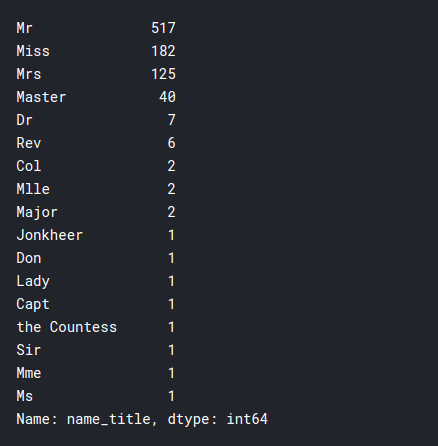
As you can see, the ship was boarded by people of many different classes, this could be useful in our model.
Paso 5: data preprocessing for the model
In this segment, we prepare our data for models. The objectives that we have to meet are listed below:
- Remove null values from the Shipped column
- Include only relevant data
- Categorically transform all data, using something called a transformer.
- Imputing data with central trends by age and rate.
- Normalize the rate column to have a more normal distribution.
- using standard scale scale data 0-1
Paso 6: Model implementation
Aquí simplemente implementaremos los diversos modelos con parametersThe "parameters" are variables or criteria that are used to define, measure or evaluate a phenomenon or system. In various fields such as statistics, Computer Science and Scientific Research, Parameters are critical to establishing norms and standards that guide data analysis and interpretation. Their proper selection and handling are crucial to obtain accurate and relevant results in any study or project.... predeterminados y veremos cuál produce el mejor resultado. Models can be further adjusted for better performance, but they are not in the scope of this article. The models that we will run are:
- Logistic regression
- K Nearest neighbor
- Support vector classifier
First, we import the necessary models
from sklearn.model_selection import cross_val_score
from sklearn.linear_model import LogisticRegression
from sklearn.neighbors import KNeighborsClassifier
from sklearn.svm import SVC
1) Logistic regression
lr = LogisticRegression(max_iter = 2000)
cv = cross_val_score(lr,X_train_scaled,y_train,cv=5)
print(cv)
print(cv.mean())

2) K Nearest neighbor
knn = KNeighborsClassifier()
cv = cross_val_score(knn,X_train_scaled,y_train,cv=5)
print(cv)
print(cv.mean())

3) Support vector classifier
svc = SVC(probability = True)
cv = cross_val_score(svc,X_train_scaled,y_train,cv=5)
print(cv)
print(cv.mean())

Therefore, the accuracy of the models is:
- Logistic regression: 82,2%
- K Nearest neighbor: 81,4%
- SVC: 83,3%
As you can see, we get decent accuracy with all of our models, but the best is SVC. And ready, this is how you have completed your first data science project! Although much more can be done to obtain better results, this is more than enough to get you started and see how you think like a data scientist. I hope this tutorial has helped you, I had a great time doing the project myself and I hope you enjoy it too. Health!!





